
I’ve wasted embarrassing amounts of time trying to fake water reflections in Photoshop. Flip the layer, blur it, drop the opacity, add a wave distortion, cry a little. The result always looked like someone spilled dish soap on a photograph. It never looked like water. So when I came across this episode of Photoshop User TV from the KelbyOne crew, specifically the segment where Pete Collins walks through a plugin called Flood by Flaming Pear, I stopped what I was doing (drinking my third coffee of the morning, obviously) and paid attention.
Watch the full tutorial on YouTube
This is Episode 384 of Photoshop User TV, hosted by Corey Barker and Pete Collins. Pete kicks things off with the Flood plugin after spotting it used in a submission to the KelbyOne Pixel Fight Club, their weekly Photoshop challenge. His reaction was genuine enough that I took it seriously, and after spending a couple of hours with the plugin myself, I get it. This thing punches way above its price point.
Step 1: Install the Flood Plugin from Flaming Pear
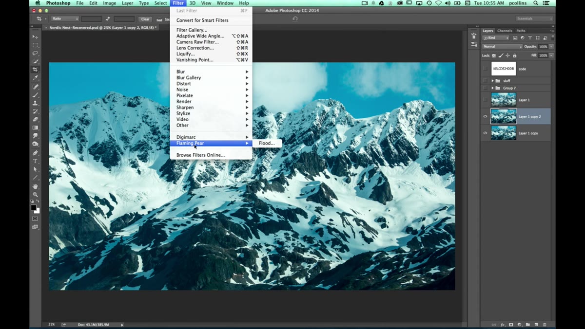 Filter menu open, Flaming Pear submenu visible
The plugin comes from Flaming Pear Software, and once it’s installed it shows up under the Filter menu like any standard Photoshop plugin. You’ll see the Flaming Pear submenu, and Flood lives inside it. Installation is straightforward, and the plugin works inside Photoshop’s filter system without any weird workarounds. Before you launch it, open your image. Pete uses a landscape shot of a mountain range, which is a smart choice because the strong horizontal lines give the water reflection something clear to work with.
A quick tip before you even open the filter: duplicate your background layer first. Run the plugin on the duplicate. You’ll want the flexibility to mask, blend, or walk back the effect later without destroying your original.
Step 2: Open the Flood Interface and Get Oriented
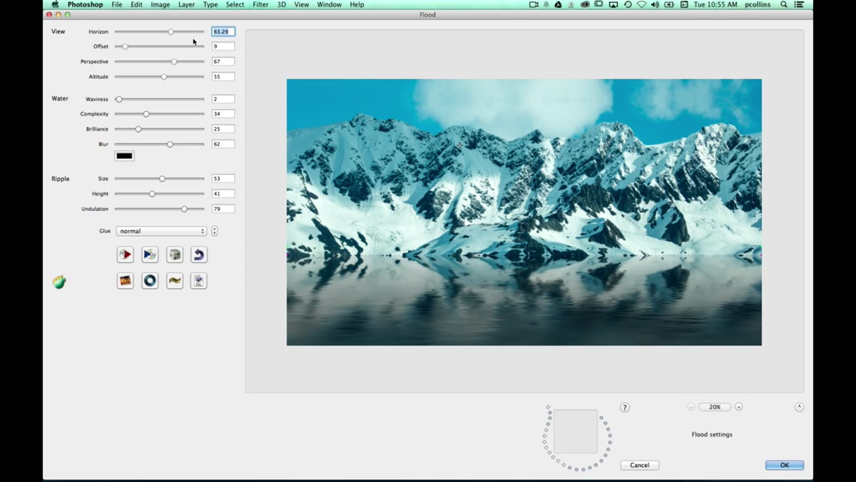 Flood plugin dialog open with preview and sliders visible
When Flood opens, you get a preview window alongside a panel of controls. The interface looks a little retro, but don’t let that fool you. The controls are logically grouped and there are more of them than you’d expect. Pete points out the main categories: horizon placement, offset, perspective, reflection quality, and altitude. These work together to define where the water starts and how it sits in the scene geometrically.
Spend a minute just dragging sliders before you commit to anything. The preview updates in real time, so you can see exactly how the water interacts with your specific image. What you’re doing in this step is understanding the spatial relationship between your photo and the synthetic water plane the plugin is building.
Step 3: Set the Horizon and Offset
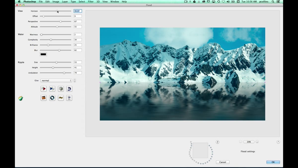 Horizon and offset sliders being adjusted in Flood dialog
The horizon control defines where the water meets the sky or background in your image. The offset lets you decouple the water surface from that horizon line, so you can say the visual horizon is up here, but I want the actual waterline to sit a bit lower. This is surprisingly useful because real photos rarely have clean, perfectly placed horizon lines.
Perspective adjusts the angle at which you’re viewing the water surface. Pulling this slider changes whether you’re looking almost straight down at the water or at a very shallow angle across it. For a landscape like the mountain shot Pete’s using, a moderate perspective angle reads as most natural.
Step 4: Dial in the Water Appearance
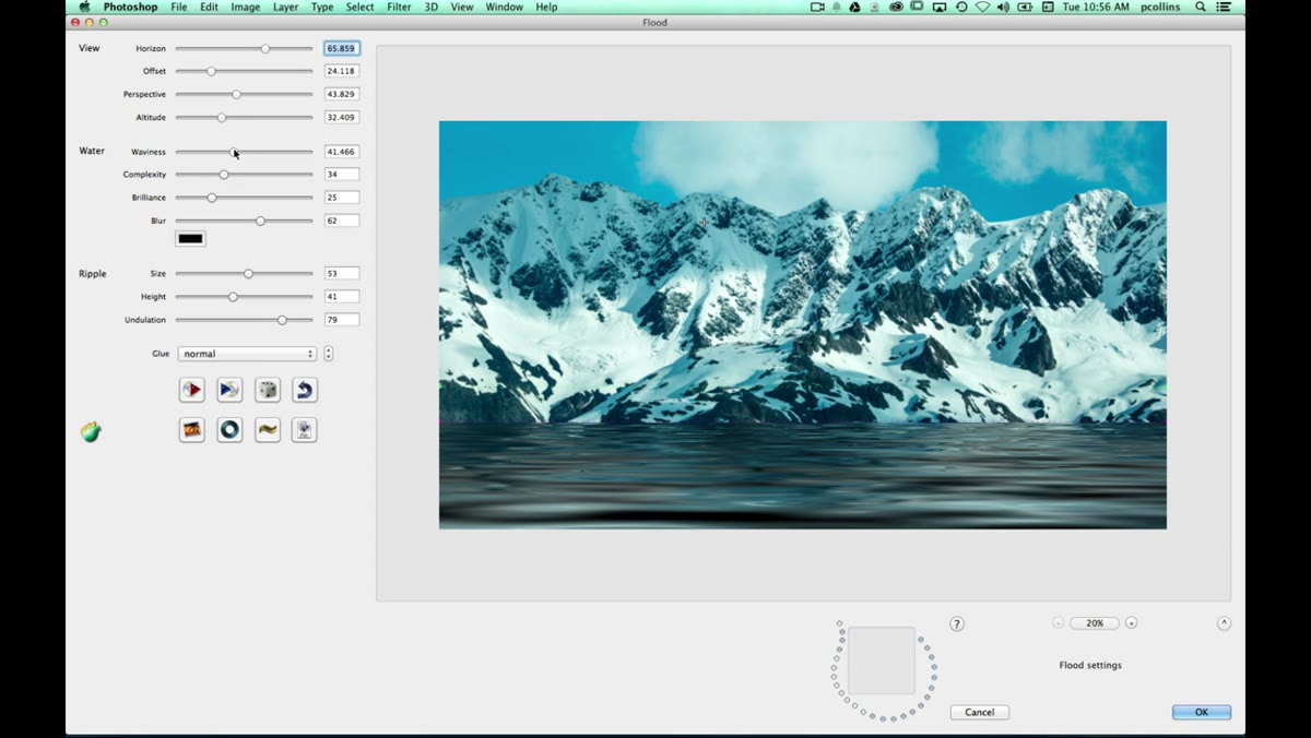 Wave complexity and water style sliders being adjusted
This is where the plugin earns its keep. You have controls for wave intensity and wave complexity, essentially how rough the water is and how intricate the wave patterns are. Calm, still water gets low values on both. Choppy, storm-looking water gets higher complexity. You can also adjust the brilliance, which controls brightness and shadow depth. Darker values give you that heavy, shadowy water you see in overcast conditions. Brighter values push toward a glittery midday look.
There’s also a blur control specifically for the water. Adding a small amount of blur smooths out the wave detail and makes the reflection look like it’s viewed through moving water rather than through glass. It’s a subtle thing, but it makes a noticeable difference in realism.
Step 5: Add a Color Cast
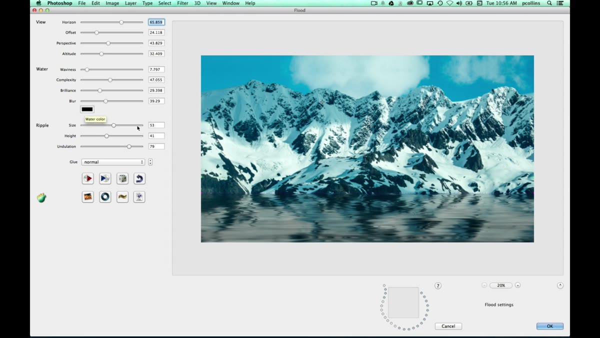 Color cast control being adjusted, water shifting tone
Flood lets you apply a color tint to the water surface, which is more useful than it sounds. Real water picks up color from the sky, the surrounding environment, the time of day. A mountain lake at dusk isn’t going to look the same color as an ocean on a clear afternoon. Using the color cast control to nudge the water toward a slight blue or steel gray helps it feel like it belongs in your specific photo rather than being pasted in from somewhere else.
Don’t go heavy-handed here. A subtle shift of maybe 10 to 20 percent is usually enough to sell it. If you can tell you’ve added a color tint, you’ve probably added too much.
Step 6: Place a Ripple Point
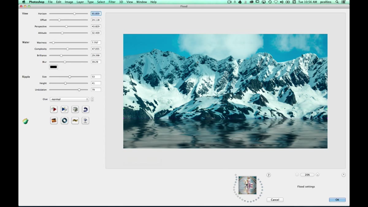 Ripple icon being clicked and repositioned in preview
This is the detail that separates Flood from every manual technique I’ve tried. You can drop a ripple point directly into the preview by clicking in the water area. The ripple icon, a small plus sign marker, lets you define a specific point of disturbance in the water surface. Think of it like dropping a pebble: the ripple radiates outward from wherever you place it.
You can reposition this point by clicking again, so if you want the disturbance to look like it’s coming from a reflection of a specific element in the image, you can line it up precisely. It’s a small thing that adds a lot of life to what would otherwise be a perfectly flat, slightly artificial-looking surface.
Step 7: Save Presets for Different Water Styles
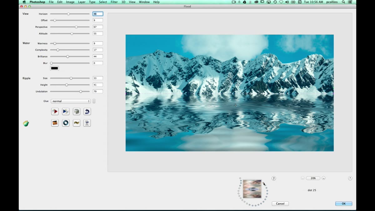 Preset dots panel showing multiple saved water configurations
Once you’ve built a water look you like, Flood lets you save it as a preset using the dot-based preset panel. Pete has a whole row of these saved, ranging from a smooth, milky mirror-like reflection to rougher, choppier water. He even mentions one labeled something like “algae,” which suggests the plugin has some presets built in that skew toward more stylized or unusual water effects.
Saving presets is worth doing even if you’re just exploring. You’ll stumble onto a combination that looks great and then accidentally move a slider and lose it forever. Click save early.
One Thing I’d Add: Use a Gradient Mask to Blend the Edge
The Flood plugin handles everything below the waterline convincingly, but the transition right at the edge where water meets land can look slightly hard, depending on your image. What I’ve started doing is running the filter on a duplicate layer, then adding a layer mask and painting a soft black gradient right along that transition zone. It softens the edge just enough that the water looks like it’s lapping gently at the terrain rather than sitting on top of it like a sticker. Takes about 30 seconds and makes the whole composite feel more grounded.
The single most important thing this tutorial taught me: convincing water in a photo composite doesn’t require building the effect from scratch every time. The Flood plugin does the physically accurate heavy lifting, and your job is just to make it fit the specific image. That’s a much better use of your time.
Watch the full tutorial on YouTube to see Pete walk through the Flood plugin in real time, plus Corey’s Puppet Warp segment later in the episode, which is worth sticking around for.
Comments
Leave a Comment