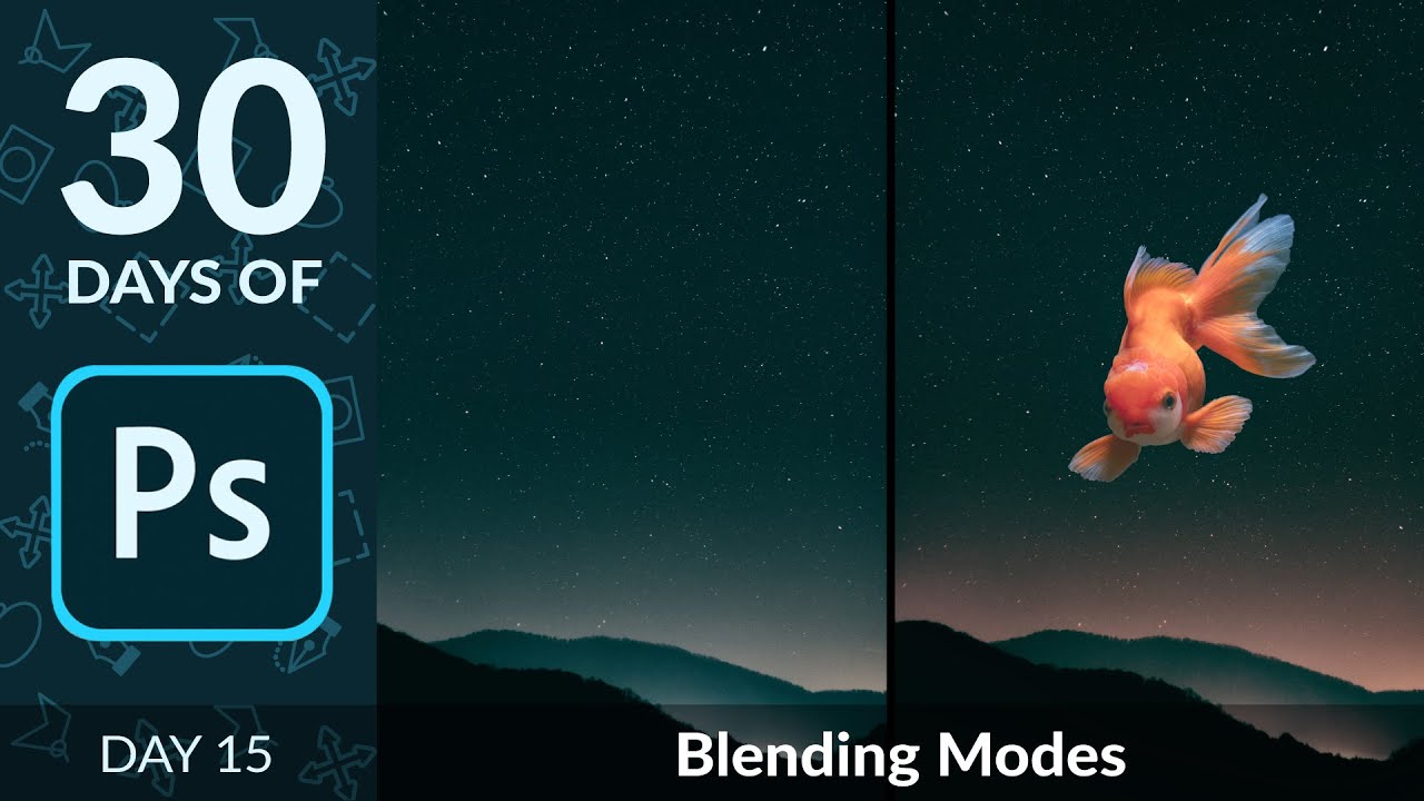
A few years back, I spent three days wrestling with a composite that a more experienced designer later rebuilt in about twenty minutes using a technique I’d completely overlooked. That technique was blending modes. I’d used Normal, maybe occasionally Multiply when I wanted to darken a shadow layer, but I’d never really understood the logic underneath them. They felt like magic spells you either knew or didn’t. Turns out the logic is pretty simple once someone breaks it down correctly.
That someone, in this case, is Aaron Nace over at PHLEARN, in his Day 15 tutorial from his “30 Days of Photoshop” series. Watch the full tutorial on YouTube – it’s one of those videos that reframes how you think about a tool you’ve been ignoring. The example he uses is a fish on a black background composited onto a starfield image, which sounds oddly specific, but the principle transfers to basically any situation where your subject is isolated against a solid light or dark background.
The big unlock for me was this: blending modes don’t require masking when contrast does the work for you. If your subject is light on dark, or dark on light, the right blending mode makes the background disappear without you touching a selection tool. Here’s how it works, step by step.
Step 1: Set Up Your Composite by Dragging Layers Together
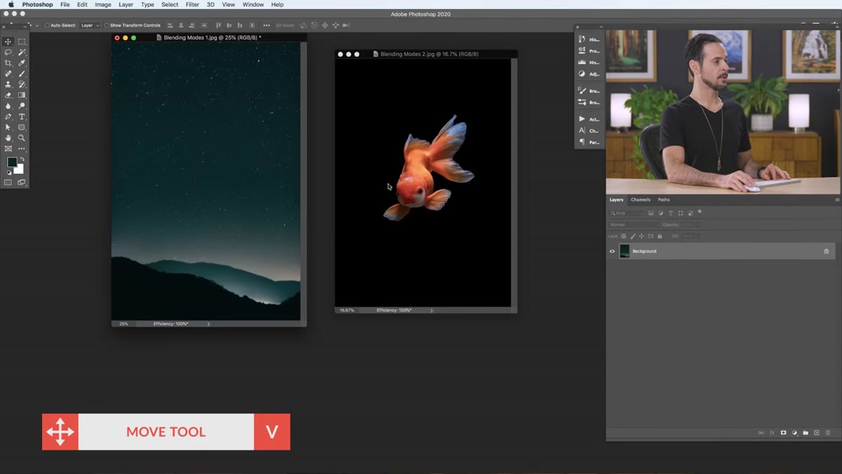 Moving the fish image onto the background in Photoshop
Grab the Move tool (V) and drag your subject image onto your background image. Once it lands as a new layer, hit F to toggle into fullscreen mode if you want a cleaner view. Scale the layer down if you need to with Free Transform (Cmd/Ctrl + T) so you can see how the two images interact with each other at a glance. At this stage, nothing looks right – the subject just sits on top of the background like a bad sticker. That’s expected.
Moving the fish image onto the background in Photoshop
Grab the Move tool (V) and drag your subject image onto your background image. Once it lands as a new layer, hit F to toggle into fullscreen mode if you want a cleaner view. Scale the layer down if you need to with Free Transform (Cmd/Ctrl + T) so you can see how the two images interact with each other at a glance. At this stage, nothing looks right – the subject just sits on top of the background like a bad sticker. That’s expected.
Step 2: Locate Your Blending Modes in the Layers Panel
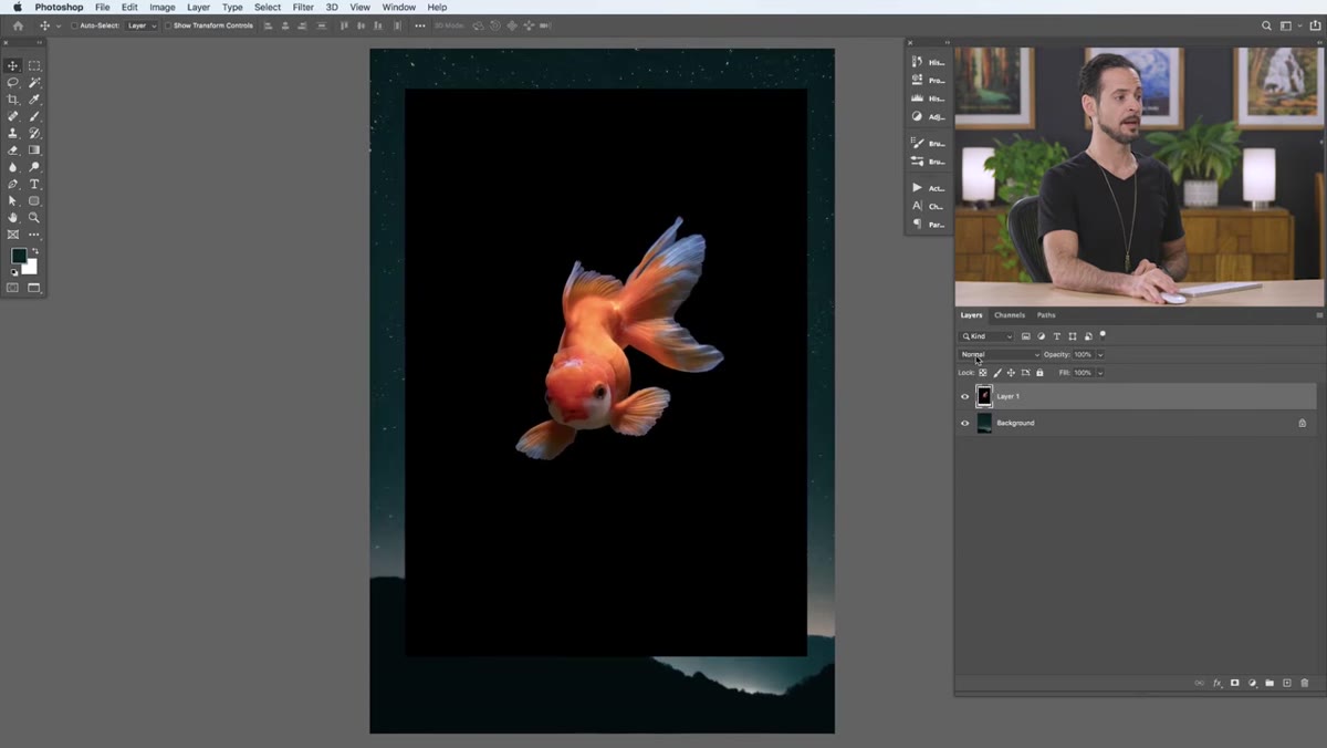 The blending mode dropdown showing Normal selected in the Layers panel
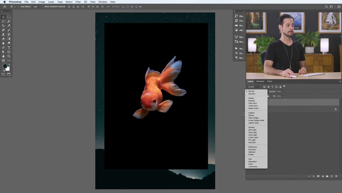
Your blending modes live at the top left of the Layers panel, in a dropdown that reads “Normal” by default. Click it and you’ll see a fairly intimidating list. Don’t panic. Aaron’s key insight here is genuinely useful: you don’t need to memorize all of them. They’re organized into groups separated by thin horizontal lines, and understanding one or two modes per group covers about 90% of real-world use cases.
The blending mode dropdown showing Normal selected in the Layers panel
Your blending modes live at the top left of the Layers panel, in a dropdown that reads “Normal” by default. Click it and you’ll see a fairly intimidating list. Don’t panic. Aaron’s key insight here is genuinely useful: you don’t need to memorize all of them. They’re organized into groups separated by thin horizontal lines, and understanding one or two modes per group covers about 90% of real-world use cases.
The groups break down like this: Normal at the top, then Darken (includes Multiply), then Lighten (includes Screen), then Overlay (includes Soft Light), then Difference/Subtract, and finally the Color group at the bottom. Each group has a governing logic, and once you know that logic, you can make educated guesses instead of clicking through every option randomly.
Step 3: Understand the Contrast Logic Before You Click Anything
 Fish layer in Normal mode showing dark background clearly visible
Before touching the dropdown, look at your subject layer and ask one question: is my subject light on a dark background, or dark on a light background? This determines which half of the blending mode list you’re working with.
Fish layer in Normal mode showing dark background clearly visible
Before touching the dropdown, look at your subject layer and ask one question: is my subject light on a dark background, or dark on a light background? This determines which half of the blending mode list you’re working with.
In the tutorial, the fish is relatively light against a solid black background. Black, as Aaron explains, is a neutral in the Lighten group – it contributes nothing to a lighten operation, so it becomes invisible. White is the equivalent neutral in the Darken group. So if you want to eliminate a dark background, you go Lighten or Screen. If you want to eliminate a light background, you go Darken or Multiply. That’s the whole framework. Write it on a sticky note if you need to.
Step 4: Apply Screen Mode to Remove the Dark Background
 Screen blending mode applied, black background disappearing from the fish layer
With your subject layer selected, open the blending mode dropdown and choose Screen. Watch the black background disappear immediately – no masking, no selection, no pen tool gymnastics. Screen is essentially a stronger version of Lighten. Where Lighten compares pixel values and keeps the lighter one, Screen actually blends values mathematically, producing a brighter result. The practical difference is that Screen tends to handle mid-tones better and gives you a cleaner integration, especially with soft or glowing subjects.
Screen blending mode applied, black background disappearing from the fish layer
With your subject layer selected, open the blending mode dropdown and choose Screen. Watch the black background disappear immediately – no masking, no selection, no pen tool gymnastics. Screen is essentially a stronger version of Lighten. Where Lighten compares pixel values and keeps the lighter one, Screen actually blends values mathematically, producing a brighter result. The practical difference is that Screen tends to handle mid-tones better and gives you a cleaner integration, especially with soft or glowing subjects.
If your subject were dark on a white background, the equivalent move would be Multiply, which makes whites transparent and preserves dark tones. Same logic, opposite direction.
Step 5: Identify What Isn’t Working and Understand Why
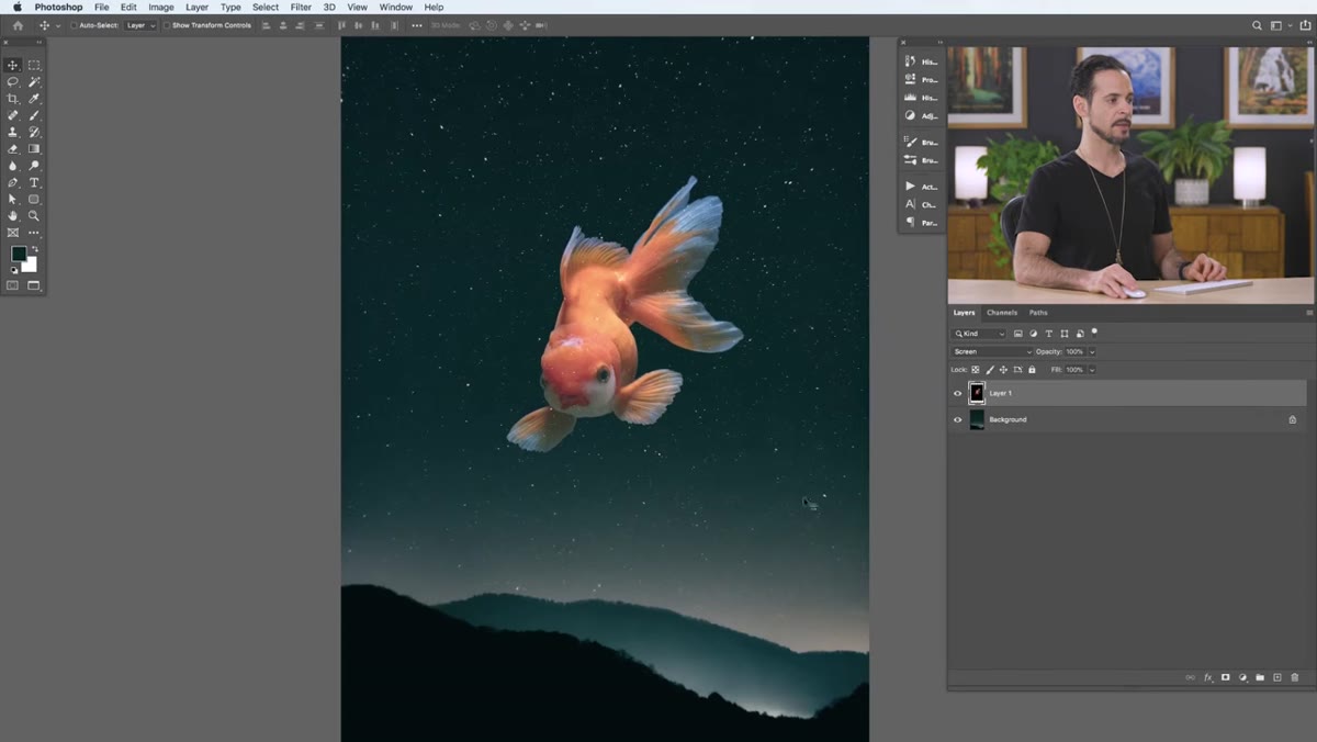 Stars visible through the fish body after applying Screen mode
Here’s where it gets honest. After applying Screen, Aaron points out that the background stars are showing through the fish itself. This isn’t a bug in your process – it’s the blending mode doing exactly what it was designed to do. Screen makes lighter areas more visible everywhere on the layer, so any areas of the fish that have lighter tones start letting the layer beneath bleed through.
Stars visible through the fish body after applying Screen mode
Here’s where it gets honest. After applying Screen, Aaron points out that the background stars are showing through the fish itself. This isn’t a bug in your process – it’s the blending mode doing exactly what it was designed to do. Screen makes lighter areas more visible everywhere on the layer, so any areas of the fish that have lighter tones start letting the layer beneath bleed through.
This is the moment where blending modes reveal their limitation as a one-click solution. They work cleanly when the contrast between subject and background is high and the subject itself doesn’t share tonal values with what you’re trying to remove. When that condition isn’t met, you’ll need to combine blending modes with masking or adjust the levels of your subject layer to push those lighter areas darker before applying the blend. Knowing when the technique works – and when it won’t – saves you a lot of frustrated clicking.
Step 6: Cycle Through Modes to Find the Right Fit
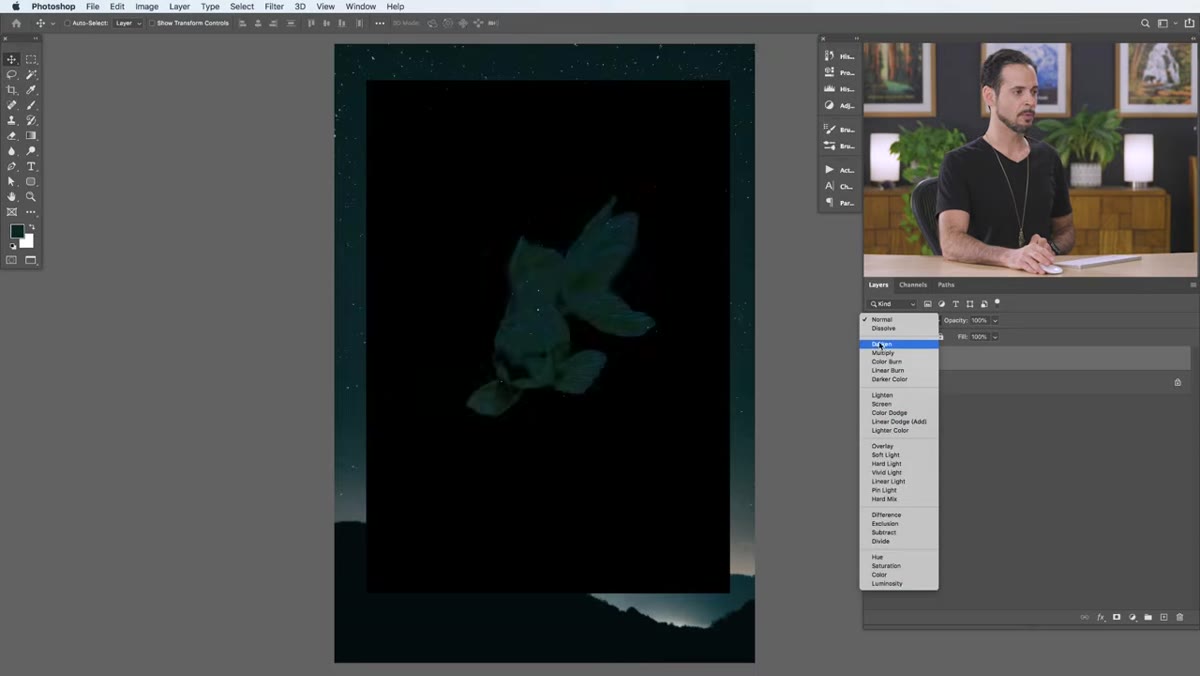 Scrolling through blending mode dropdown to preview effects
One of the most practical pieces of advice in the video is this: you can scroll through blending modes with your keyboard. With the Move tool active (not the Type tool or a painting tool), select the blending mode dropdown and use the up and down arrow keys to cycle through options while watching your canvas update in real time. This is way faster than clicking each one individually and much better than trying to memorize what every mode does theoretically.
Scrolling through blending mode dropdown to preview effects
One of the most practical pieces of advice in the video is this: you can scroll through blending modes with your keyboard. With the Move tool active (not the Type tool or a painting tool), select the blending mode dropdown and use the up and down arrow keys to cycle through options while watching your canvas update in real time. This is way faster than clicking each one individually and much better than trying to memorize what every mode does theoretically.
For the Color group at the bottom – Hue, Saturation, Color, Luminosity – the use case shifts entirely. These modes don’t deal with light and dark; they affect how the color information of one layer interacts with another. Drop a solid color layer set to Hue on top of your image and you can shift the entire color cast without touching the tones. It’s a quick and non-destructive way to experiment with color grading.
What I Do Differently Now
The thing that changed in my own workflow after really absorbing this approach is that I stopped treating blending modes as an afterthought. I now actually plan composites around them. Before I source images, I ask whether my subject has the right tonal contrast against its background to make Screen or Multiply work cleanly. When I’m shooting or sourcing stock, a subject against a clean black or white background isn’t just easier to mask – it’s also ready for a blending-mode composite that takes thirty seconds instead of thirty minutes.
I also lean on Soft Light constantly now for color effects. Drop a painted or gradient layer set to Soft Light over a photo and you can add warmth, add haze, or push a mood without the heavy-handedness of a regular opacity-blended color layer. It plays nicer with the tones underneath.
The single most important thing to take away from this tutorial: blending modes have a logical structure, and once you understand that light backgrounds disappear with Darken/Multiply and dark backgrounds disappear with Lighten/Screen, you’ve got the core of it. Everything else is experimentation.
Watch the full tutorial on YouTube and follow along with Aaron’s sample images to get the hands-on feel for it – reading about blending modes and actually seeing them toggle in real time are two very different experiences.
Comments (2)
I've been looking for exactly this kind of tutorial. Perfect timing.
Bookmarked. Coming back to this one for sure.
Leave a Comment