
Client work has a funny way of expanding scope. You’re hired to do one thing, and three emails later you’re being asked if you can “quickly throw together an app icon too.” I’ve been in that exact spot, and my first instinct was to fake confidence while quietly panicking about whether Photoshop could even do this properly. Turns out, it absolutely can, and the process is more systematic than you’d think once someone walks you through it.
Watch the full tutorial on YouTube
In this Aaron Nace (PHLEARN) tutorial, the whole workflow gets broken down cleanly: shape creation with the Rounded Rectangle tool, gradient fills sampled directly from real iOS 8 apps, centered logo placement using alignment tools, and a final PNG export with a transparent background. It’s the kind of tutorial that solves a real production problem, not just a hypothetical one. Here’s the full walkthrough so you can follow along in Photoshop without constantly pausing the video.
Step 1: Create a Square Document at 1000 x 1000 Pixels
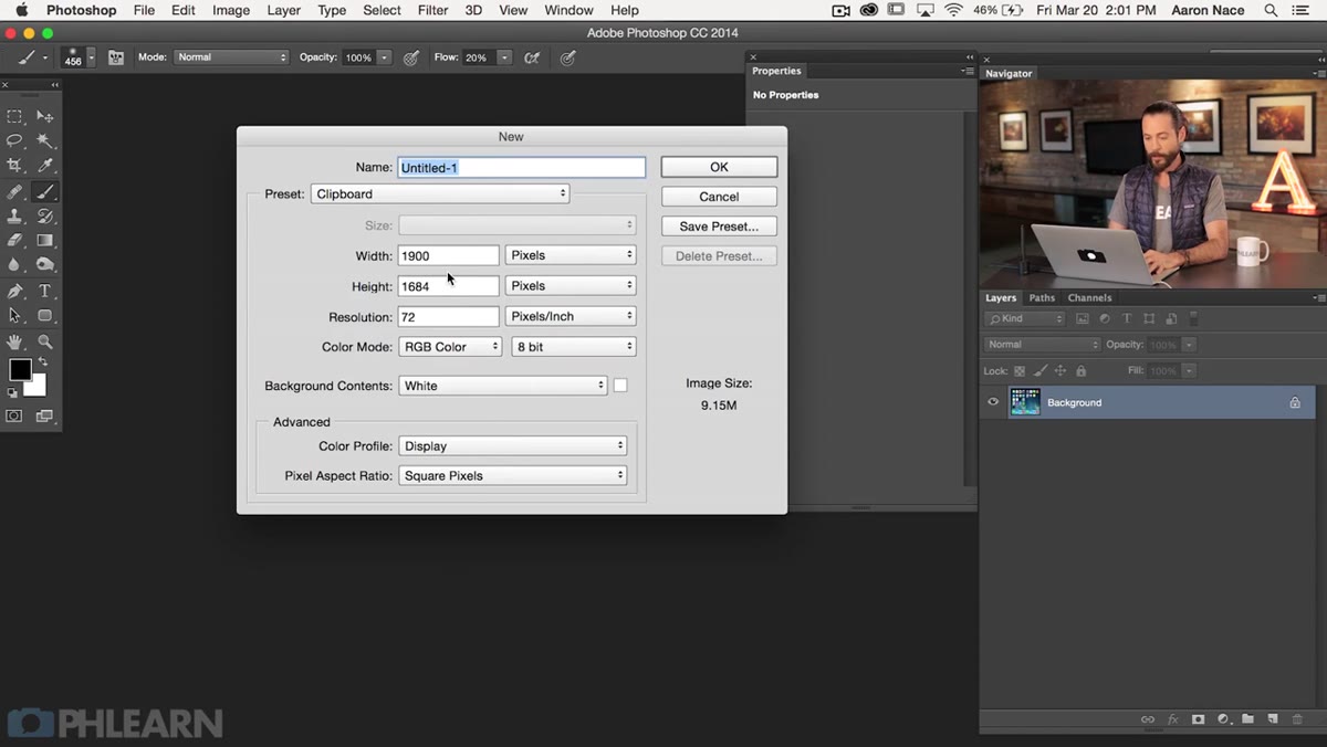 New document dialog open with 1000x1000 pixel dimensions
Hit Ctrl+N (Cmd+N on Mac) to open the New Document dialog. Set both width and height to 1000 pixels. The square canvas gives you a clean working space with room to center your icon shape with some breathing room around the edges. Set your background to a dark gray, which makes it easier to see the icon shape and any gradients you’ll be building.
New document dialog open with 1000x1000 pixel dimensions
Hit Ctrl+N (Cmd+N on Mac) to open the New Document dialog. Set both width and height to 1000 pixels. The square canvas gives you a clean working space with room to center your icon shape with some breathing room around the edges. Set your background to a dark gray, which makes it easier to see the icon shape and any gradients you’ll be building.
This might seem like a lot of canvas for an icon, but working at a larger size and scaling down preserves quality. It also makes your radius and spacing math cleaner, which matters more than you’d expect once you’re fussing over pixel-perfect positioning.
Step 2: Draw a Rounded Rectangle Using the Dedicated Tool
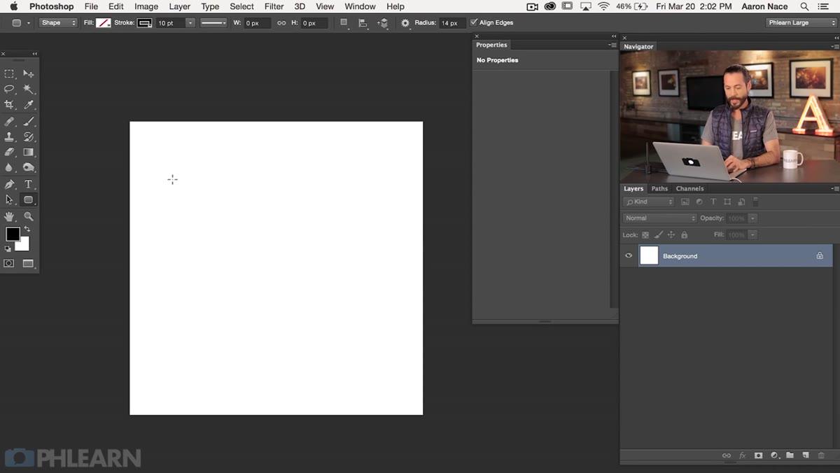 Rounded Rectangle tool selected in toolbar, shape drawn on canvas
Grab the Rounded Rectangle tool from the toolbar. In Photoshop CC and later, this tool comes with a Properties panel that gives you real-time control over dimensions, position, and corner radius after you’ve already drawn the shape. Draw from the top-left to the bottom-right of your canvas to get a rough version down first. Don’t worry about precision at this stage.
Rounded Rectangle tool selected in toolbar, shape drawn on canvas
Grab the Rounded Rectangle tool from the toolbar. In Photoshop CC and later, this tool comes with a Properties panel that gives you real-time control over dimensions, position, and corner radius after you’ve already drawn the shape. Draw from the top-left to the bottom-right of your canvas to get a rough version down first. Don’t worry about precision at this stage.
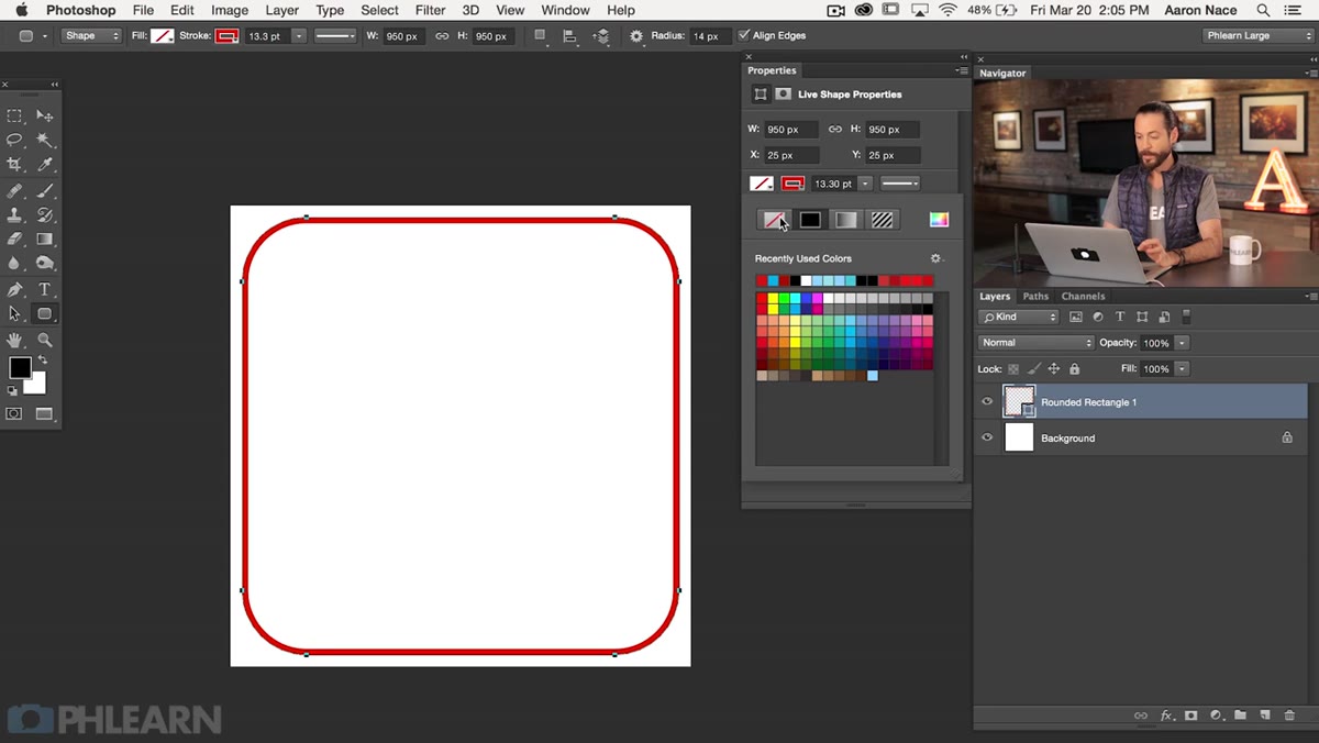
Once the shape is on the canvas, head to the Properties panel and set both the width and height to 950 pixels. Then set the X and Y position to 25 pixels each. The math here is simple: your canvas is 1000 pixels wide, your shape is 950, so you have 50 leftover pixels. Split that in half and you get 25 pixels of margin on each side, perfectly centered. No guessing, no dragging around with the Move tool trying to eyeball it.
Step 3: Dial In the Corner Radius to 140 Pixels
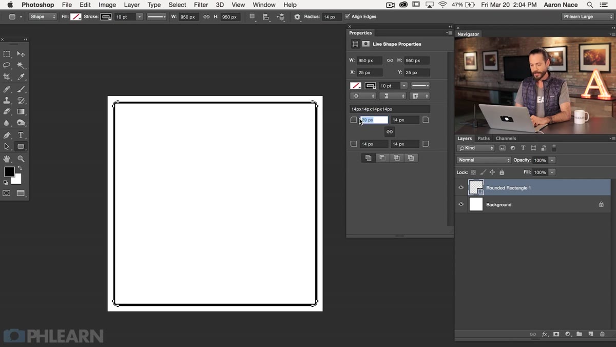 Properties panel showing corner radius field set to 140 pixels
Still in the Properties panel, look for the corner radius controls near the bottom. You can scrub the value left or right directly on the icon, or just type in a number. Set all four corners to 140 pixels. This matches the curvature Apple used on iOS 8 app icons, so your shape will feel native rather than approximate.
Properties panel showing corner radius field set to 140 pixels
Still in the Properties panel, look for the corner radius controls near the bottom. You can scrub the value left or right directly on the icon, or just type in a number. Set all four corners to 140 pixels. This matches the curvature Apple used on iOS 8 app icons, so your shape will feel native rather than approximate.
The Properties panel also has a chain-link toggle that lets you unlink the corners and set different radii independently. If you ever need an asymmetric shape for some reason, that’s your tool. For this project, keep them linked and uniform at 140.
Step 4: Remove the Stroke and Set Up Your Fill
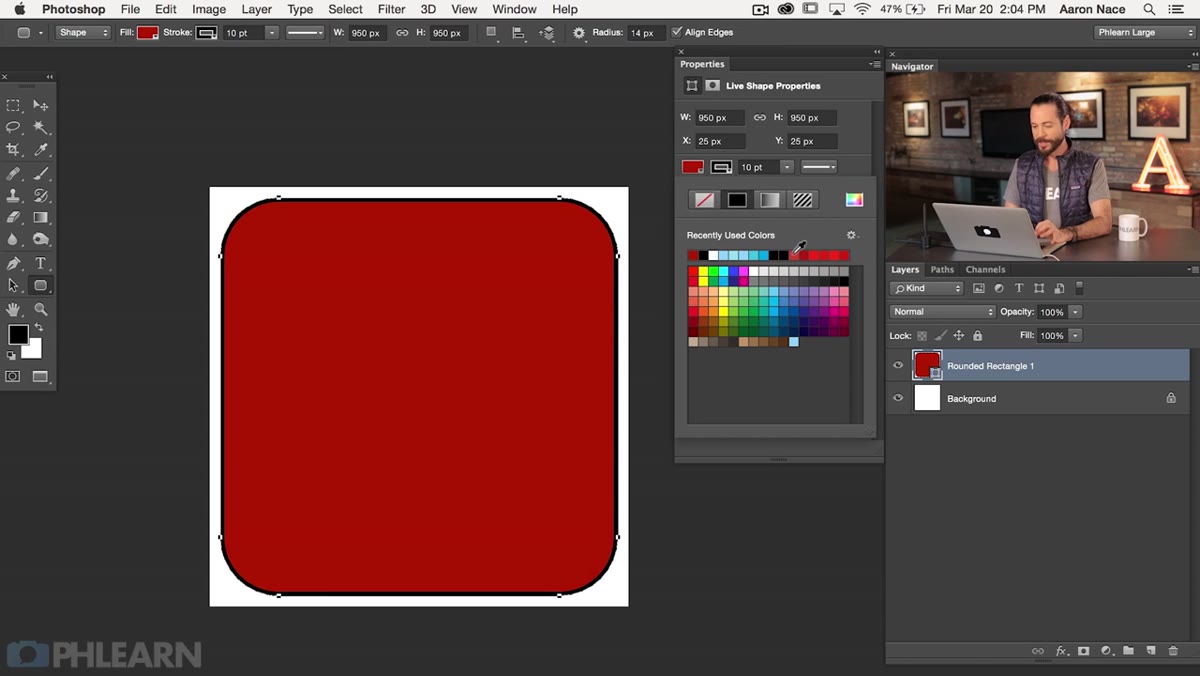 Stroke set to none, fill options visible in Properties panel
By default the shape probably has a stroke (a visible outline) applied. Find the stroke option in the Properties panel or the top toolbar and set it to none. A border around your icon will look wrong immediately, and it’s easy to miss if you’re not looking for it.
Stroke set to none, fill options visible in Properties panel
By default the shape probably has a stroke (a visible outline) applied. Find the stroke option in the Properties panel or the top toolbar and set it to none. A border around your icon will look wrong immediately, and it’s easy to miss if you’re not looking for it.
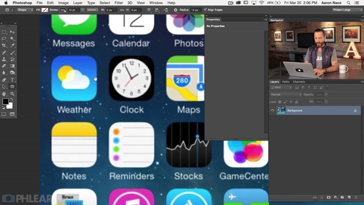
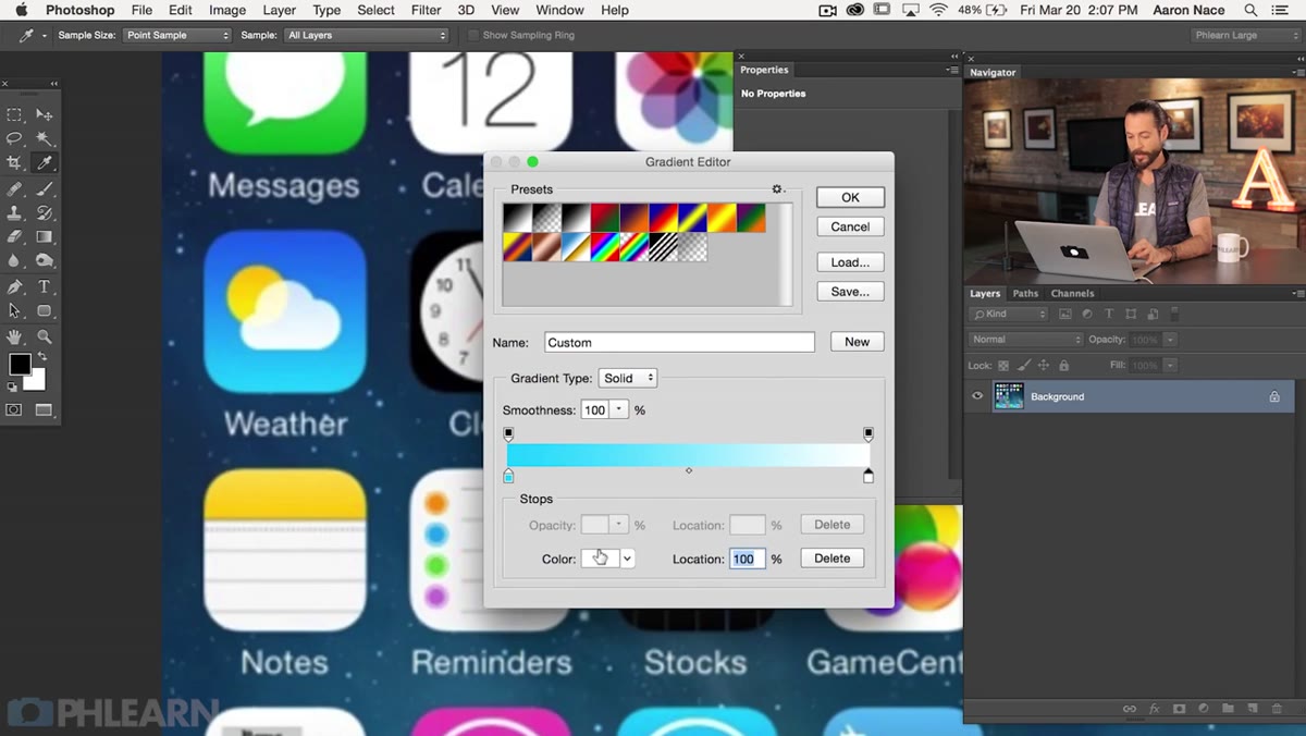
For the fill, you’re going to skip a flat color for now and set things up for a gradient. Aaron samples colors directly from actual iOS 8 app icons to get that authentic palette. You can use the Eyedropper tool to pull colors from screenshots of real apps, then feed those hex values into a custom gradient. This is a smarter approach than picking colors by feel, especially if you want the final icon to look like it belongs in an app store listing.
Step 5: Apply a Custom Gradient Fill Sampled from iOS 8 Apps
 Gradient editor open with sampled iOS 8 colors applied to shape
Double-click the shape layer thumbnail to open the fill options, then select Gradient. Open the Gradient Editor and add your sampled color stops. iOS 8 gradients tend to run from a lighter, slightly warm tone at the top to a deeper, richer version of the same hue at the bottom. Diagonal gradients (angled around 135 degrees) were particularly common in that design era.
Gradient editor open with sampled iOS 8 colors applied to shape
Double-click the shape layer thumbnail to open the fill options, then select Gradient. Open the Gradient Editor and add your sampled color stops. iOS 8 gradients tend to run from a lighter, slightly warm tone at the top to a deeper, richer version of the same hue at the bottom. Diagonal gradients (angled around 135 degrees) were particularly common in that design era.
If you’re recreating a specific app’s style, pull a screenshot of that app onto a separate layer, use the Eyedropper to sample two or three key tones, and then delete the reference layer when you’re done. Using real colors rather than invented ones is the difference between an icon that looks professional and one that just looks designed, if you know what I mean.
Step 6: Place and Center Your Logo with Alignment Tools
 Logo layer selected, alignment buttons highlighted in top toolbar
Bring in your logo or icon graphic, place it on its own layer above the rounded rectangle, and then use Photoshop’s alignment tools to lock it to the center. Select both the logo layer and the rounded rectangle layer, then hit the align horizontal centers and align vertical centers buttons in the top toolbar. Two clicks and you’re done.
Logo layer selected, alignment buttons highlighted in top toolbar
Bring in your logo or icon graphic, place it on its own layer above the rounded rectangle, and then use Photoshop’s alignment tools to lock it to the center. Select both the logo layer and the rounded rectangle layer, then hit the align horizontal centers and align vertical centers buttons in the top toolbar. Two clicks and you’re done.
This beats nudging something around with arrow keys and second-guessing yourself. If your logo has uneven whitespace baked in (common with vector imports), you may need to crop or adjust the canvas of the logo itself before centering. Otherwise you’ll center the bounding box, not the visual weight of the logo, and it’ll look slightly off.
Step 7: Add a Drop Shadow, Make the Background Transparent, and Export as PNG
 Layer Style dialog open with drop shadow settings visible
Add a drop shadow through Layer Styles (double-click the shape layer). Keep it subtle, a low opacity, a small distance, and a soft spread. iOS 8 icons weren’t dramatic with their shadows.
Layer Style dialog open with drop shadow settings visible
Add a drop shadow through Layer Styles (double-click the shape layer). Keep it subtle, a low opacity, a small distance, and a soft spread. iOS 8 icons weren’t dramatic with their shadows.
To get a transparent background, hide or delete the background layer so you see the checkerboard pattern behind your icon. Then go to File, Export, Export As (or Save for Web in older versions) and choose PNG-24 with the transparency box checked. This gives you a clean icon file that sits properly over whatever background color appears on a user’s phone. Save a layered PSD as your working file too. Always.
One Thing I’d Add: Save Multiple Sizes While You’re at It
When I’m building icons for a client, I duplicate the whole document immediately after finishing and resize down to the common sizes: 512px, 256px, 180px, 120px. iOS actually requires multiple icon sizes submitted together, so building at 1000px and scaling down is intentional workflow, not overkill. If you set this up as an Action in Photoshop, you can run it in seconds and hand the client a full icon set instead of just one file. That kind of thing gets remembered.
Getting the corner radius right and centering a logo properly sounds like small stuff until you’ve submitted a sloppy icon to a client and had to fix it twice. The systematic approach Aaron Nace lays out here, precise values in the Properties panel, sampled colors, alignment tools, clean export, is genuinely faster than winging it. These aren’t workarounds. They’re the actual right way to do this.
Watch the full tutorial on YouTube
Comments (2)
Just used this on a wedding shoot edit. Client was thrilled.
Shared this with my photography group. Everyone loved it.
Leave a Comment