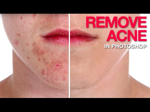
I do a lot of freelance portrait work. Not high-fashion editorial stuff, just real people who want to look their best in headshots, event photos, and the occasional engagement shoot. And one request comes up constantly: “Can you clean up my skin a little?” That’s polite for “I had a breakout and I hate this photo of myself.” For years, my go-to was just hammering the Spot Healing Brush until something resembling a face appeared. It worked, sort of. But the results were muddy, and anything more than a few spots ate up way too much of my afternoon. Then I found this Watch the full tutorial on YouTube from Aaron Nace over at PHLEARN, and it completely changed how I approach this kind of work.
What Aaron does differently is he attacks the problem in two distinct phases: kill the redness first using a Hue/Saturation adjustment layer, then deal with the physical texture of the blemishes using healing tools. That order matters more than you’d think. If you go straight to cloning and healing without neutralizing the color first, you’re constantly fighting the red tone bleeding into your sampled pixels. Handle color first, and the healing step becomes almost easy. Here’s how the whole thing breaks down.
Step 1: Add a Hue/Saturation Adjustment Layer
 Adjustment layers panel open, Hue/Saturation option highlighted
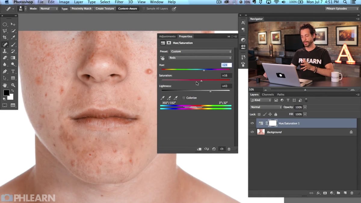
Go to your Adjustments panel and add a Hue/Saturation layer. Don’t touch anything yet, because the real power here isn’t in the global sliders. At the top of the properties panel, you’ll see a dropdown that defaults to “Master.” Click that and switch it to “Reds.” This limits every change you make to only the red tones in the image, which is exactly where acne lives on skin. This one move is the difference between a surgical edit and nuking your subject’s entire complexion.
Adjustment layers panel open, Hue/Saturation option highlighted
Go to your Adjustments panel and add a Hue/Saturation layer. Don’t touch anything yet, because the real power here isn’t in the global sliders. At the top of the properties panel, you’ll see a dropdown that defaults to “Master.” Click that and switch it to “Reds.” This limits every change you make to only the red tones in the image, which is exactly where acne lives on skin. This one move is the difference between a surgical edit and nuking your subject’s entire complexion.
Step 2: Crank the Hue and Saturation Temporarily to See What You’re Targeting
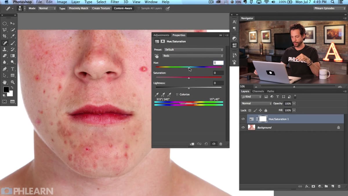 Hue and Saturation sliders cranked up, skin showing exaggerated green tones
This is a trick I genuinely wish someone had shown me sooner. Drag both the Hue and Saturation sliders way up, to extreme values you’d never actually use. The image is going to look unhinged, and that’s the point. You’re using those exaggerated colors as a diagnostic tool to see exactly which pixels the “Reds” range is grabbing. You want the pimples to light up, but you don’t want to be dragging in too much healthy skin tone.
Hue and Saturation sliders cranked up, skin showing exaggerated green tones
This is a trick I genuinely wish someone had shown me sooner. Drag both the Hue and Saturation sliders way up, to extreme values you’d never actually use. The image is going to look unhinged, and that’s the point. You’re using those exaggerated colors as a diagnostic tool to see exactly which pixels the “Reds” range is grabbing. You want the pimples to light up, but you don’t want to be dragging in too much healthy skin tone.
Inside the Hue/Saturation panel, there’s a gradient bar at the bottom with a slider in it. That slider controls which portion of the red spectrum you’re affecting. Grab the center of that slider and nudge it left. As you move it, you’ll see the selection tighten up, pulling away from general skin and zeroing in on the more saturated, angry reds of the blemishes. This is the secret weapon of the whole technique. When lips and blemishes are highlighted but the surrounding skin is mostly unaffected, you’re in the right zone.
Step 3: Dial the Sliders Back to Your Actual Values
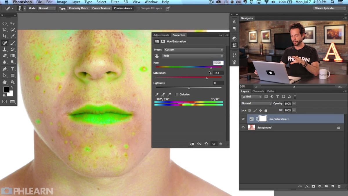 Hue, Saturation, and Lightness sliders adjusted to subtle skin-matching values
Now that you’ve confirmed what you’re targeting, reset the exaggerated values. Bring the Hue slider back toward zero and then nudge it slightly to the right. Moving it rightward pushes the red tones toward a more neutral, yellowish skin tone rather than an angry pink. Next, increase the Lightness slider a touch to brighten those targeted areas, which mimics the way healthy unpigmented skin reflects light. Finally, bring Saturation down slightly. You’re not going to zero because completely desaturated skin looks flat and weird. The goal is a modest reduction that blends the blemish color into the surrounding skin, not erases it entirely.
Hue, Saturation, and Lightness sliders adjusted to subtle skin-matching values
Now that you’ve confirmed what you’re targeting, reset the exaggerated values. Bring the Hue slider back toward zero and then nudge it slightly to the right. Moving it rightward pushes the red tones toward a more neutral, yellowish skin tone rather than an angry pink. Next, increase the Lightness slider a touch to brighten those targeted areas, which mimics the way healthy unpigmented skin reflects light. Finally, bring Saturation down slightly. You’re not going to zero because completely desaturated skin looks flat and weird. The goal is a modest reduction that blends the blemish color into the surrounding skin, not erases it entirely.
Take your time here and toggle the adjustment layer on and off to compare. The change should be subtle enough that someone who didn’t see the original would never notice a correction was made.
Step 4: Mask the Adjustment Layer to Protect Non-Skin Areas
 Layer mask painted black over lips and eyes to protect them from adjustment
Your Hue/Saturation adjustment layer already has a mask attached to it. Since we targeted reds, this correction is also going to pull at lip color and potentially any warm tones in the eyes or hair. Fill the mask with white to keep the full correction applied everywhere, then grab a soft black brush and paint over anything that shouldn’t be affected, particularly the lips. This preserves the natural color in those areas while keeping the blemish correction active on the skin. It takes maybe thirty seconds and makes the edit look significantly more professional.
Layer mask painted black over lips and eyes to protect them from adjustment
Your Hue/Saturation adjustment layer already has a mask attached to it. Since we targeted reds, this correction is also going to pull at lip color and potentially any warm tones in the eyes or hair. Fill the mask with white to keep the full correction applied everywhere, then grab a soft black brush and paint over anything that shouldn’t be affected, particularly the lips. This preserves the natural color in those areas while keeping the blemish correction active on the skin. It takes maybe thirty seconds and makes the edit look significantly more professional.
Step 5: Flatten to a New Layer and Use the Healing Brush for Texture
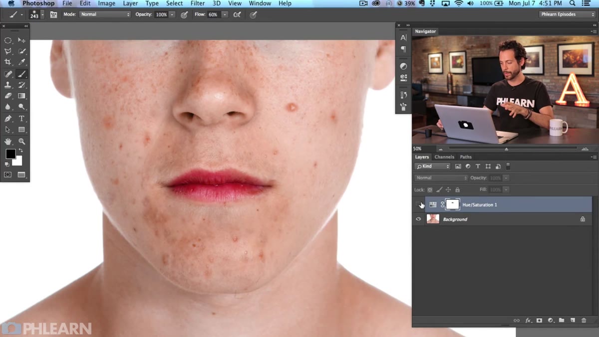 Healing brush active, sampling clean skin near a blemish
At this point, the redness is tamed. Now you deal with the actual physical texture of the blemishes. Create a new merged layer above everything by pressing Cmd+Alt+Shift+E (Ctrl+Alt+Shift+E on Windows). This gives you a flattened version of your work so far to paint on non-destructively.
Healing brush active, sampling clean skin near a blemish
At this point, the redness is tamed. Now you deal with the actual physical texture of the blemishes. Create a new merged layer above everything by pressing Cmd+Alt+Shift+E (Ctrl+Alt+Shift+E on Windows). This gives you a flattened version of your work so far to paint on non-destructively.
Switch to the Healing Brush tool (not the Spot Healing Brush). The regular Healing Brush lets you define your sample point manually. Hold Alt and click on a clean patch of skin close to the blemish you’re fixing, then paint over the pimple itself. Sampling nearby skin is critical because color, tone, and texture all shift across the face. If you sample from too far away you’ll get mismatched patches. Work in small strokes, re-sample often, and resist the urge to try covering a large area in one go.
Step 6: Work Methodically Across the Problem Areas
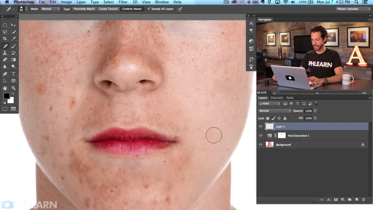 Multiple blemishes healed, before-and-after visible across the cheek area
There’s no shortcut for this part. Go blemish by blemish. The Hue/Saturation step has already done the heavy lifting on the redness, so each individual healing stroke should blend much more cleanly than it would have without it. If you hit an area with a cluster of blemishes close together, start from the outside and work inward so you always have clean skin to sample from. Zoom in close, work carefully, and zoom out periodically to check that the overall skin texture still reads as natural and not over-smoothed.
Multiple blemishes healed, before-and-after visible across the cheek area
There’s no shortcut for this part. Go blemish by blemish. The Hue/Saturation step has already done the heavy lifting on the redness, so each individual healing stroke should blend much more cleanly than it would have without it. If you hit an area with a cluster of blemishes close together, start from the outside and work inward so you always have clean skin to sample from. Zoom in close, work carefully, and zoom out periodically to check that the overall skin texture still reads as natural and not over-smoothed.
What I’d Add: Don’t Forget the Opacity Check
One thing the tutorial doesn’t dwell on but I always do before I deliver any retouched portrait: drop the Hue/Saturation adjustment layer opacity down to somewhere between 70 and 85 percent. Even a beautifully calibrated correction can look slightly artificial at full strength on some skin tones. Pulling the opacity back lets just a hint of the original color breathe through, and the result reads as real skin rather than a digital paint job. Same idea applies if you duplicate your healed layer and drop its opacity slightly. A good retouch is the one the client’s mom can’t spot.
The biggest thing I took away from Aaron’s approach is the idea of separating color problems from texture problems. They look related because they show up on the same zit, but they respond to completely different tools. Trying to solve both at once is why so many retouches end up looking plastic. Treat the red, then treat the bump, in that order, and you’ll get results that hold up at full resolution.
Watch the full tutorial on YouTube to see Aaron walk through the whole thing with a real image and get a feel for the pace and pressure of each stroke. It’s worth watching even if you think you already know how to do skin retouching.
Comments (1)
Bookmarked. Coming back to this one for sure.
Leave a Comment