
There’s a specific kind of bad composite that haunts me. You’ve seen it. A logo slapped onto a t-shirt or a hat, sitting perfectly flat and perfectly lit, glowing like a digital sticker that has absolutely no relationship with the fabric underneath it. I’ve made that mistake more times than I want to admit, usually under deadline pressure, usually when a client wanted something “quick.” The result always looked cheap, and I knew it. The fix, it turns out, is displacement maps, and once you understand what they actually do, you’ll wonder how you ever worked without them.
In this Aaron Nace (PHLEARN) tutorial, he walks through the full process of taking a logo and making it look like it was printed or stitched directly onto a hat. Watch the full tutorial on YouTube before or after reading this, but this guide is written so you can follow along step by step without pausing every thirty seconds. The core idea is this: a displacement map uses the brightness values of an image to physically shift pixels in another layer. Light areas push one way, dark areas push the other, and suddenly your flat logo is reacting to every wrinkle, thread, and curve in the fabric underneath it. It’s the difference between a sticker and a screen print.
Step 1: Set Up Your Two Source Files
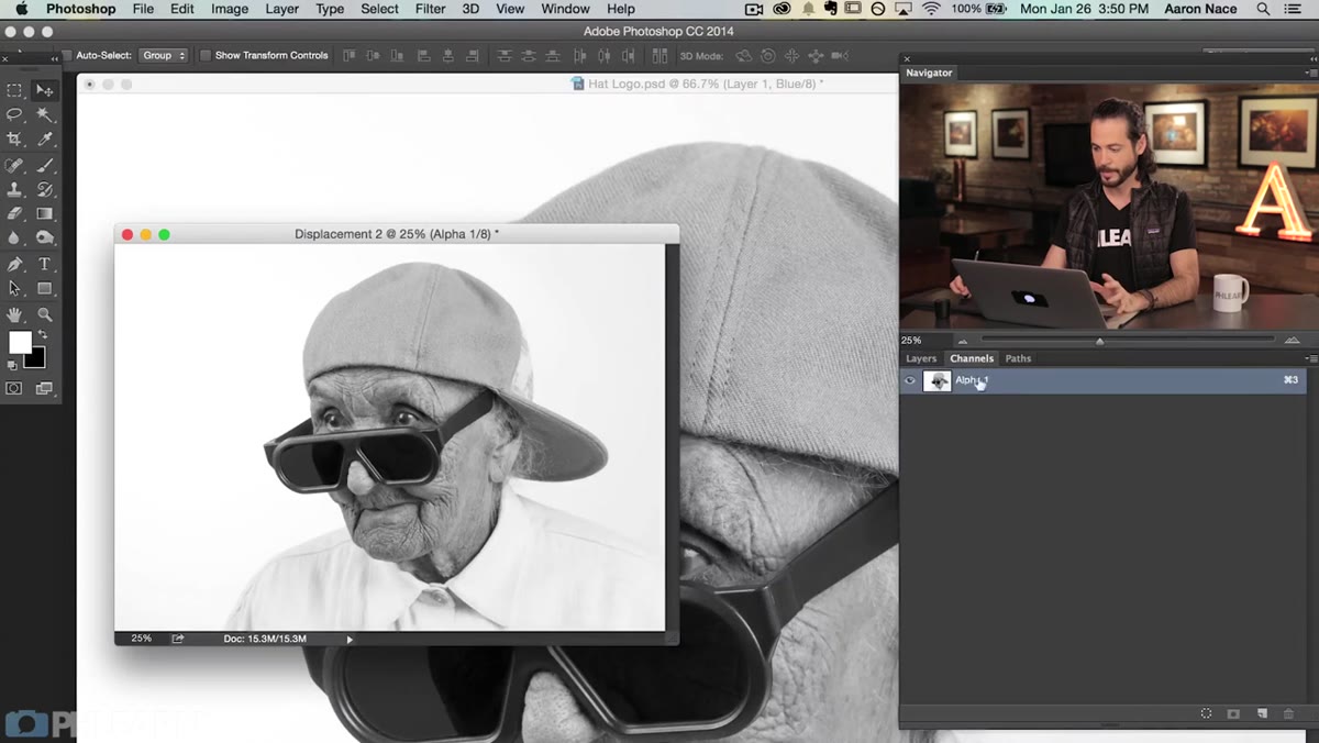
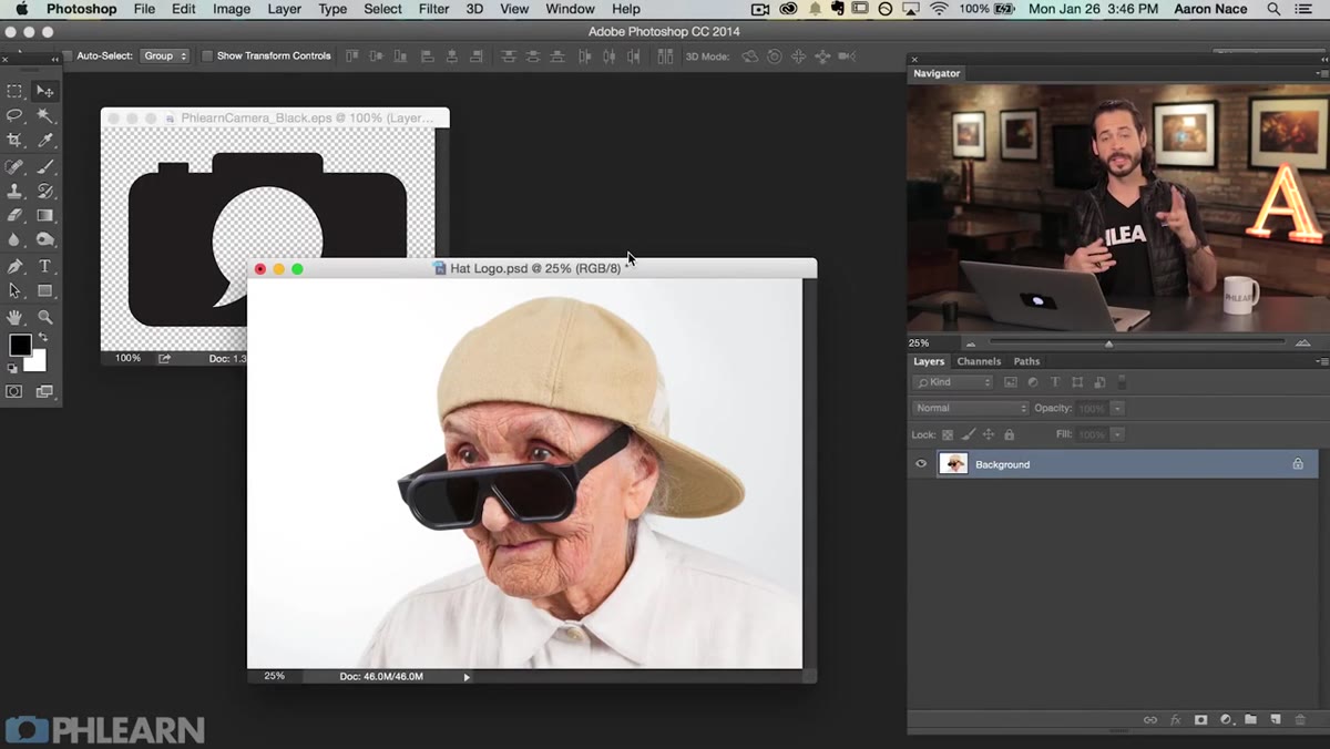 Two open documents: the logo file and the hat photo
You need two things going into this: the image you want to apply something to (in the tutorial, a photo of a woman in a hat with visible texture), and the logo or text you want to apply onto it. Open both in Photoshop. Grab the Move tool (V), then click and drag the logo from its document directly onto the hat photo. You’ll end up with both elements in a single document, with the logo sitting on its own layer above the background.
Two open documents: the logo file and the hat photo
You need two things going into this: the image you want to apply something to (in the tutorial, a photo of a woman in a hat with visible texture), and the logo or text you want to apply onto it. Open both in Photoshop. Grab the Move tool (V), then click and drag the logo from its document directly onto the hat photo. You’ll end up with both elements in a single document, with the logo sitting on its own layer above the background.
Step 2: Warp and Transform the Logo Into Position
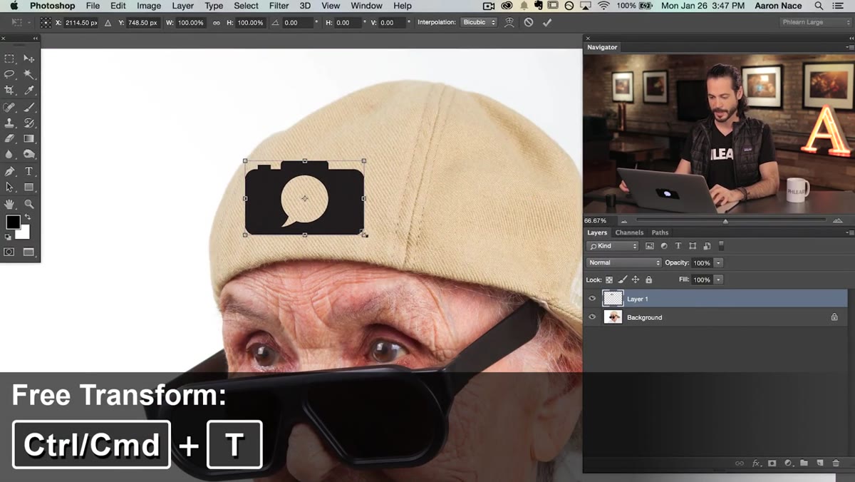 Logo layer selected with Free Transform warp handles active
Before you touch the displacement map, you need the logo to actually look like it’s sitting on the surface in terms of perspective and shape. Hit Command/Ctrl + T to bring up Free Transform, then right-click and choose Warp. This lets you pull the corners and edges of the logo so it curves and follows the general shape of the hat. Don’t go overboard here. The goal is to match the rough contour of the surface. The displacement map will handle the fine detail.
Logo layer selected with Free Transform warp handles active
Before you touch the displacement map, you need the logo to actually look like it’s sitting on the surface in terms of perspective and shape. Hit Command/Ctrl + T to bring up Free Transform, then right-click and choose Warp. This lets you pull the corners and edges of the logo so it curves and follows the general shape of the hat. Don’t go overboard here. The goal is to match the rough contour of the surface. The displacement map will handle the fine detail.
Once the warp looks right, confirm the transform, then hit Command/Ctrl + T again if you need to fine-tune the scale or rotation. Think about how the hat curves away from the viewer and tilt the logo slightly to match that angle. Small rotations matter. A flat, perfectly horizontal logo on a curved surface is still going to read as fake.
Step 3: Find the Highest-Contrast Channel
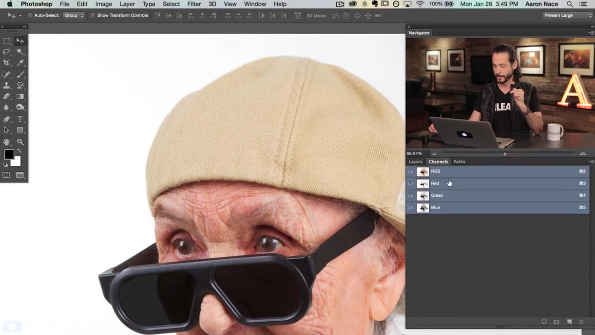 Channels panel open with Blue channel selected showing strong contrast
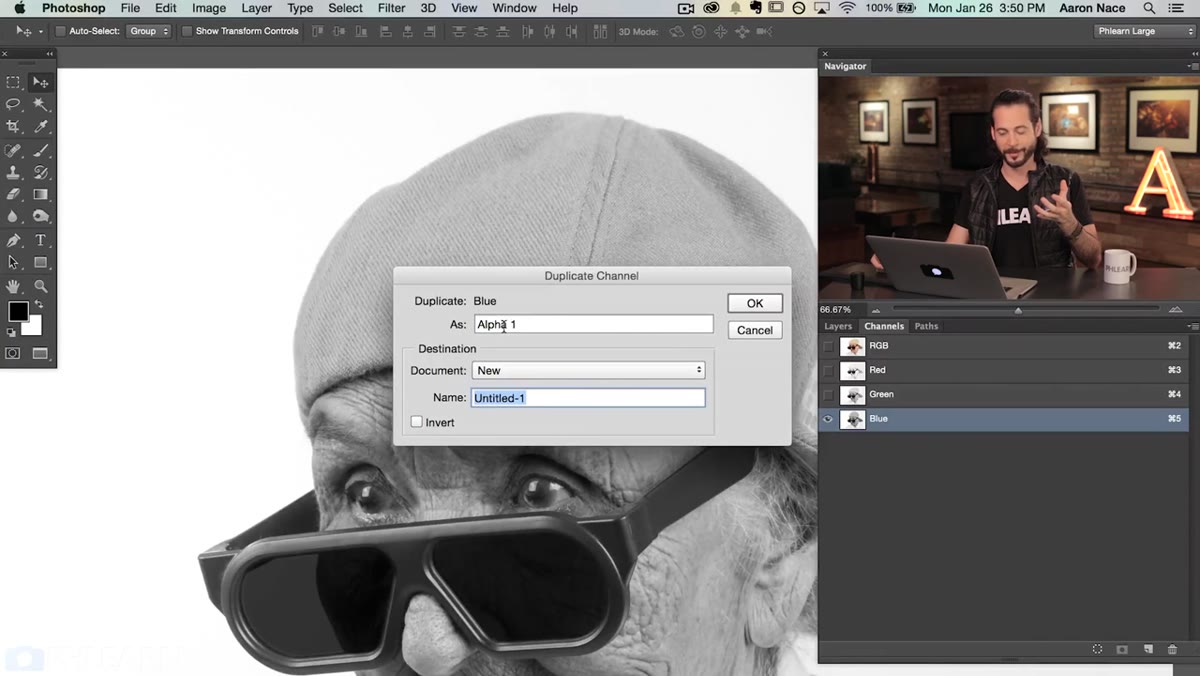
Here’s where most tutorials lose people, but it’s simpler than it sounds. Hide your logo layer for now by clicking the eye icon. Click over to the Channels panel (Window > Channels if you don’t see it). You’ll see Red, Green, and Blue channels listed. Click through each one and look at which version of the image shows the most contrast between the light and dark areas of the texture. In the tutorial, the Blue channel wins because the weave of the hat fabric is most visible there. Whatever your image is, pick the channel that makes the texture pop the most. That contrast is literally the data your displacement map will use.
Channels panel open with Blue channel selected showing strong contrast
Here’s where most tutorials lose people, but it’s simpler than it sounds. Hide your logo layer for now by clicking the eye icon. Click over to the Channels panel (Window > Channels if you don’t see it). You’ll see Red, Green, and Blue channels listed. Click through each one and look at which version of the image shows the most contrast between the light and dark areas of the texture. In the tutorial, the Blue channel wins because the weave of the hat fabric is most visible there. Whatever your image is, pick the channel that makes the texture pop the most. That contrast is literally the data your displacement map will use.
Step 4: Duplicate the Channel to a New Document
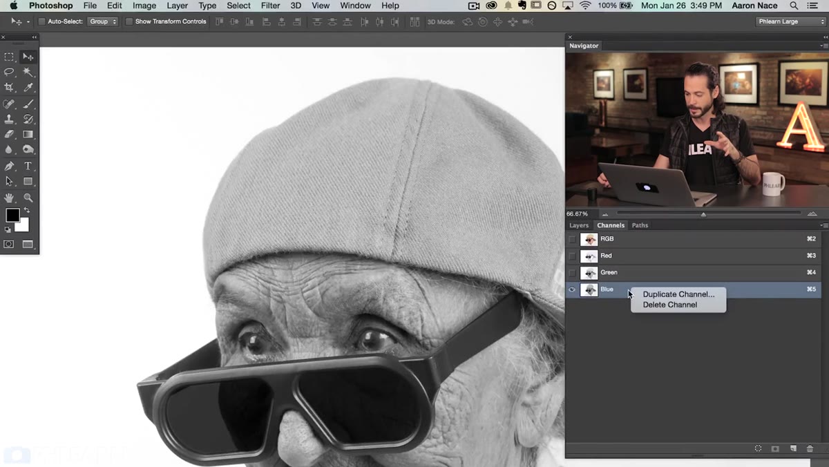 Duplicate Channel dialog with “New” document selected
Right-click on your chosen channel and select Duplicate Channel. In the dialog that appears, change the Document dropdown from the current file to New. Give the new document a clear name, something like “displacement-map” works fine. Hit OK. Photoshop will create a brand new grayscale document containing just that channel data.
Duplicate Channel dialog with “New” document selected
Right-click on your chosen channel and select Duplicate Channel. In the dialog that appears, change the Document dropdown from the current file to New. Give the new document a clear name, something like “displacement-map” works fine. Hit OK. Photoshop will create a brand new grayscale document containing just that channel data.
This new document IS your displacement map. Don’t close it yet, but do save it as a PSD file to your hard drive (File > Save As, format: Photoshop). Displacement maps in Photoshop must be saved as PSD files before you can apply them. If you skip this save step, the filter won’t have a file to reference and you’ll be confused and annoyed, which I say from personal experience.
Step 5: Optional - Blur the Displacement Map Slightly
 Gaussian Blur dialog applied to the grayscale displacement document
Before saving, consider applying a very subtle Gaussian Blur to the displacement map document (Filter > Blur > Gaussian Blur). A radius of 1-3 pixels is usually enough. This softens any harsh transitions in the grayscale data so that when the displacement is applied, it produces smooth warping rather than jagged pixel-level noise. For something like fabric or a hat, you want organic undulation, not digital jitter. Save the file after blurring.
Gaussian Blur dialog applied to the grayscale displacement document
Before saving, consider applying a very subtle Gaussian Blur to the displacement map document (Filter > Blur > Gaussian Blur). A radius of 1-3 pixels is usually enough. This softens any harsh transitions in the grayscale data so that when the displacement is applied, it produces smooth warping rather than jagged pixel-level noise. For something like fabric or a hat, you want organic undulation, not digital jitter. Save the file after blurring.
Step 6: Apply the Displacement Filter to Your Logo Layer
 Displace dialog box with horizontal and vertical scale values
Go back to your main document, make the logo layer visible again, and select it. Now go to Filter > Distort > Displace. The dialog will ask you for horizontal and vertical scale values. These control how dramatically the displacement pushes your pixels around. For something subtle like fabric, values between 5 and 15 usually work well. Higher numbers give you a more pronounced warp. Hit OK, and Photoshop will immediately ask you to locate a displacement map file. Navigate to the PSD you saved in the previous step and select it.
Displace dialog box with horizontal and vertical scale values
Go back to your main document, make the logo layer visible again, and select it. Now go to Filter > Distort > Displace. The dialog will ask you for horizontal and vertical scale values. These control how dramatically the displacement pushes your pixels around. For something subtle like fabric, values between 5 and 15 usually work well. Higher numbers give you a more pronounced warp. Hit OK, and Photoshop will immediately ask you to locate a displacement map file. Navigate to the PSD you saved in the previous step and select it.
Watch what happens to your logo. The pixels shift and ripple according to the light and dark values in that grayscale map, following every bump and thread in the fabric. That’s the whole trick.
Step 7: Blend the Logo Into the Texture
 Layers panel showing logo layer blend mode dropdown
The displacement handles the shape, but you still need the logo to feel embedded in the material rather than floating on top of it. Try changing the logo layer’s blend mode to Multiply or Overlay, depending on whether your logo is dark or light. Multiply works well for dark logos on light or mid-tone backgrounds. You can also drop the layer opacity slightly, somewhere in the 80-95% range, to let the fabric texture bleed through the logo just a little. That subtle texture visibility is what sells the whole thing.
Layers panel showing logo layer blend mode dropdown
The displacement handles the shape, but you still need the logo to feel embedded in the material rather than floating on top of it. Try changing the logo layer’s blend mode to Multiply or Overlay, depending on whether your logo is dark or light. Multiply works well for dark logos on light or mid-tone backgrounds. You can also drop the layer opacity slightly, somewhere in the 80-95% range, to let the fabric texture bleed through the logo just a little. That subtle texture visibility is what sells the whole thing.
What I’d Add From My Own Experience
The part of this technique that took me the longest to internalize is that the displacement map works relative to the resolution of your document. If you’re working on a high-res file and your displacement values feel weak, bump the scale numbers up. Conversely, if everything is going haywire and your logo looks like it’s underwater, pull those numbers way back. There’s no universal correct value. I usually duplicate the logo layer, apply the displacement to one copy, and compare it against the original until I find the right intensity. Non-destructive experimentation is always worth the extra thirty seconds.
Displacement maps are one of those techniques that seem technical right up until the moment they click. After that, you’ll start seeing opportunities to use them everywhere. Wrapping type around a mug, putting a graphic on a crumpled paper bag, aging a sign on a brick wall. The logic is always the same: find the contrast, extract it, displace against it, blend it in.
Watch the full tutorial on YouTube to see Aaron walk through the full process with the actual hat image. Watching him choose between channels in real time is genuinely useful for building the visual intuition this technique requires.
Comments (1)
Just used this on a wedding shoot edit. Client was thrilled.
Leave a Comment