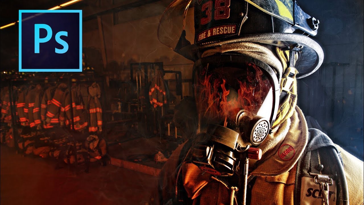
There’s a specific flavor of frustration that comes from shooting a solid portrait in flat, boring light and knowing the subject deserved better. The photo is technically fine. Exposure is good. Focus is sharp. And yet it looks like a LinkedIn headshot when it should look like a movie poster. I’ve been there more times than I care to admit, usually sitting in whatever coffee shop I’ve claimed as my office that week, staring at a Lightroom catalog full of “technically fine” images.
That’s exactly why this technique hit me so hard when I first came across it. In this Peter McKinnon tutorial, McKinnon walks through a color gradient method he’s been using since 2009 to push the existing colors in a photo into something that feels bigger, bolder, and more cinematic. No fancy lighting setup. No studio. Just Photoshop, a gradient, a blending mode, and a little restraint on the opacity slider. The technique works especially well on portraits where the subject has strong directional light already, because you’re not faking light from scratch, you’re amplifying what’s already there.
The whole thing takes about two minutes once you know what you’re doing. Here’s how to actually do it.
Step 1: Open Your Photo and Set Up Your Foreground Color
 Color picker palette open with red selected
Start with any portrait that has some existing directional light or color variation. Flat, even-lit photos will still work, but the results are more convincing when there’s already something to push. Once your photo is open in Photoshop, click on the foreground color swatch in your toolbar to open the color picker. For the first pass, pick a red, or whatever color you want to pull to one side of the image. McKinnon starts with red because it has strong contrast against the cooler tones on the opposite side of his frame. The color choice should relate to the mood you’re going for, not just what looks cool in isolation.
Color picker palette open with red selected
Start with any portrait that has some existing directional light or color variation. Flat, even-lit photos will still work, but the results are more convincing when there’s already something to push. Once your photo is open in Photoshop, click on the foreground color swatch in your toolbar to open the color picker. For the first pass, pick a red, or whatever color you want to pull to one side of the image. McKinnon starts with red because it has strong contrast against the cooler tones on the opposite side of his frame. The color choice should relate to the mood you’re going for, not just what looks cool in isolation.
Step 2: Create a New Layer
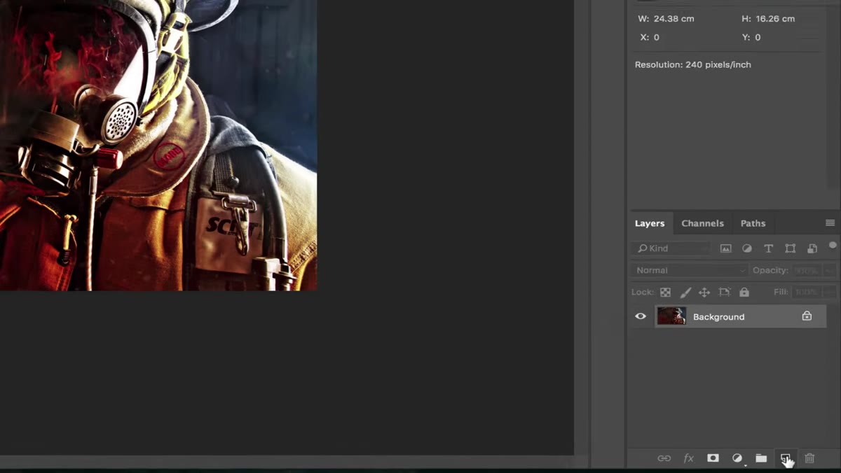 New layer being added in the Layers panel
Before you do anything with that color, create a new blank layer above your photo. This is non-destructive and gives you full control over the effect. If you flatten the gradient into your image directly, you lose the ability to adjust opacity, blending mode, or delete it entirely without undoing a chain of edits. Keep things on separate layers. Your future self will thank you. This is the kind of thing I had to learn by bricking a client’s file. Do it the right way the first time.
New layer being added in the Layers panel
Before you do anything with that color, create a new blank layer above your photo. This is non-destructive and gives you full control over the effect. If you flatten the gradient into your image directly, you lose the ability to adjust opacity, blending mode, or delete it entirely without undoing a chain of edits. Keep things on separate layers. Your future self will thank you. This is the kind of thing I had to learn by bricking a client’s file. Do it the right way the first time.
Step 3: Select the Foreground-to-Transparent Gradient
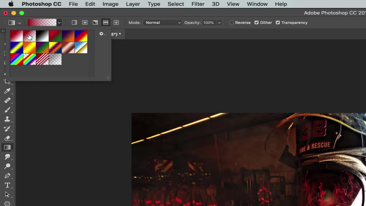 Gradient tool options bar showing foreground-to-transparent preset
Hit G on your keyboard to grab the Gradient tool. Up in the options bar at the top, you’ll see a row of gradient presets. You want the one that goes from your foreground color to transparent. This is critical. If you use a solid gradient, you’ll get a hard color block across your image. The transparent version lets the gradient fade naturally, which is what makes the effect look like light rather than a paint bucket.
Gradient tool options bar showing foreground-to-transparent preset
Hit G on your keyboard to grab the Gradient tool. Up in the options bar at the top, you’ll see a row of gradient presets. You want the one that goes from your foreground color to transparent. This is critical. If you use a solid gradient, you’ll get a hard color block across your image. The transparent version lets the gradient fade naturally, which is what makes the effect look like light rather than a paint bucket.
Step 4: Draw the Gradient Across Your New Layer
 Gradient being dragged horizontally across the canvas
On your new blank layer, hold Shift and drag across the canvas in a straight horizontal line. Holding Shift locks the angle so you don’t accidentally drag at a slight tilt. You’ll drag from the edge of the image toward the center, so the color fades in from one side. The gradient will look alarming at this stage. A big, opaque red wash over a portrait is not a good look. That’s fine. The next step fixes it.
Gradient being dragged horizontally across the canvas
On your new blank layer, hold Shift and drag across the canvas in a straight horizontal line. Holding Shift locks the angle so you don’t accidentally drag at a slight tilt. You’ll drag from the edge of the image toward the center, so the color fades in from one side. The gradient will look alarming at this stage. A big, opaque red wash over a portrait is not a good look. That’s fine. The next step fixes it.
Step 5: Change the Blending Mode to Color
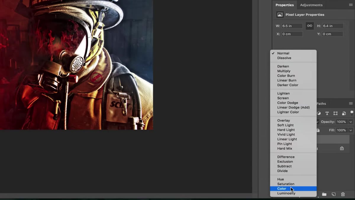 Blending mode dropdown showing Color selected in Layers panel
With your gradient layer selected, open the blending mode dropdown in the Layers panel and scroll down to Color. This is the key move. The Color blending mode applies the hue and saturation of your gradient layer to the luminosity of the layer below, which means it tints the image without blowing out highlights or crushing shadows. It works with the photo instead of sitting on top of it. The result still looks heavy at this point, which is where the next step comes in.
Blending mode dropdown showing Color selected in Layers panel
With your gradient layer selected, open the blending mode dropdown in the Layers panel and scroll down to Color. This is the key move. The Color blending mode applies the hue and saturation of your gradient layer to the luminosity of the layer below, which means it tints the image without blowing out highlights or crushing shadows. It works with the photo instead of sitting on top of it. The result still looks heavy at this point, which is where the next step comes in.
Step 6: Dial In Opacity and Fill
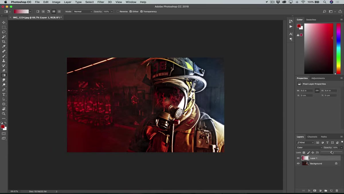 Opacity and Fill sliders being adjusted in the Layers panel
Reduce both the Opacity and the Fill on the gradient layer until the effect feels like it belongs in the photo, not painted onto it. McKinnon doesn’t specify exact values because every image is different, but he mentions he’s working on a photo that already has the effect applied, so it reads heavier than his usual approach. A good starting point is somewhere between 40 and 70 percent on both sliders. Opacity affects the entire layer including any layer styles. Fill affects the layer content only. In practice for a simple gradient layer, they’ll behave similarly. Use your eyes, not a formula.
Opacity and Fill sliders being adjusted in the Layers panel
Reduce both the Opacity and the Fill on the gradient layer until the effect feels like it belongs in the photo, not painted onto it. McKinnon doesn’t specify exact values because every image is different, but he mentions he’s working on a photo that already has the effect applied, so it reads heavier than his usual approach. A good starting point is somewhere between 40 and 70 percent on both sliders. Opacity affects the entire layer including any layer styles. Fill affects the layer content only. In practice for a simple gradient layer, they’ll behave similarly. Use your eyes, not a formula.
Step 7: Repeat the Process with a Second Color on the Opposite Side
 Second gradient layer with blue being applied from the opposite side
Create another new layer, switch your foreground color to something that complements the first, and repeat the gradient drag from the opposite edge of the frame. McKinnon pairs red with blue on one portrait and green with blue on another. The contrast between warm and cool tones is what creates that cinematic, larger-than-life feel. Set this second gradient layer to Color blending mode as well, adjust the opacity until it’s balanced with the first, and then compare the before and after. The difference is usually significant.
Second gradient layer with blue being applied from the opposite side
Create another new layer, switch your foreground color to something that complements the first, and repeat the gradient drag from the opposite edge of the frame. McKinnon pairs red with blue on one portrait and green with blue on another. The contrast between warm and cool tones is what creates that cinematic, larger-than-life feel. Set this second gradient layer to Color blending mode as well, adjust the opacity until it’s balanced with the first, and then compare the before and after. The difference is usually significant.
One Thing I’d Add: Try It on the Shadows Only
McKinnon applies these gradient layers across the full image, which works great for a bold, graphic look. But if you want something a little more grounded, try restricting the effect to the shadow areas using a luminosity mask. You can create a rough version quickly by Cmd-clicking (Ctrl on Windows) the composite channel in the Channels panel to load a highlights selection, then inverting it. Fill that selection as a mask on your gradient layer and suddenly the color tinting only affects the darker areas of the frame, which is where colorists push color in film and TV work. It’s a more subtle take on the same idea and it reads as more photographic than graphic.
The biggest takeaway here is that blending modes are doing the heavy lifting, not the gradient itself. The gradient is just a delivery system. Swapping a layer to Color mode is one of those moves that feels like a cheat code the first time you use it. Once you understand that Color mode targets hue and saturation without touching luminosity, a whole range of creative applications opens up beyond this specific technique.
Watch the full tutorial on YouTube to see McKinnon walk through the before and after comparisons on three different portraits. Seeing his example images is worth the two minutes.
Comments
Leave a Comment