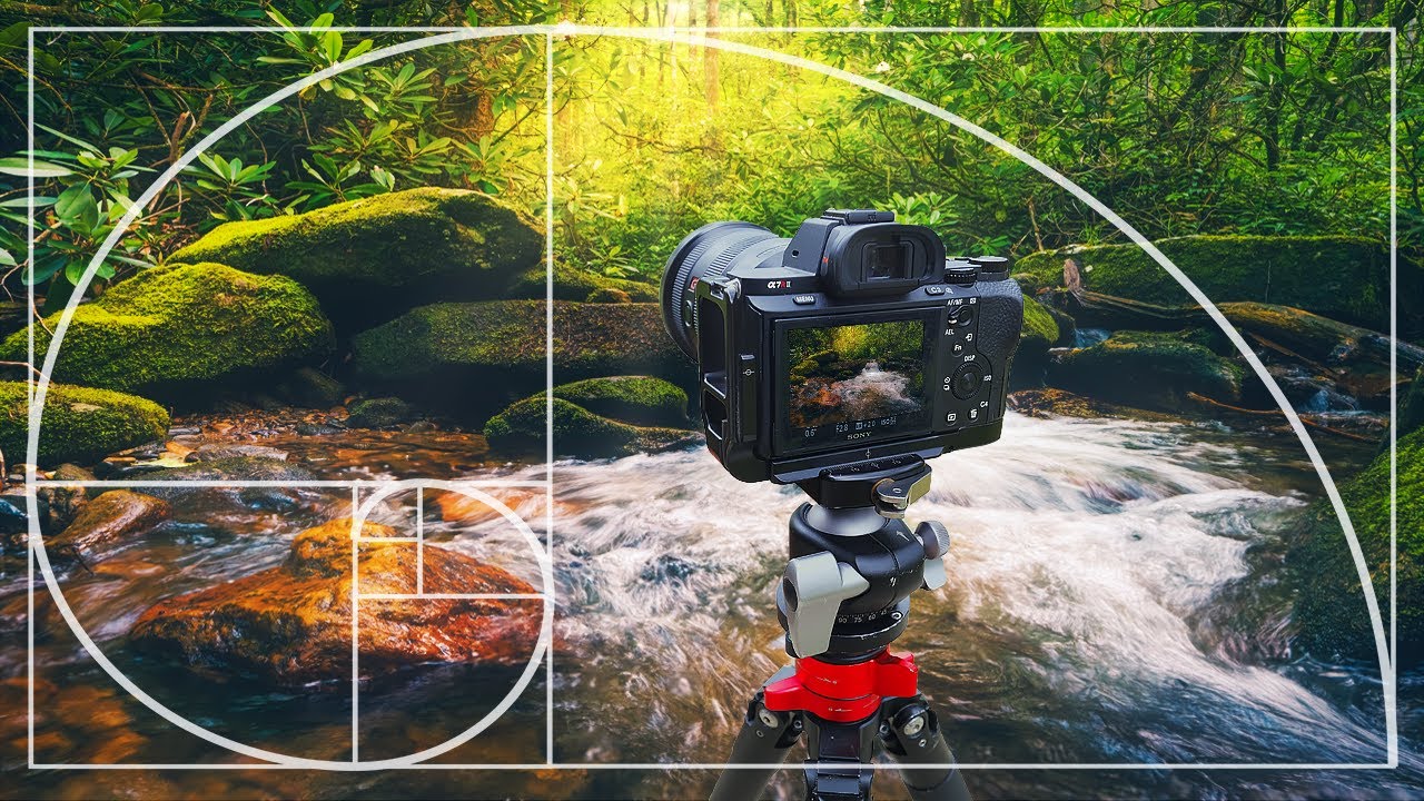
I used to think knowing the rule of thirds made me a smart visual thinker. I slapped that grid overlay on everything, nodded approvingly when my subject landed near an intersection point, and called it a day. Then I started doing it with photos that were clearly mediocre, and the grid still lined up. That’s when I realized the rule of thirds might be less of a guiding principle and more of a post-hoc justification machine.
This Mark Denney tutorial on composition for landscape photography put words to something I’d been vaguely suspicious of for a while. Watch the full tutorial on YouTube — it’s genuinely worth your time even if you don’t shoot landscapes. The underlying logic applies to anyone building a frame, whether that’s a photo, a composite, or a design layout. The short version: the rule of thirds is so broad that it confirms almost any composition, which makes it nearly useless as a decision-making tool.
What Denney proposes instead is a more intentional framework, and walking through his reasoning step by step reframed how I think about where I place things in a frame. Here’s the breakdown.
Step 1: Understand Why the Rule of Thirds Keeps “Working” (And Why That’s the Problem)
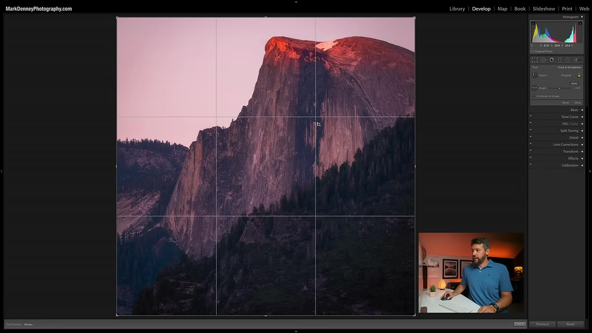 Rule of thirds grid overlaid on three landscape photos
The first thing Denney does is overlay a rule of thirds grid on several of his landscape photos. Mountains, trees, coastlines, all of it. And every single image technically satisfies the rule. The main subject lands near an intersection point, the horizon sits along a grid line, and you could convincingly argue each shot was deliberately composed using the rule.
But here’s the catch he points out: landscape subjects are big. Mountains fill frames. Trees dominate a third of the image on their own. When your subjects are that large, the four intersection points of a rule of thirds grid will almost always be near something visually interesting. The rule isn’t guiding your composition at that point. It’s just confirming that large objects exist in your photo. That’s not a tool, that’s a coincidence detector.
Step 2: Recognize the Legitimate Building Blocks That Do Hold Up
 Diagram showing guiding lines drawing the eye into a landscape scene
Before he dismantles the rule of thirds entirely, Denney gives credit where it’s due. Two composition strategies he fully endorses: guiding lines and layering. Guiding lines, things like a river, a trail, a fence line, draw the viewer’s eye into the depth of the frame. Layering means structuring your shot with a distinct foreground, middle ground, and background so the image has actual three-dimensional weight to it.
These two techniques remain useful because they require active decision-making in the field. You have to physically find a line and position yourself relative to it. You have to crouch down or move back to create foreground separation. The rule of thirds doesn’t require you to do anything except check a grid after the fact.
Step 3: Challenge Your Own Archive First
 Photographer overlaying rule of thirds grid on personal photo library
Denney throws down a challenge here that I’d recommend actually doing before you watch another composition video: pull up ten of your own photos, overlay a rule of thirds grid, and try to find one where the rule clearly does not apply. It’s harder than it sounds.
The exercise isn’t about proving the rule is useless. It’s about exposing how little friction the rule actually creates. If a compositional guideline fits every photo you’ve ever taken, including the bad ones, it isn’t filtering out weak compositions. It’s just decorative validation. Doing this test with your own work makes the limitation concrete in a way that just hearing about it doesn’t.
Step 4: Shift From Grid-Matching to Intentional Tension
 Comparison of grid-based framing versus subject-driven compositional decisions
The alternative Denney builds toward isn’t another rigid grid system. It’s a mindset shift toward asking what creates genuine visual tension in a specific image, rather than whether the subject lands on a predetermined point. Visual tension comes from relationships between elements: the negative space around a subject, the implied movement of a leading line, the contrast between a lit area and a dark surround.
The rule of thirds gives you four points and says “put something here.” The better approach asks “where does the eye want to go, and what do I want it to find when it gets there?” That’s a harder question, but it’s the right one. It forces you to look at the actual content of the frame rather than its geometric scaffolding.
Step 5: Use the Grid as a Starting Point, Not a Destination
 Grid overlay shown as one option among several composition tools
Denney’s position isn’t that you should throw the grid away. His position is that it shouldn’t be your endpoint. If you’re newer to composition, the rule of thirds is a useful scaffold because it immediately breaks the habit of centering everything. That’s real value.
But once you’ve internalized that subjects don’t have to be centered, the grid has done its job. Continuing to treat intersection points as compositional targets past that point is like still using training wheels on a road bike. You’ve outgrown the tool, even if the tool itself isn’t broken. The question to start asking is not “does this satisfy the rule of thirds?” but “is this the strongest version of this composition?”
What I’d Add: This Applies in Photoshop Work Too
I don’t shoot landscapes. My day-to-day is usually composites, mockups, and the occasional piece of promotional material for clients who describe their brand as “clean but edgy.” But this same problem shows up constantly in design work.
I spent three days once on a product composite, moving elements around until they hit the intersection points of a thirds grid. The result looked fine. Then a friend looked over my shoulder, ignored the grid entirely, and suggested I think about where the eye enters the image and what path it takes through it. Twenty minutes of rearrangement later, the comp was dramatically better, and the main subject wasn’t anywhere near a traditional intersection point.
If you work in Photoshop, try this: next time you’re arranging elements in a composite, turn off your grid overlay and instead draw an imaginary path with your eye through the image. Where does it start? Where does it want to go? What stops it or redirects it? That question does more compositional work than any grid.
The single biggest thing to take away from Denney’s tutorial is this: a guideline that fits every image teaches you nothing about why a specific image works. The rule of thirds is too flexible to be a real filter. The stronger habit is learning to see tension, flow, and visual weight directly in the frame, without needing a grid to tell you whether you got it right.
Watch the full tutorial on YouTube — Denney walks through real examples from his own landscape portfolio and the visual comparisons alone are worth fifteen minutes of your day.
Comments
Leave a Comment