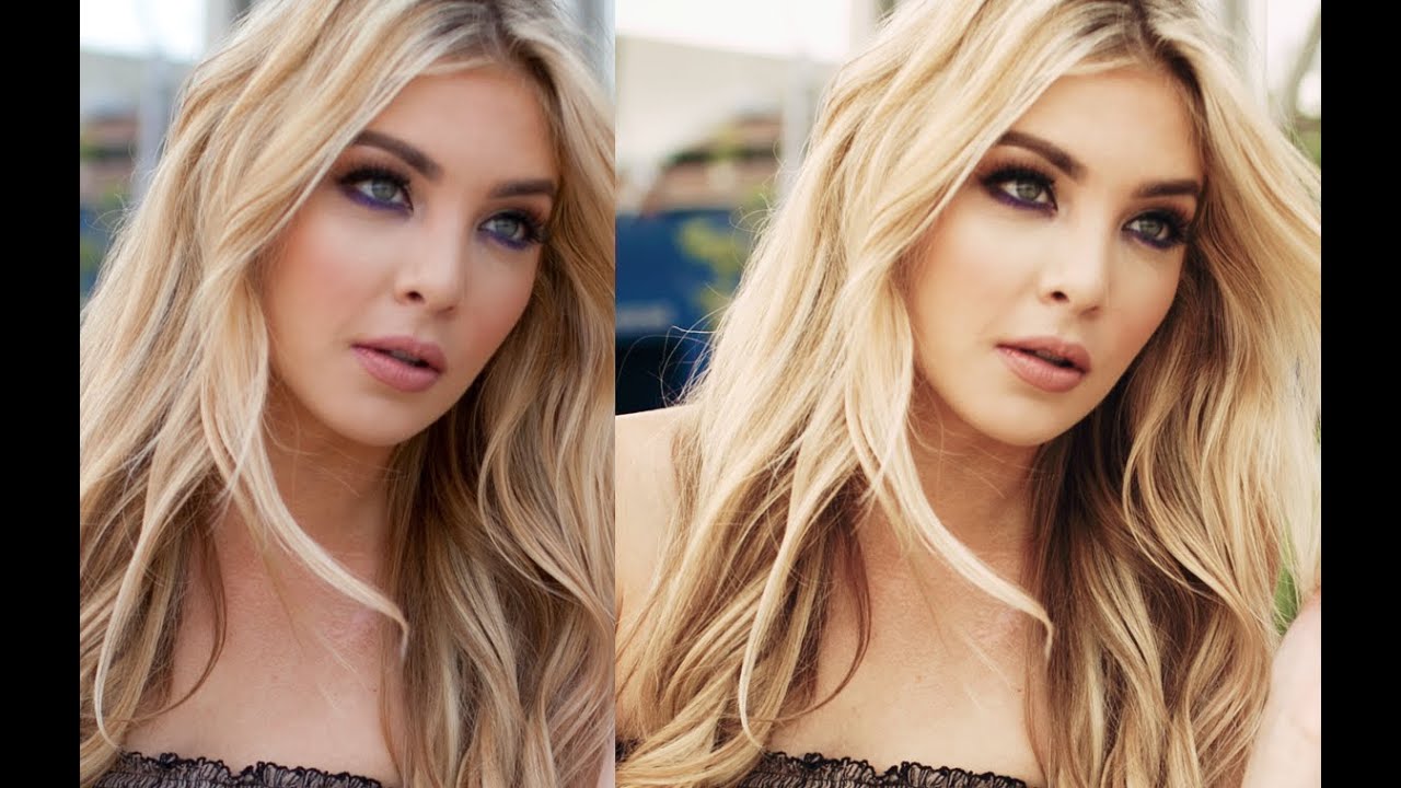
There’s a specific kind of photo edit I used to fake badly for years. You know the one: soft, slightly warm, desaturated without looking washed out, like the photo was shot on film by someone who actually knew what they were doing. I’d throw a gradient map on it, mess with hue/saturation, call it a day, and wonder why it looked muddy. Turns out the answer was always curves. It’s basically always curves.
In this Jessica Kobeissi tutorial, she walks through a soft vintage tint effect that’s deceptively simple. No third-party plugins, no LUTs downloaded from some sketchy website. Just a solid color fill layer, two curves adjustments, and a real understanding of how color channels behave when you push them gently in the right direction. I say “gently” because the whole point of this technique is restraint. Every move she makes is subtle. The cumulative result is not.
This is the kind of edit that works for portraits, lifestyle shots, that one moody coffee photo you’ve been sitting on. If you do any kind of client work where “vintage” or “film-inspired” shows up in the brief, you’re going to want this in your toolkit. Let me walk you through exactly how she does it.
Step 1: Create a Solid Color Fill Layer and Set It to “Color” Blend Mode
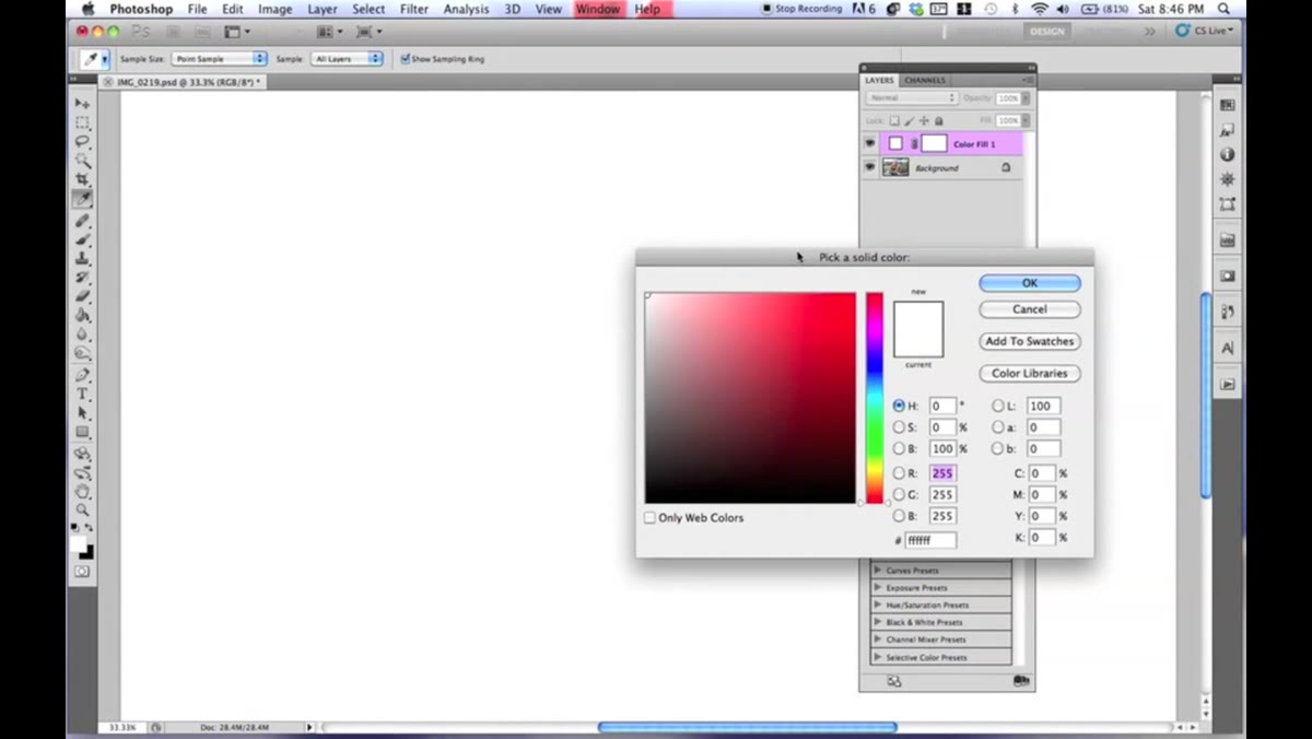 Color picker open with warm brown-orange selected
Start by adding a new Solid Color fill layer. Go to Layer, New Fill Layer, Solid Color. When the color picker opens, you’re looking for a warm brown with some orange in it. Nothing too saturated, nothing too red. Think of it like a dark caramel color. The exact hex value isn’t the point here - eyeball it toward that orange-brown territory.
Once you confirm the color, change the blend mode of that layer from Normal to Color. This is the key move. The Color blend mode applies the hue and saturation of your fill color to the layer below while preserving the luminosity of the original image. Then bring the opacity down to around 20%. At full strength it looks like a disaster. At 20% it just quietly warms the whole image and pulls back some of that vivid saturation. Even in skin tones you’ll notice it starts to even things out in a way that feels analog rather than digital.
Step 2: Add a Curves Adjustment Layer and Shape the RGB Channel
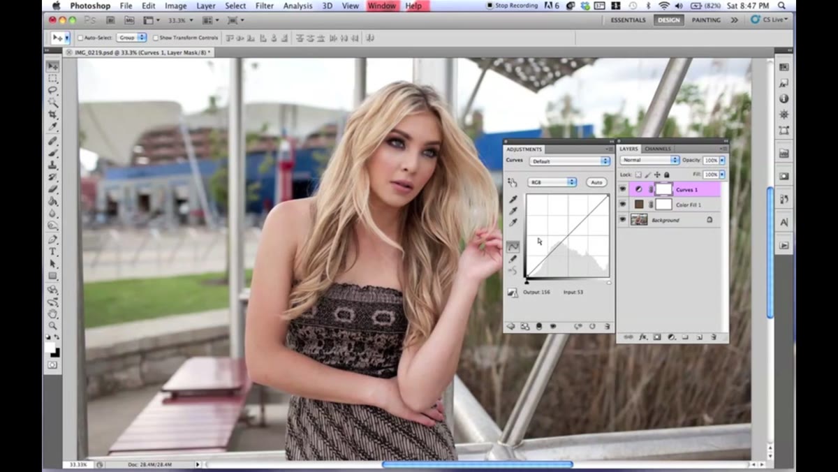 Curves panel open on RGB channel with S-curve applied
Add a Curves adjustment layer via Layer, New Adjustment Layer, Curves. Start with the RGB channel - this controls overall luminosity before you touch any color. Jessica creates something close to a wide, loose S-curve. Nothing dramatic, but enough to add a little contrast in the midtones.
The important part here is what she does to the endpoints. Pull the black point (bottom-left anchor) upward. This lifts the shadows so true black becomes more of a dark gray, which is a core part of that faded film look. Then pull the white point (top-right anchor) slightly downward to bring the highlights back from blowing out. That compression at both ends of the tonal range is what makes the image feel soft rather than punchy.
Step 3: Work the Red Channel to Warm the Image
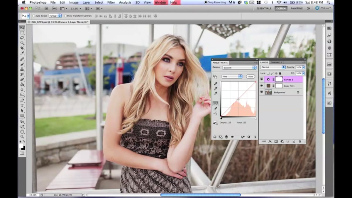 Curves panel showing Red channel with top anchor lifted
Still inside that same curves adjustment layer, switch from RGB to the Red channel. Add a point in the middle of the curve to anchor it, then pull the top anchor point upward just slightly. You’re introducing warmth into the highlights without torching the whole image.
It’s a small move - maybe 10 to 15 points of lift on that top anchor. Toggle the adjustment layer visibility on and off to check your before and after. The reds should feel warmer, not orange. If it looks like a sunset threw up on your photo, dial it back.
Step 4: Adjust the Green Channel for a Subtle Push
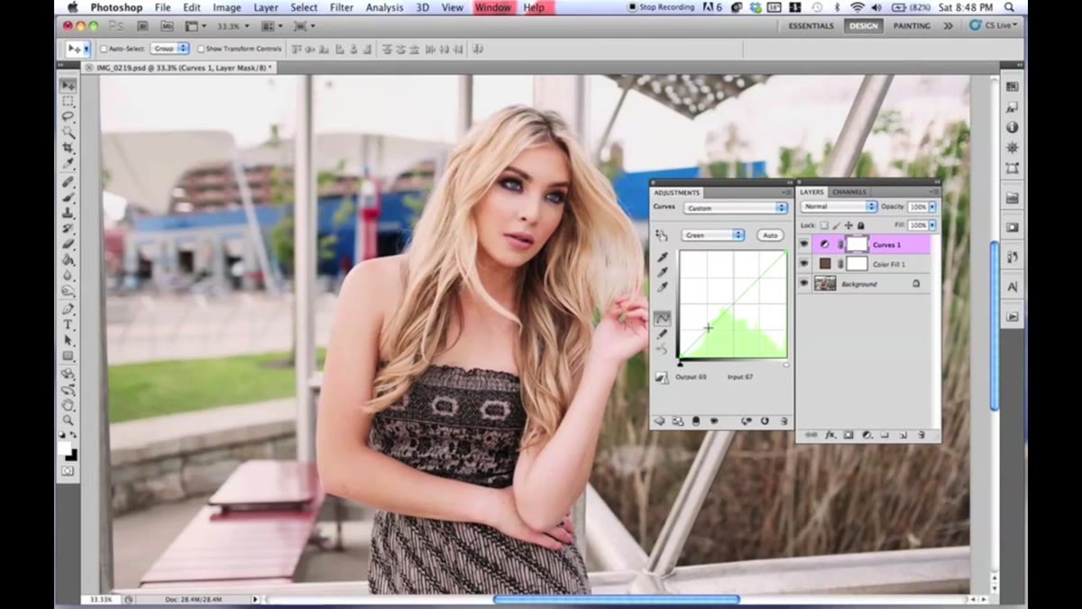 Curves panel on Green channel with slight upward adjustment
Switch to the Green channel in the same curves layer. This one is subtle - just a slight lift in the midtones. Click to place a point roughly in the middle of the curve and nudge it upward a touch. Green and red working together in this direction starts to push the overall palette toward that warm, slightly yellow-toned vintage feel without making it look cross-processed.
The temptation here is to do too much. Resist it. If you’re squinting at your screen trying to see the difference, you’re probably in the right territory.
Step 5: Shape the Blue Channel to Add Yellow and Manage Shadows
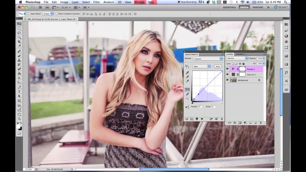 Blue channel curve with bottom lifted and middle adjusted
The Blue channel is where things get interesting. Lifting the shadows in the blue channel (pulling that bottom-left anchor up) introduces yellow into your shadows, since yellow is the opposite of blue on the color wheel. Jessica also places a couple of points through the midtones to create a gentle curve that keeps the blues from going completely flat while still letting that warmth through.
Pull the bottom anchor upward, then work through the midtones to manage how that yellow distributes. You want it to feel warm in the shadows, not green. If your image starts looking like it’s lit by a jaundiced fluorescent bulb, the green channel is probably fighting the blue channel - go back and reduce your green adjustment.
Step 6: Add a Second Curves Layer for Final Color Refinement
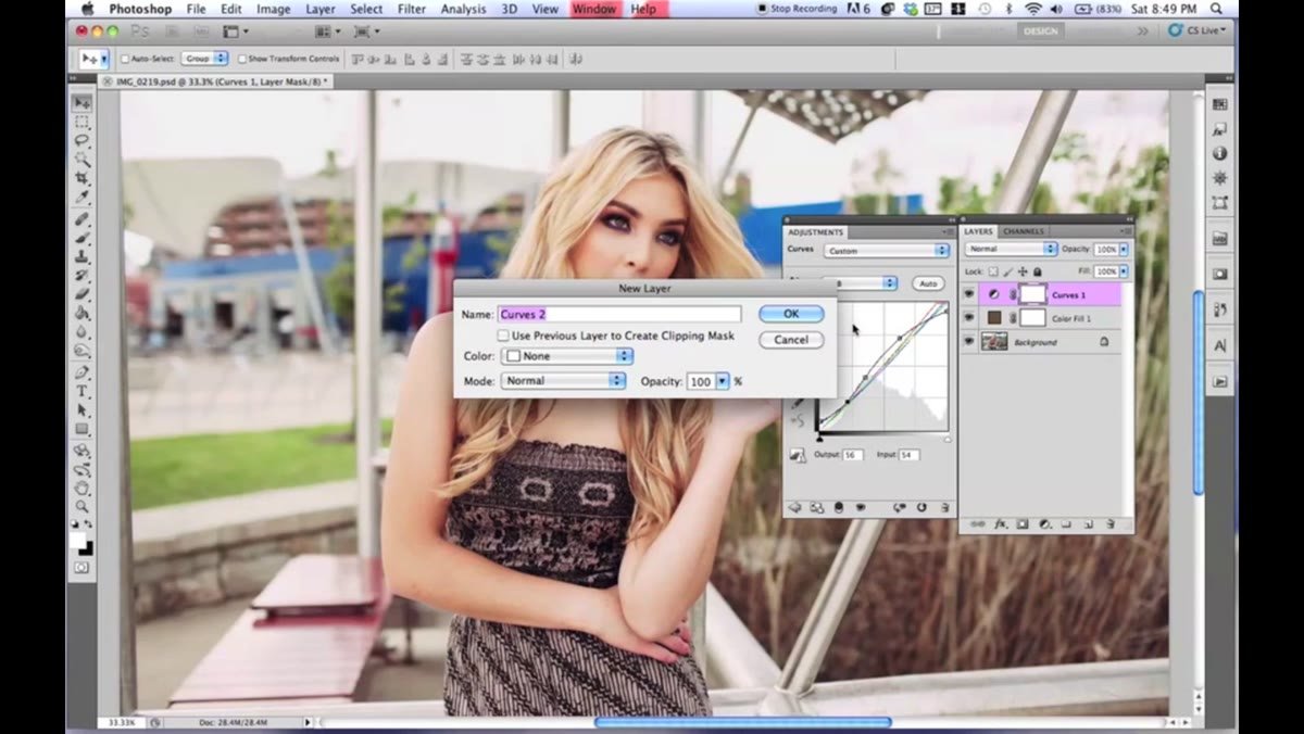 Second Curves adjustment layer added, Blue channel shown
Jessica adds a second curves adjustment layer on top of everything to do a final pass of color refinement. This time she works through Blue, Green, and Red again - but even more conservatively. We’re talking micro-adjustments, mostly adding a point to a channel and moving it barely at all just to nudge the color balance in the final image.
Think of this layer as mixing paint to get the last 5% right. The first curves layer does the heavy lifting. This one just brings everything together. If your image feels almost there but slightly off, this is where you correct it.
What I’d Add: Group Your Layers and Use a Mask
One thing I do whenever I build an effect like this is immediately group all the adjustment layers into a folder and add a black mask to the group. That way if a client wants to show a before/after, or if the effect is too heavy on the subject’s face, I can paint back in with a white brush at reduced opacity on the mask and dial back the effect selectively. Skin tones in particular can go weird under heavy color grading, and masking gives you an escape hatch without flattening everything and starting over.
I learned this lesson the messy way on a freelance portrait shoot where the edit looked great on the background and terrible on the model’s face. Now every color grade I build lives inside a grouped folder with a mask. Takes 10 extra seconds and has saved me hours.
The real lesson from this tutorial isn’t any single setting - it’s the idea that color grading is a conversation between channels, not a single slider you drag until it looks cool. Push red up, compensate with blue, let green hold the middle ground. Done subtly, curves can make a photo feel like it was shot on film before you were born. Done heavy-handedly, it looks like a 2010 Instagram filter. The difference is in how lightly you touch each channel.
Watch the full tutorial on YouTube to see Jessica’s hand on the curves in real time - there’s something about seeing the adjustments move that makes the channel relationships click in a way a screenshot never quite captures.
Comments (3)
I've been looking for exactly this kind of tutorial. Perfect timing.
Wow, I had no idea you could do this. Mind blown.
Love this. I referenced a similar technique in one of my recent posts. Always good to see other perspectives.
Leave a Comment