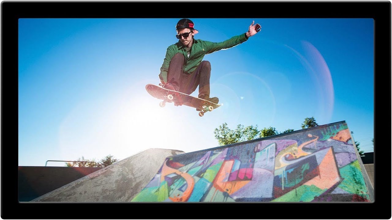
There’s a specific kind of client request that used to make me sweat: “Can you put some text/logo/graphic on that surface?” Not floating beside it. Not stamped on flat. Actually on it, following the curves, matching the lighting, looking like it was always there. Early in my freelance life I’d just nudge the layer around until it looked “close enough” and hope nobody zoomed in. Spoiler: clients zoom in.
This technique is the proper answer to that problem. In this Aaron Nace (PHLEARN) tutorial, Watch the full tutorial on YouTube, Aaron takes a photo of real graffiti he shot on his phone in Chicago and composites it convincingly onto a skate ramp photo. The genius is in how he uses the Transform tool not just to resize and rotate, but to warp and blend the image so it actually lives on the surface. The same workflow applies to pretty much any texture-on-surface composite you need to pull off.
What makes this tutorial worth your time is that Aaron doesn’t just show you what to do, he shows you why each decision matters – opacity, blend modes, perspective warping, and matching the tonal qualities of the destination surface. It’s the difference between a layer that sits on top of a photo and one that feels baked into it.
Step 1: Move Your Graphic Into the Base Image
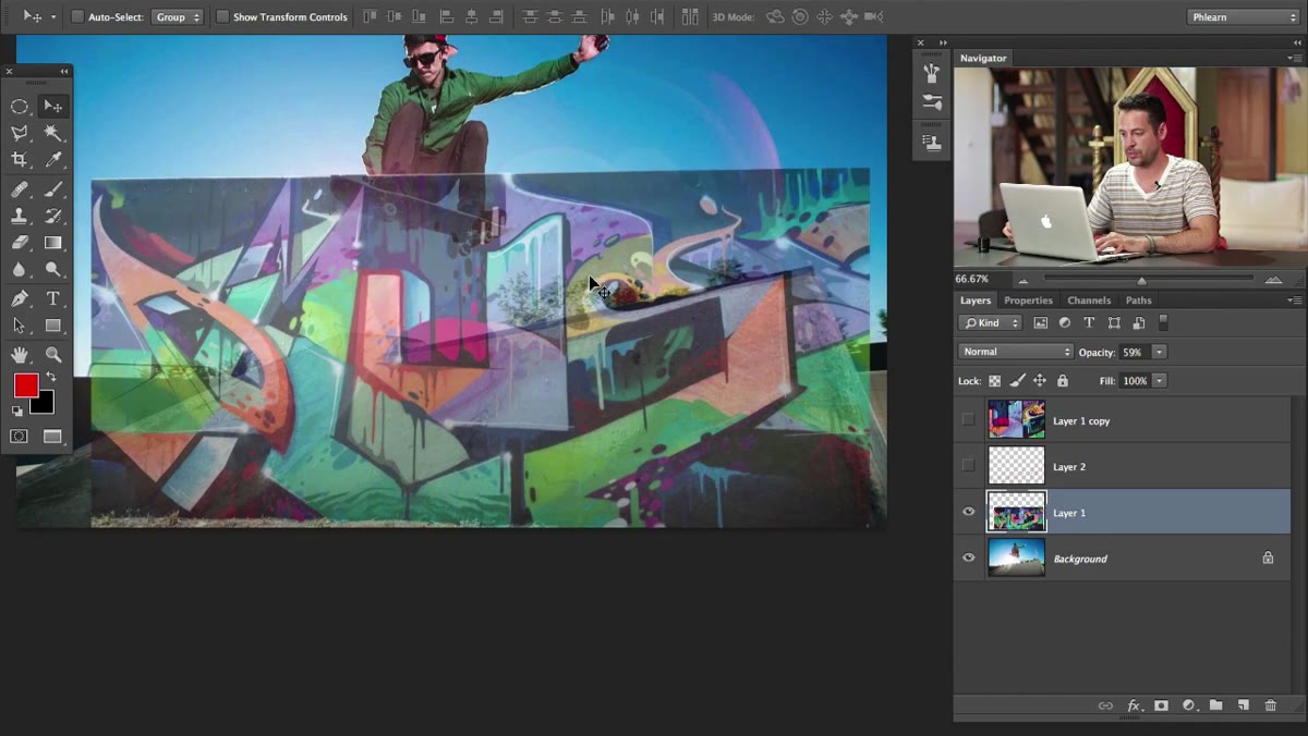
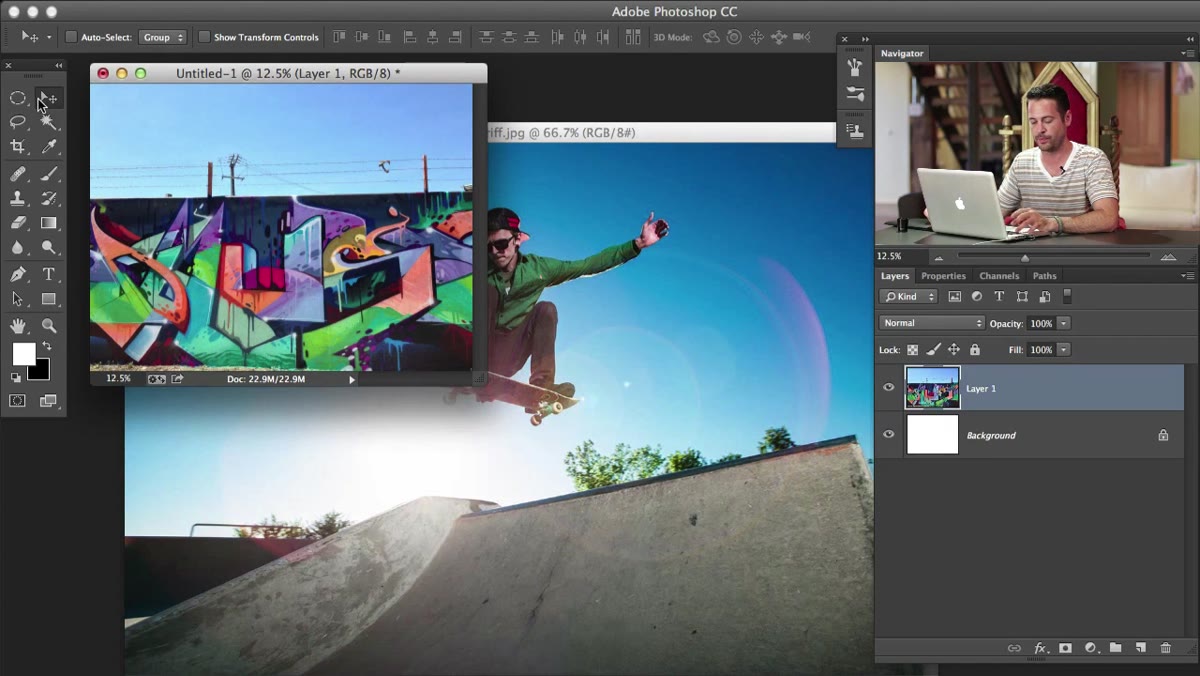 Dragging graffiti photo onto skateboarder image with Move tool
Open both images in Photoshop – your base photo and the graphic or texture you want to place on a surface. Grab the Move tool (V), hold Shift, and drag from one document over to the other. Holding Shift drops the incoming layer centered on the canvas, which saves you some shuffling around later.
Dragging graffiti photo onto skateboarder image with Move tool
Open both images in Photoshop – your base photo and the graphic or texture you want to place on a surface. Grab the Move tool (V), hold Shift, and drag from one document over to the other. Holding Shift drops the incoming layer centered on the canvas, which saves you some shuffling around later.
Once it’s in, immediately hit Command+J (Ctrl+J on PC) to duplicate that layer. This is a habit worth building. When you’re about to do heavy transforming, having that untouched original sitting underneath means you can always go back without mashing Undo twenty times. Think of it as your safety net before the tightrope walk.
Step 2: Lower Opacity to See What You’re Working With
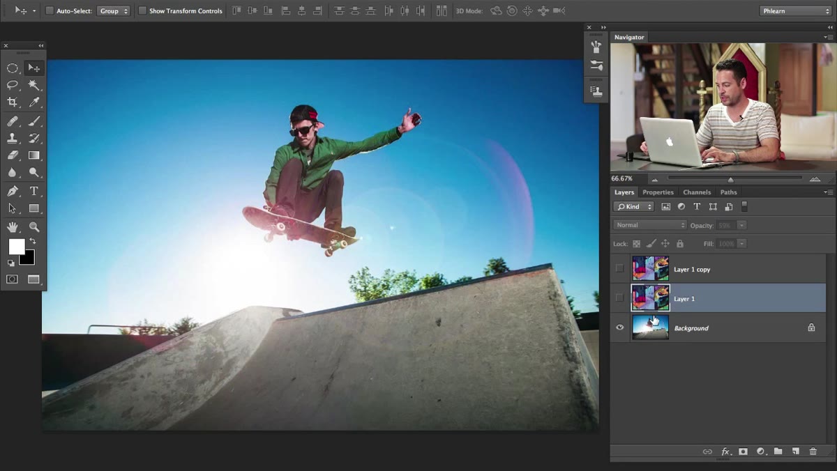 Graffiti layer opacity lowered, showing both layers simultaneously
Drop the opacity of your graffiti layer down to somewhere around 50-60%. This isn’t the final look – it’s a working view so you can see both the surface you’re placing the graphic on and the graphic itself at the same time. Trying to position and transform a fully opaque layer on top of your base image is basically working blind.
Graffiti layer opacity lowered, showing both layers simultaneously
Drop the opacity of your graffiti layer down to somewhere around 50-60%. This isn’t the final look – it’s a working view so you can see both the surface you’re placing the graphic on and the graphic itself at the same time. Trying to position and transform a fully opaque layer on top of your base image is basically working blind.
This step sounds obvious but I’ve watched people skip it and then wonder why their composite looks off. You need to see the relationship between the two images as you work. The transparency gives you that X-ray view of the scene.
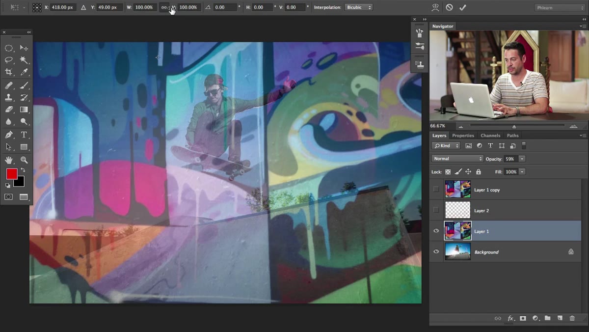
Step 3: Enter Free Transform and Scale the Layer
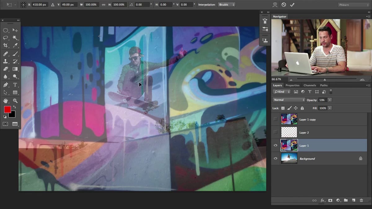 Free Transform bounding box active with toolbar options visible at top
Hit Command+T (Ctrl+T on PC) to enter Free Transform. Up in the toolbar at the top of the screen, you’ll see a chain-link icon between the Width and Height percentage fields – click that to lock the aspect ratio. Now you can click and drag directly on either the W or H value to scale the layer proportionally without holding Shift.
Free Transform bounding box active with toolbar options visible at top
Hit Command+T (Ctrl+T on PC) to enter Free Transform. Up in the toolbar at the top of the screen, you’ll see a chain-link icon between the Width and Height percentage fields – click that to lock the aspect ratio. Now you can click and drag directly on either the W or H value to scale the layer proportionally without holding Shift.
Don’t stress too much about getting it pixel-perfect at this stage. The goal is rough positioning – getting the graffiti into the right general area of the frame so you can see how the shapes and colors are going to interact. Aaron’s approach here is refreshingly loose: get it in the ballpark, then refine. That mindset alone will speed up your composite workflow significantly.
Step 4: Use Warp to Follow the Surface Curve
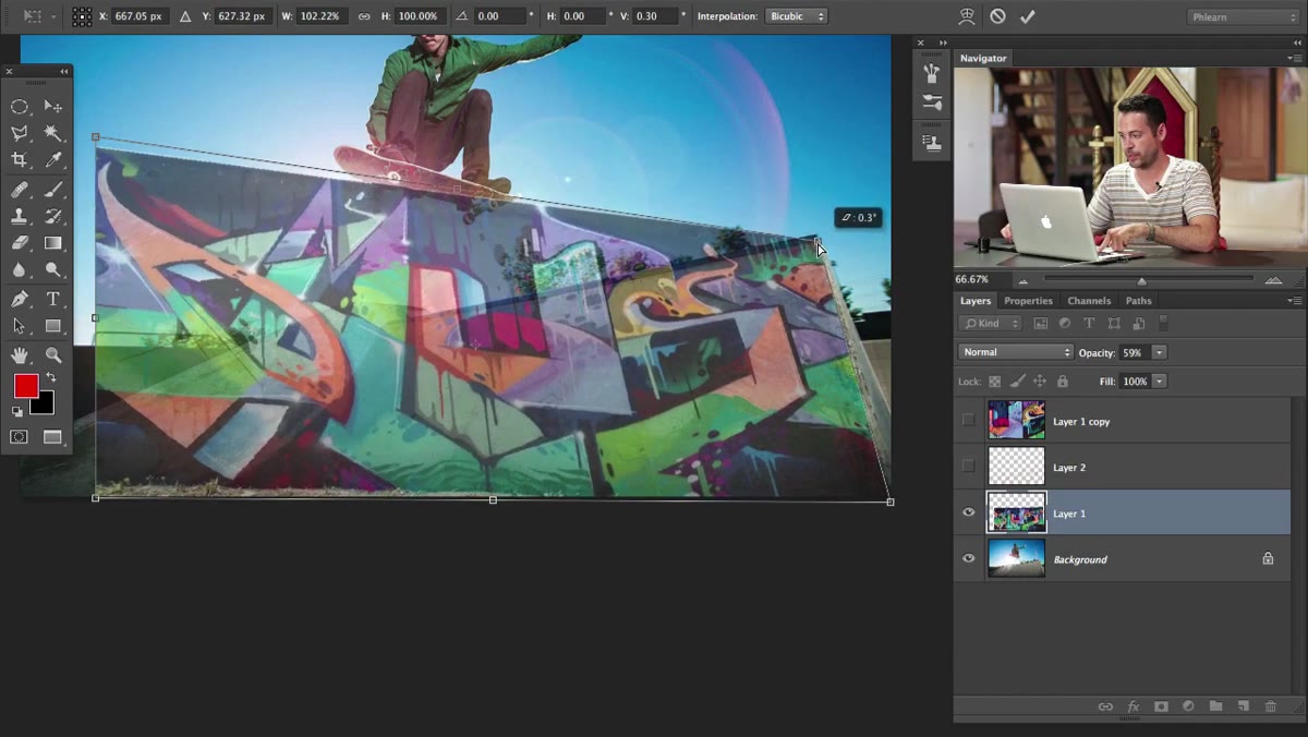
 Warp grid applied to graffiti layer over curved skate ramp surface
Still inside Free Transform, right-click on the bounding box and choose Warp from the context menu. This switches your transform handles from simple corner points to a full grid you can push and pull like a piece of mesh. This is where the magic happens for curved surfaces.
Warp grid applied to graffiti layer over curved skate ramp surface
Still inside Free Transform, right-click on the bounding box and choose Warp from the context menu. This switches your transform handles from simple corner points to a full grid you can push and pull like a piece of mesh. This is where the magic happens for curved surfaces.
For a skate ramp, you want the bottom edge of the graffiti to curve upward the way the ramp does. Grab the grid handles and drag them to match the perspective and curve of the surface underneath. The goal isn’t mathematical precision – it’s visual convincing. Take your time here, zoom in, and use the reduced opacity to constantly check alignment against the actual surface contours beneath.
Step 5: Match Blend Mode to the Surface Texture
 Blend mode dropdown showing Multiply selected in Layers panel
Once your warp looks right, hit Enter to commit the transform. Now bring the opacity back up and look at what you’ve got. A graffiti image on a white background sitting at Normal blend mode is going to look like a sticker, not graffiti. Change the blend mode to Multiply – this makes the lighter parts of your layer transparent and lets the surface texture and shadows from the base image show through.
Blend mode dropdown showing Multiply selected in Layers panel
Once your warp looks right, hit Enter to commit the transform. Now bring the opacity back up and look at what you’ve got. A graffiti image on a white background sitting at Normal blend mode is going to look like a sticker, not graffiti. Change the blend mode to Multiply – this makes the lighter parts of your layer transparent and lets the surface texture and shadows from the base image show through.
Multiply works well here because real graffiti paint doesn’t erase the texture underneath it. The concrete grain, the shadows, the imperfections – they all still show through the paint. Multiply mimics that relationship. Depending on your surface, you might also experiment with Overlay or Soft Light if Multiply reads too dark.
Step 6: Refine with Levels or Curves to Match Tonal Values
 Adjustments being made to match graffiti brightness to base image lighting
The composite will look better immediately after the blend mode change, but it probably still won’t feel integrated. The graffiti photo was taken in different lighting than the base image. Use a Levels or Curves adjustment layer clipped to your graffiti layer (hold Alt and click between the layers in the panel to clip it) and bring the highlights and shadows in line with the lighting of the destination surface.
Adjustments being made to match graffiti brightness to base image lighting
The composite will look better immediately after the blend mode change, but it probably still won’t feel integrated. The graffiti photo was taken in different lighting than the base image. Use a Levels or Curves adjustment layer clipped to your graffiti layer (hold Alt and click between the layers in the panel to clip it) and bring the highlights and shadows in line with the lighting of the destination surface.
If the wall in your base image is in shadow, your graffiti layer needs to get darker to match. If there’s directional light hitting the surface, you can use a clipped gradient or dodge-and-burn pass on the graffiti layer to fake that light falloff. This step is what separates a quick composite from one that actually fools people.
A Note on Surface Complexity
Flat walls are forgiving. Skate ramps are medium-difficulty. Curved bottles, crumpled paper, faces – those are where this workflow gets humbled fast. I spent the better part of an afternoon once trying to wrap a logo around the curved side of a product shot using just Free Transform Warp, and it looked fine in the center and completely wrong at the edges.
For highly curved surfaces, you’re better off using the Displacement Map technique in combination with warping – a whole separate tutorial in itself. But for architectural surfaces, walls, floors, and ramps like Aaron is working with here, the warp approach is fast, readable, and good enough for most real-world client work.
The single most important thing this tutorial reinforced for me: the blend mode does heavy lifting, but the tonal matching is what closes the deal. You can have perfect geometry and still blow the composite if the lighting on your placed graphic doesn’t match the environment it’s supposed to be living in. Get the blend mode right, then get the tones right, and the eye will believe it.
Watch the full tutorial on YouTube to see Aaron walk through every adjustment in real time – especially the later sections where he refines the color and contrast of the graffiti to lock it into the scene.
Comments (4)
I keep coming back to this article. It's that useful.
This should be required reading for anyone starting out.
I've watched a dozen tutorials on this and yours is the clearest by far.
Great article! I actually covered something related on my site — the gear angle is really complementary to this.
Leave a Comment