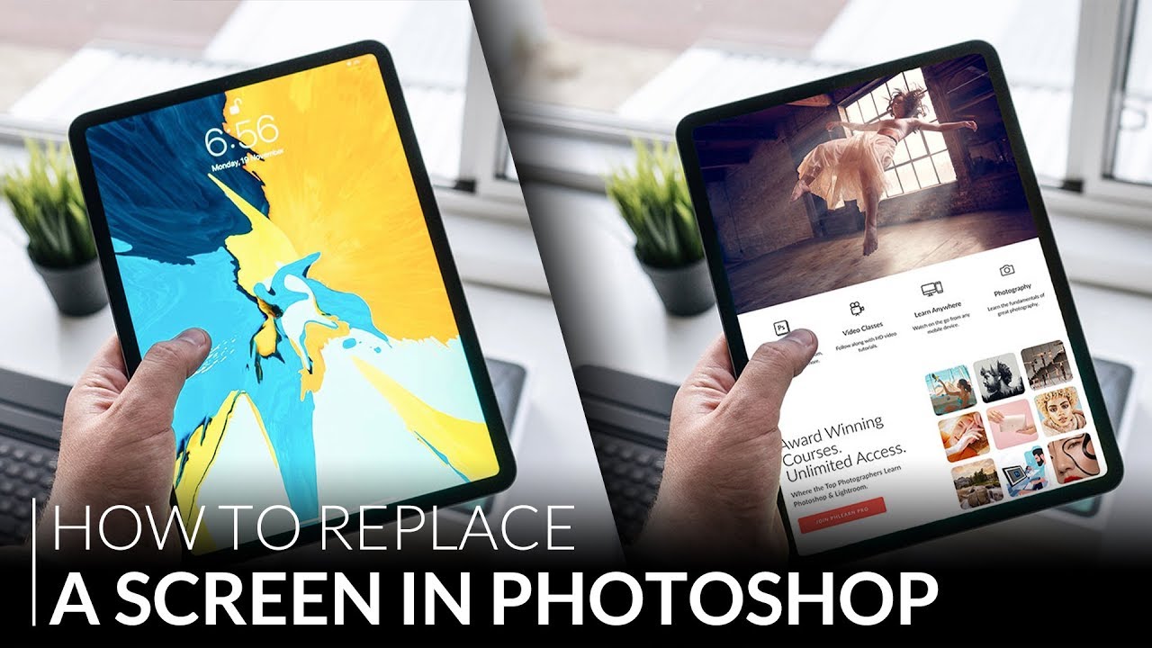
Client presentations used to stress me out more than they needed to. I’d finish a web or app layout, export a flat PNG, and then try to describe to someone what it would “feel like” on an actual device. Very convincing. Very professional. Meanwhile, the client is squinting at a 1200-pixel-wide screenshot wondering why I sent them a website. The fix, it turns out, was sitting inside Photoshop the whole time and I just hadn’t taken the time to learn it properly.
In this Aaron Nace (PHLEARN) tutorial on screen replacement and device mockups, the whole thing clicks into place. Watch the full tutorial on YouTube. The core idea is deceptively simple: you build your design once, save it as a PSD, then place it into your mockup scene as a linked Smart Object. The magic is that any update you make to the original design file ripples through to every device it’s placed on. One source file, multiple screens, zero manual copy-pasting. Once I understood that, I rebuilt my entire mockup workflow around it.
The technique also solves a problem I didn’t know I had until I was already elbow-deep in a project. I used to duplicate layers manually across tablet and phone mockups. Then I’d change something. Then I’d forget to update one of them. Then a client would notice. This approach kills that problem entirely.
Step 1: Assemble Your Design Layout in a Single Document
 Multiple design screenshots being merged into one Photoshop document
Start by pulling all your design assets into one Photoshop document. Aaron grabs screenshots of an existing website homepage and uses the Move tool to drag them into a single file. The point here isn’t perfection. It’s about getting a representative layout together that you can place into a device frame later. Don’t overthink the design at this stage. Even a rough comp works.
Once everything is in one document, use the Crop tool (C on the keyboard) to adjust your canvas size so the layout actually fits and breathes a little. Click and drag the crop handles to resize, then commit. You want the overall composition to look intentional, not crammed.
Step 2: Save the Design File as a PSD
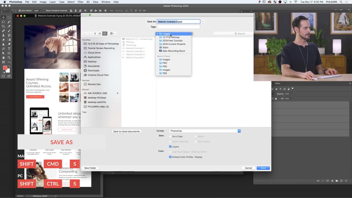 Save As dialog box with PSD format selected
This is the step that makes the whole technique work, so don’t skip past it. Once your design layout looks the way you want it, save it as a PSD using Shift + Command + S (Shift + Ctrl + S on Windows). Give it a clear name. Aaron uses “website-example.psd” and saves it to a dedicated images folder for the project.
The reason you’re saving as a PSD rather than exporting a flat file is that the PSD is what you’ll be linking into your device mockups. Photoshop needs a live, editable file to maintain that dynamic connection. If you save as a JPEG or PNG instead, you lose the ability to push edits through automatically.
Step 3: Open Your Device Mockup Files
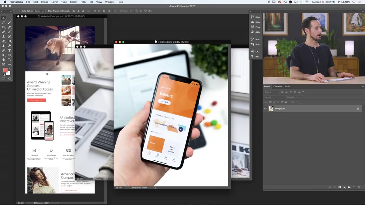 Device mockup scene open in Photoshop with phone and tablet visible
With your design file saved, open the mockup scenes you’re working with. These are your photos or renders of the actual devices, whether that’s a smartphone, a tablet, whatever you’re presenting on. Aaron works with two separate mockup images here, one featuring a phone and one featuring a tablet in a lifestyle-style photo.
If you don’t have mockup images ready, free ones are everywhere. Mockup World and Unsplash both have solid device photography. The key thing to look for is a clean, uncluttered screen area and a perspective that isn’t too extreme. Extreme angles make the warping work harder later.
Step 4: Place Your Design as a Linked Smart Object
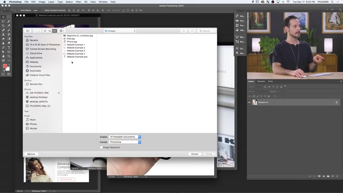 File menu open with Place Linked option highlighted
Here’s the actual core of the technique. In your mockup document, go to File and choose “Place Linked” (not “Place Embedded” - that’s a different beast). Navigate to the PSD you just saved and click Place. Photoshop drops the design into your document as a linked Smart Object, which shows up with a little chain-link badge on the layer thumbnail.
Do this for each device mockup you’re working with. Place the same source PSD into each one. Now both mockup files are pointing back to that single design file. Touch the source, and both update. It’s the closest thing to a superpower that Photoshop offers without requiring a plugin.
Step 5: Scale, Rotate, and Skew to Fit the Screen
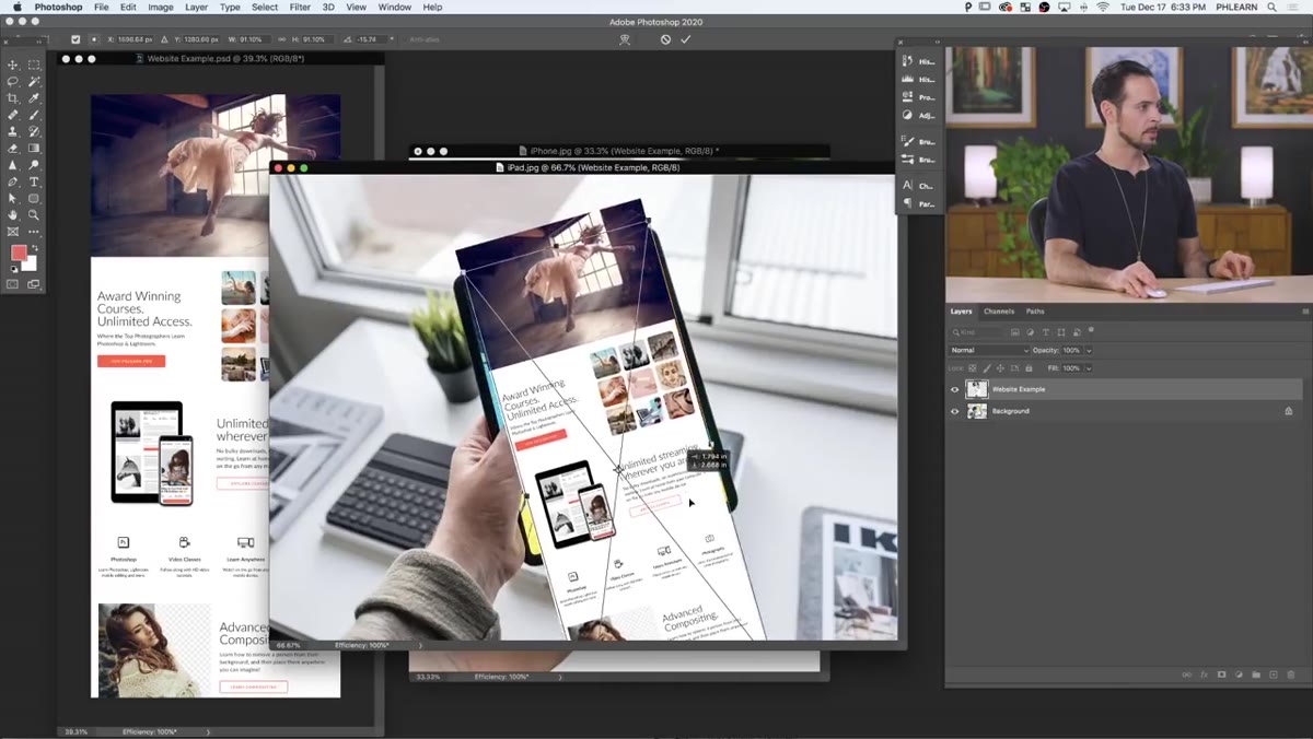 Transform handles active, design being skewed to match tablet perspective
Once the design is placed, you need to fit it to the device screen. Use Free Transform (Command + T / Ctrl + T) to scale and rotate the layer so it roughly covers the screen area. For a straight-on shot, scaling and rotating is usually enough.
For angled shots where the device is in perspective, you need to skew the design to match. Hold Command (Mac) or Ctrl (Windows) and drag individual corner handles independently. This lets you match the trapezoidal shape of a screen that’s angled toward the camera. Take your time with this. Getting the corners to line up with the actual device screen edges is what separates a convincing mockup from a sloppy one.
Step 6: Mask the Design to the Screen Area
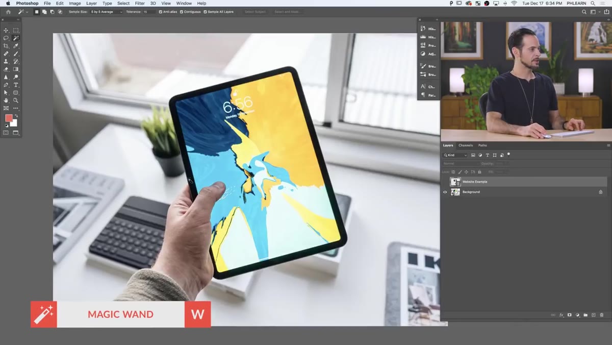 Black border selection being created around the device screen area
With the design transformed into position, you need to hide everything outside the screen boundary. The clean way to do this is with a layer mask. Make a selection of the screen area using whatever selection tool fits the shape, the Rectangular Marquee for flat-on shots, or the Polygonal Lasso for angled ones. Then add a layer mask to the Smart Object layer. The design is now contained inside the screen and nothing bleeds over the device bezel.
If you need to refine the fit later, you can always go back and adjust the transform on the Smart Object layer. The mask stays independent, so you’re not locked in.
A Note from My Own Workflow: Keep the Source PSD Tidy
The first time I tried this approach, I let the source design PSD get messy fast. Orphaned layers, hidden groups I forgot about, random adjustment layers I was “just testing.” When I went back to update the design, it was slower to edit than it should have been because I had to untangle my own chaos first.
My fix was treating the source PSD like a client deliverable even when it’s just an internal working file. Named layers, organized groups, nothing hidden unless it’s intentional. It sounds tedious but it takes about two extra minutes per file and saves real time later. The whole point of linked Smart Objects is that updating should be fast. Don’t let a sloppy source file cancel that advantage out.
The single most important thing to take away from this technique is not the mockup itself. It’s the mindset behind it: build once, link everywhere, edit from the source. That principle scales to way more than device screens. Once it’s in your toolkit, you’ll start seeing places to use it all over your Photoshop workflow.
Watch the full tutorial on YouTube to see Aaron walk through the whole thing live, including the specific moves for fitting a design to both a phone and a tablet in the same session.
Comments
Leave a Comment