How Matt Kloskowski's Photoshop Origin Story Will Make You Feel Better About Your First Project

How Matt Kloskowski's Photoshop Origin Story Will Make You Feel Better About Your First Project

There’s a specific kind of embarrassment that comes with looking back at your earliest Photoshop work. Mine was a meme I made in MS Paint at age twelve, which I thought was genuinely hilarious, and which I will not be describing further. The point is: everyone starts somewhere ridiculous. And when I came across Watch the full tutorial on YouTube - this video from Matt Kloskowski reflecting on his very first time using Photoshop - I didn’t expect it to be particularly useful.

Adobe's August 2026 Update: What's New in Lightroom and Camera RAW

Adobe's August 2026 Update: What's New in Lightroom and Camera RAW

Adobe’s August 2026 Update: What’s New in Lightroom and Camera RAW I’ve been digging into the latest August 2026 update for both Lightroom Classic and Adobe Camera RAW, and let me tell you—there’s some genuinely useful stuff here that’ll make your editing life easier. Adobe clearly listened to what users actually need rather than just adding complexity for complexity’s sake. The Feature Shuffle (And Why It Matters) Here’s what I’m noticing with Adobe’s release strategy lately: they’re rolling out new features in Camera RAW first, then letting them percolate for a bit before bringing them into Lightroom Classic.

How to Fake a Graduated Sky Filter in Photoshop (Without Touching a Single Slider)

How to Fake a Graduated Sky Filter in Photoshop (Without Touching a Single Slider)

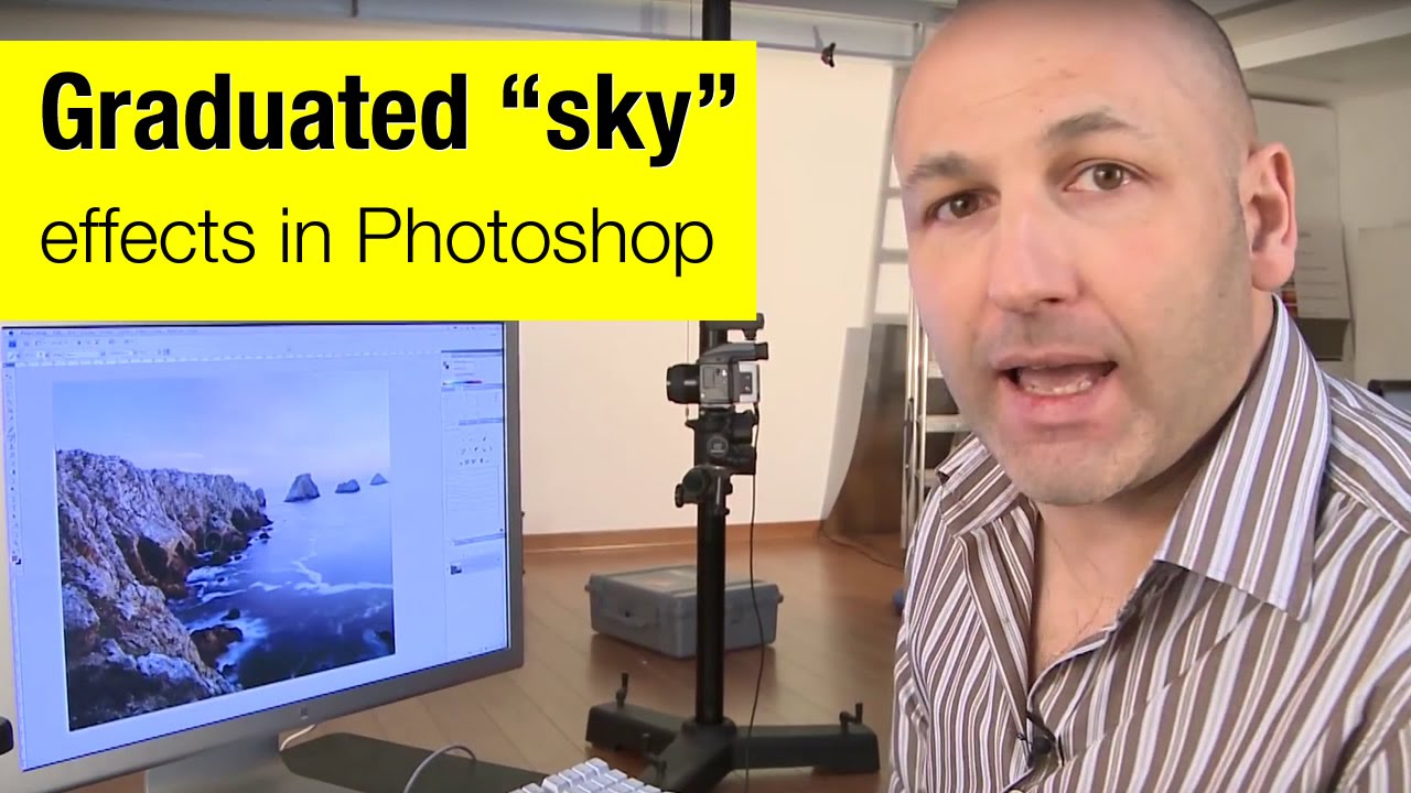
There’s a specific kind of frustration that hits when you’ve got a genuinely great shot — good composition, interesting foreground, strong light — and the sky is just… beige. Flat, washed-out, completely uninspiring. You know the image has something, but the sky is dragging it down. I’ve been there more times than I’d like to admit, and my usual instinct was to reach for Hue/Saturation or start messing with Curves until something looked vaguely better.

The Lightroom Color Tool You've Been Scrolling Past (And Why That's a Mistake)

The Lightroom Color Tool You've Been Scrolling Past (And Why That's a Mistake)

A few months ago I spent the better part of an afternoon trying to warm up a landscape shot using nothing but the Temperature slider. The result was technically warmer, sure, but it also looked like someone had smeared Velveeta across the sky. Everything shifted. The rocks, the shadows, the parts I didn’t even want touched. I ended up with a photo that looked like it was shot through a jaundiced window.

Stop Guessing With Color: A Practical Guide to Hue/Saturation in Photoshop

Stop Guessing With Color: A Practical Guide to Hue/Saturation in Photoshop

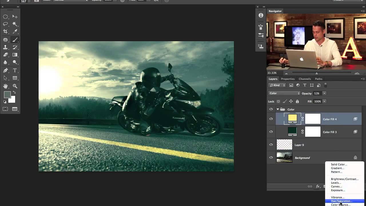
Color adjustments are where most beginners torch their files and don’t realize it until three saves later. I know because I spent years doing exactly that, flattening hue shifts directly onto background layers and then wondering why I couldn’t refine anything without starting over. The whole workflow felt fragile, like editing in pen instead of pencil. In this Aaron Nace (PHLEARN) tutorial, he walks through the Hue/Saturation tool from the ground up, and what makes it worth your time isn’t just the “move slider, color changes” part.

Why Your Text Effects Look Flat (And the Layer Style Stacking Order That Fixes It)

Why Your Text Effects Look Flat (And the Layer Style Stacking Order That Fixes It)

I had a client last year who wanted a vintage stamped-ink logo treatment. Simple enough brief. I spent about two hours getting the texture right, the distressing looking natural, the letterforms feeling worn without looking broken. Sent it over. He came back with a screenshot of something he’d found on Pinterest and said, “Can you make it look more like this?” It was almost exactly what I’d made. Almost. The difference was this subtle inner shadow that made the letters feel pressed into the paper rather than printed on top of it.

How to Actually Separate a Subject from a Busy Background (Without Losing Your Mind)

How to Actually Separate a Subject from a Busy Background (Without Losing Your Mind)

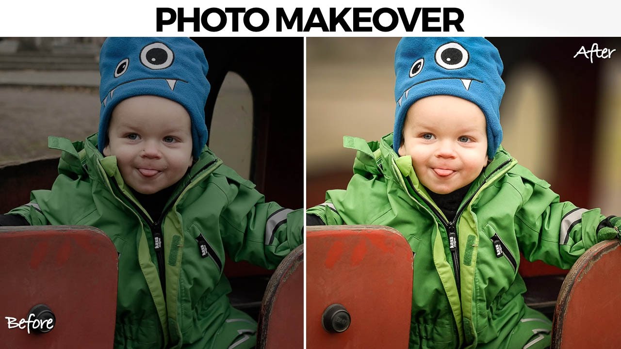
There’s a specific kind of job that used to make me quietly dread opening my inbox. A parent, a friend, someone’s aunt, sends you a candid photo of a kid with a genuinely great expression, and the background is just… a gray wall of visual noise. The subject is good. The light is okay. But nothing separates the person from everything behind them, and the whole thing reads as flat. I used to either spend way too long on it or hand it back with minimal changes and feel vaguely embarrassed about it.

Split Toning, Blend If, and Building a Cinematic Edit from Scratch (PHLEARN Breakdown)

Split Toning, Blend If, and Building a Cinematic Edit from Scratch (PHLEARN Breakdown)

There’s a specific kind of frustration that hits when you finish editing a photo and it just looks… fine. Technically correct. Boring. You added some contrast, maybe bumped the saturation, and the result is an image that could have come out of any free Lightroom preset pack. I spent an embarrassing amount of time in that zone early in my freelance career, convinced I was missing some secret tool. Turns out I wasn’t missing a tool.

Build a Book Cover Template That Updates Across Every Mockup Automatically

Build a Book Cover Template That Updates Across Every Mockup Automatically

Here’s a workflow problem I used to solve the dumbest way possible. Client wants to see their book cover design on three different book mockups. Old me would place the design manually on each mockup, flatten everything, then realize I wanted to tweak the title font, and start the whole process over from scratch. Three times. I did this for longer than I’m willing to admit before someone pointed me toward smart objects and linked files.

Fake It Till You Make It: How to Wrap 3D Text Around a Subject in Photoshop (No AI Required)

Fake It Till You Make It: How to Wrap 3D Text Around a Subject in Photoshop (No AI Required)

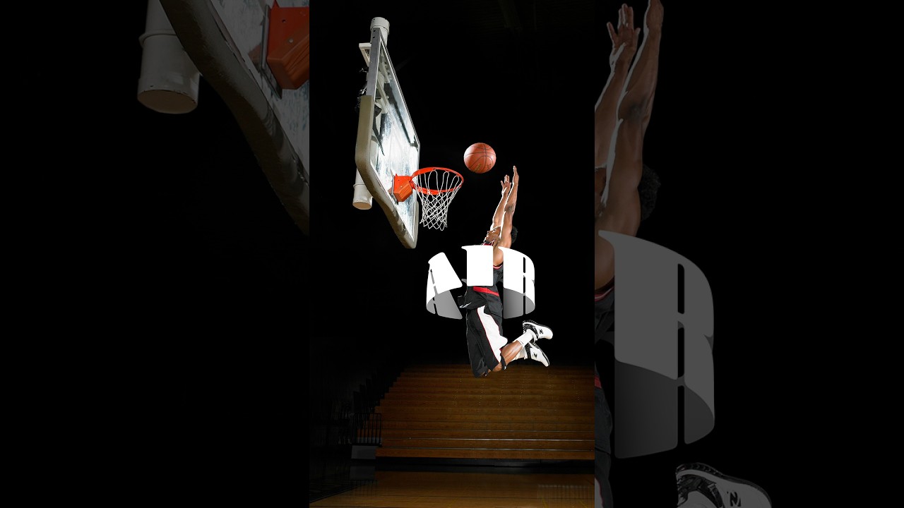
There’s a specific kind of design envy that hits when you see text curving around a subject like it actually exists in the same physical space. Not slapped on top. Not dropped in as an afterthought. Actually wrapping. I’ve faked this effect badly more times than I care to admit, usually by just skewing text and hoping nobody looked too closely. Spoiler: they always look too closely. So when I came across this Aaron Nace (PHLEARN) tutorial on creating a 3D text effect in Photoshop, I sat up a little straighter in my coffee shop booth.

How to Fake 3D Text in Photoshop Without Touching a Single AI Button

How to Fake 3D Text in Photoshop Without Touching a Single AI Button

Every few months I stumble across a technique that makes me feel like I’ve been doing things the hard way for no reason. This was one of those moments. I was working on a poster comp where the client wanted text that felt like it was physically wrapped around the subject, that kind of old-school carnival or vintage sports graphic energy. My first instinct was to reach for something complicated. Maybe export to a 3D program, maybe mess around with displacement maps, maybe just charge the client more and hope they forgot about it.

One Flash, One Stand, No Excuses: The Multi-Boom Setup That Replaced Half My Gear Bag

One Flash, One Stand, No Excuses: The Multi-Boom Setup That Replaced Half My Gear Bag

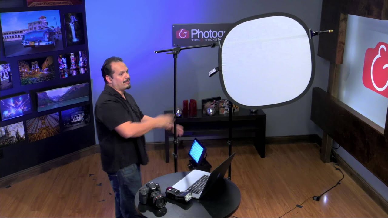
There’s a specific kind of dread that hits when a client says “keep it simple” and you show up with a rolling luggage bag full of stands, modifiers, and cables that takes 40 minutes to set up. I’ve been that person. I have very much been that person. The whole point of traveling light is to actually travel light, and for a long time my version of “light” still involved two stands, a reflector arm, and a bag of clamps I’d inevitably lose one of.