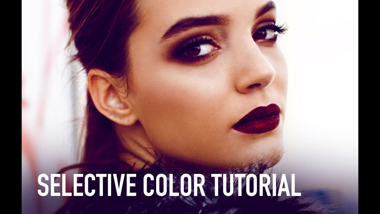
There’s a specific kind of frustration that hits when you’ve finished retouching a photo and it looks technically correct but somehow emotionally flat. The exposure is fine. The skin tones are clean. But the image has no mood, no atmosphere, nothing pulling you in. For years I was reaching for Hue/Saturation or Curves to fix this, and while those tools are great, they’re blunt instruments when what you actually need is a scalpel. Selective Color is that scalpel, and I genuinely wish someone had walked me through it properly earlier in my career.
Watch the full tutorial on YouTube
In this Jessica Kobeissi tutorial, she breaks down Selective Color in a refreshingly honest, unscripted way, working directly on a finished portrait retouch to show how the tool can shift mood, pop highlights, and introduce colors that weren’t in the original image at all. What I appreciate about her approach is that she skips the textbook explanation and goes straight to the channels she actually uses in her real workflow. That’s the stuff worth paying attention to.
Step 1: Add a Selective Color Adjustment Layer
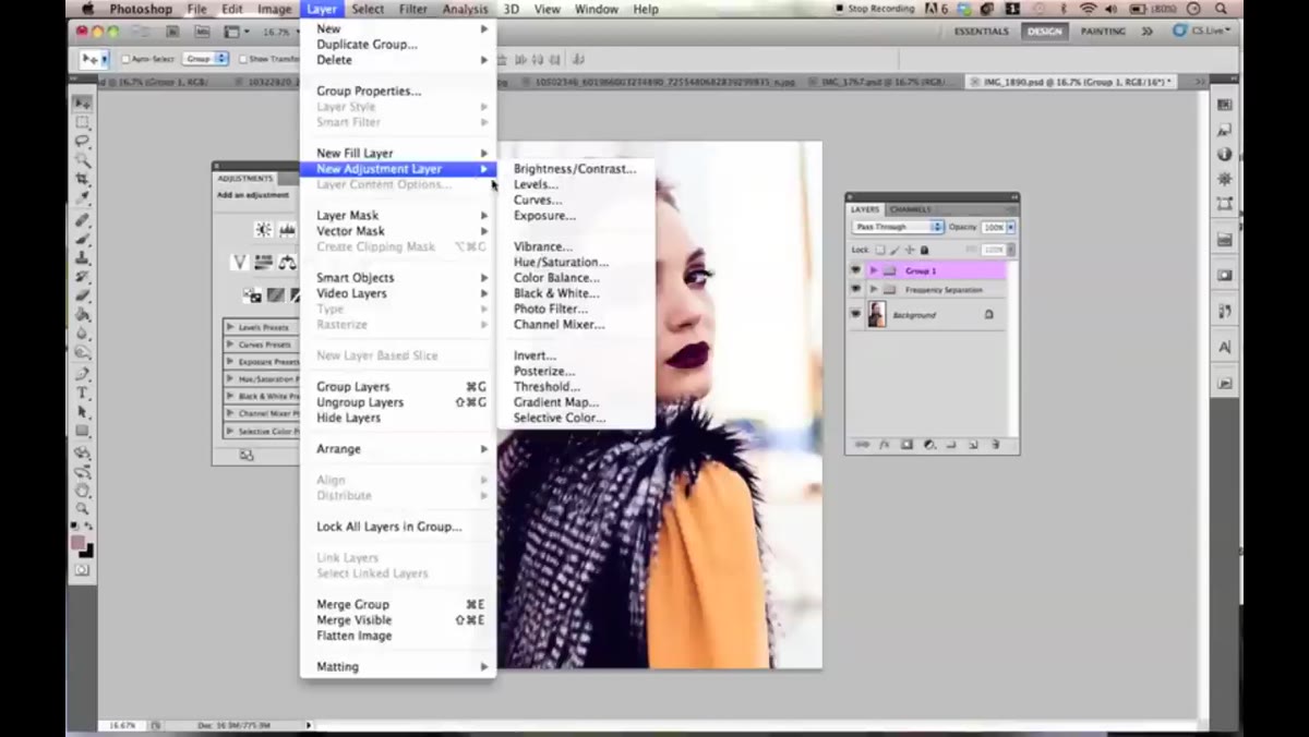 Navigating to Layer New Adjustment Layer Selective Color
Don’t go hunting through the Filter menu for this one. Selective Color lives under Layer, then New Adjustment Layer, then Selective Color. You can also find it in the Adjustments panel if you have that open. Either way, adding it as an adjustment layer (rather than going through Image, Adjustments) means it stays non-destructive and fully editable, which you’ll thank yourself for later when a client asks for a tweak three weeks after delivery.
Navigating to Layer New Adjustment Layer Selective Color
Don’t go hunting through the Filter menu for this one. Selective Color lives under Layer, then New Adjustment Layer, then Selective Color. You can also find it in the Adjustments panel if you have that open. Either way, adding it as an adjustment layer (rather than going through Image, Adjustments) means it stays non-destructive and fully editable, which you’ll thank yourself for later when a client asks for a tweak three weeks after delivery.
Once the layer is created, you’ll see a Properties panel with a dropdown at the top labeled Colors and four sliders below: Cyan, Magenta, Yellow, and Black. The core idea is simple. You pick a color channel from the dropdown, and any adjustments you make only affect pixels that fall into that color range. It’s targeted in a way that Hue/Saturation just isn’t.
Step 2: Start With Reds and Yellows for Skin Tones
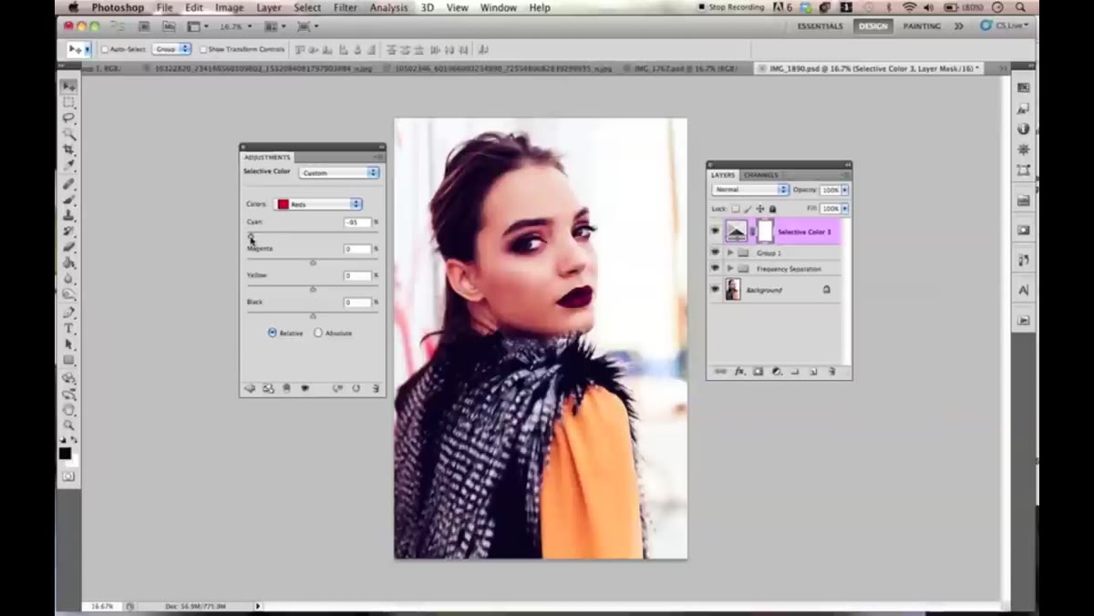 Selective Color panel open on Reds channel with sliders visible
Kobeissi is straightforward about which channels she actually uses, and it’s a shorter list than you’d expect: Reds, Yellows, Whites, Neutrals, and Blacks. For portrait work, Reds and Yellows are where skin tone lives. If your subject’s complexion looks a little too warm, too cool, or just slightly off, these two channels are your first stop.
Selective Color panel open on Reds channel with sliders visible
Kobeissi is straightforward about which channels she actually uses, and it’s a shorter list than you’d expect: Reds, Yellows, Whites, Neutrals, and Blacks. For portrait work, Reds and Yellows are where skin tone lives. If your subject’s complexion looks a little too warm, too cool, or just slightly off, these two channels are your first stop.
On the Reds channel, try pulling the Cyan slider left or right and watch what happens to the skin in your image. You’ll see the color shift in a way that feels much more surgical than dragging a temperature slider. Yellows work similarly, and since most skin tones have a significant yellow component regardless of ethnicity, this channel tends to have a strong effect on the overall warmth of a face. Adjust slowly here. Small moves go a long way.
Step 3: Use the Blacks Channel to Add Depth and Introduce Blue Tones
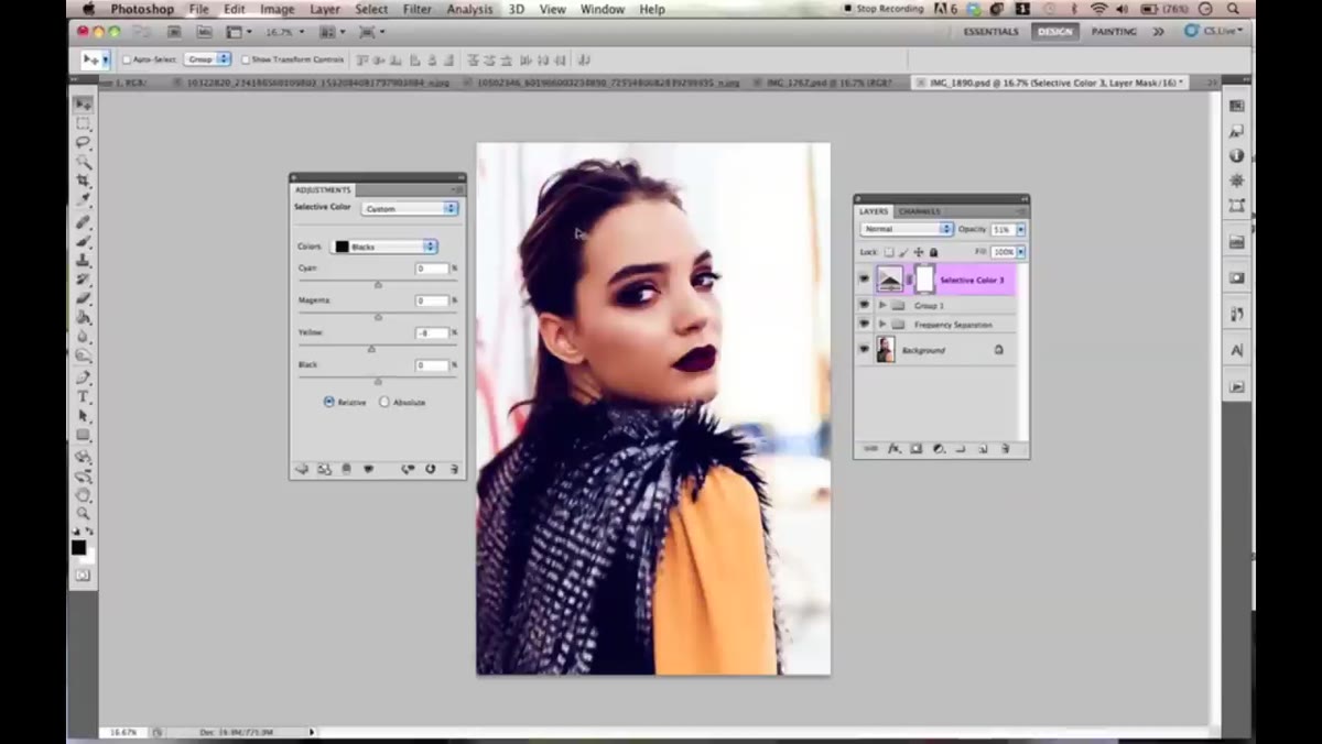 Blacks channel selected with Yellow slider pulled back creating blue shift
This is the one that surprised me the first time I saw it. When you’re working in the Blacks channel and you pull the Yellow slider back toward the negative end, it doesn’t just remove yellow from the shadows. It actually starts replacing those dark tones with blue, giving your image a cinematic, cool-shadow look without touching a single Curves point. Kobeissi also recommends adding a touch of Magenta in the Blacks channel to help pop the overall image. If a photo feels bland or washed out, this combination, a little less yellow and a little more magenta in the blacks, can give it the visual weight it was missing.
Blacks channel selected with Yellow slider pulled back creating blue shift
This is the one that surprised me the first time I saw it. When you’re working in the Blacks channel and you pull the Yellow slider back toward the negative end, it doesn’t just remove yellow from the shadows. It actually starts replacing those dark tones with blue, giving your image a cinematic, cool-shadow look without touching a single Curves point. Kobeissi also recommends adding a touch of Magenta in the Blacks channel to help pop the overall image. If a photo feels bland or washed out, this combination, a little less yellow and a little more magenta in the blacks, can give it the visual weight it was missing.
The effect is subtle enough to feel natural on a well-exposed portrait but strong enough to actually read on screen. It’s become one of my go-to moves when an image feels like it’s missing contrast in the color, not just the luminosity.
Step 4: Pull All Whites Sliders Back for a Highlights Pop
 Whites channel with multiple sliders pulled to negative values
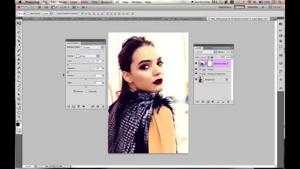
Switch to the Whites channel and try dragging all four sliders toward the left. What you get is a pretty dramatic pop in the highlights, making bright areas of the image feel more luminous and airy. It’s a high-key effect and it can look great, but Kobeissi is right to flag the warning here: it affects all white areas in the frame, not just the ones you want. Hair highlights, specular reflections, white clothing, a bright background, all of it gets pushed.
Whites channel with multiple sliders pulled to negative values
Switch to the Whites channel and try dragging all four sliders toward the left. What you get is a pretty dramatic pop in the highlights, making bright areas of the image feel more luminous and airy. It’s a high-key effect and it can look great, but Kobeissi is right to flag the warning here: it affects all white areas in the frame, not just the ones you want. Hair highlights, specular reflections, white clothing, a bright background, all of it gets pushed.
The fix is simple. Either paint on the layer mask to restrict the effect to specific areas, or just lower the opacity of the adjustment layer until the highlight pop feels like a whisper rather than a shout. Subtle usually wins.
Step 5: Experiment With Neutrals for Broad Color Shifts
 Neutrals channel selected with multiple sliders adjusted to unusual values
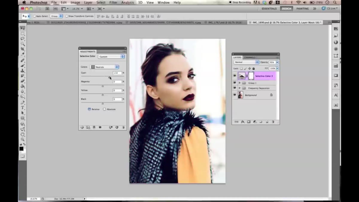
The Neutrals channel is where things get weird, and Kobeissi leans into that. Neutrals affect the mid-range tones across the whole image, so changes here tend to look dramatic pretty quickly. She actually suggests pushing the sliders to intentionally strange, almost ugly places and then changing the adjustment layer’s blend mode to something like Screen, Color, or Lighten before pulling the opacity way down.
Neutrals channel selected with multiple sliders adjusted to unusual values
The Neutrals channel is where things get weird, and Kobeissi leans into that. Neutrals affect the mid-range tones across the whole image, so changes here tend to look dramatic pretty quickly. She actually suggests pushing the sliders to intentionally strange, almost ugly places and then changing the adjustment layer’s blend mode to something like Screen, Color, or Lighten before pulling the opacity way down.
The logic is counterintuitive but it works. A heavily skewed color grade blended at low opacity can add a tint or mood that a more conservative adjustment would never produce. It’s the color grading equivalent of mixing paint by accident and realizing it’s exactly what you wanted. Worth experimenting with on a duplicate or a test image first before you commit.
Step 6: Use Layer Blend Modes to Extend What Selective Color Can Do
 Blend mode dropdown showing Screen and Color options being tested
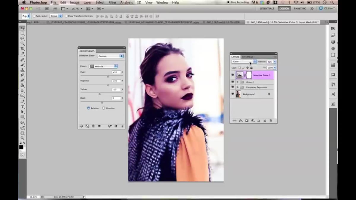
This is the part of Kobeissi’s workflow that doesn’t get enough attention. Once you’ve dialed in your Selective Color settings, the layer blend mode changes what those color adjustments actually do to the pixels beneath. Color mode applies the hue and saturation changes without affecting luminosity. Screen lightens. Lighten only affects pixels that are being made lighter by the adjustment. Each one gives you a genuinely different result from the same underlying settings.
Blend mode dropdown showing Screen and Color options being tested
This is the part of Kobeissi’s workflow that doesn’t get enough attention. Once you’ve dialed in your Selective Color settings, the layer blend mode changes what those color adjustments actually do to the pixels beneath. Color mode applies the hue and saturation changes without affecting luminosity. Screen lightens. Lighten only affects pixels that are being made lighter by the adjustment. Each one gives you a genuinely different result from the same underlying settings.
Don’t just set it and forget it on Normal. Spin through the blend modes with the opacity around 30 to 50 percent and see what each one does to your image. You’ll often find something unexpected that’s better than what you originally planned.
One Thing I’d Add From My Own Experience
Selective Color stacks beautifully. I often run two or three Selective Color adjustment layers, each one targeting a different thing. One handles skin tone, one handles the shadows, one handles a specific environmental color like a background or a piece of clothing. Keeping them separate means you can toggle each one on and off, adjust opacity independently, or mask them differently. Trying to do everything in a single layer is technically possible but it turns into a mess fast. Name your layers. Your future self will be grateful.
The single biggest shift in how I think about Selective Color is this: it’s not just a correction tool, it’s a creative one. You’re not only fixing what’s wrong with a photo. You’re deciding how it feels. That’s a different mindset than most correction workflows encourage, and it’s why this tool deserves a permanent spot in your retouching stack.
Watch the full tutorial on YouTube and follow along with Jessica’s walkthrough. Her instincts for color are worth stealing.
Comments (2)
I've watched a dozen tutorials on this and yours is the clearest by far.
My workflow just got 10x faster. Not even kidding.
Leave a Comment