There’s a specific kind of dread that hits when you realize you’ve saved a flattened JPEG over the only copy of a layered file you spent three hours building. I’ve been there. Most Photoshop users have been there at least once, and it’s the kind of mistake that only happens once before it rewires your entire saving workflow. File formats aren’t the flashiest topic in Photoshop, but getting them wrong costs you time, flexibility, and occasionally a client relationship. So when I found this Aaron Nace (PHLEARN) tutorial from his 30 Days of Photoshop series, I was genuinely pleased to see him lay it out with the kind of practical clarity the topic deserves. Watch the full tutorial on YouTube if you want to follow along directly.
The core argument Aaron makes is deceptively simple: always maintain two versions of every file. One layered file you can return to and edit. One exported, flattened file for the actual deliverable. That’s it. That’s the whole philosophy. But the devil is in the format choices, and that’s where things get interesting.
The tutorial uses a practical editing example to walk through the workflow, so we’re not just talking formats in the abstract. We’re making actual adjustments and saving them. Here’s how it goes.
Step 1: Start With Your JPEG Source File
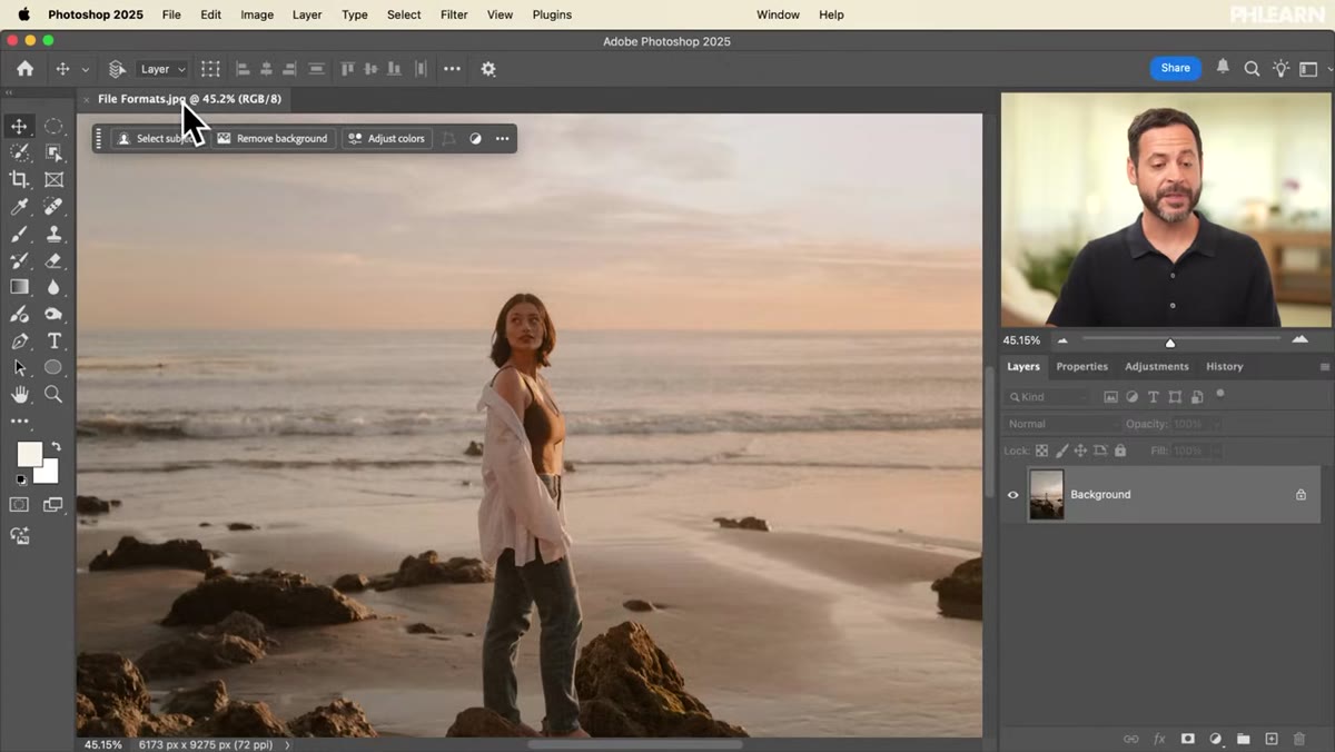 JPEG stock image open in Photoshop workspace
JPEGs are the most common file format you’ll encounter in the wild. They’re compressed, they’re flat, and they’re everywhere. Aaron opens a stock photo in JPEG format to kick things off, which is a realistic starting point for most real-world projects. The key thing to understand about a JPEG coming in is that it has no layers, it’s already been compressed, and your job is to work with it without destroying what you started with. Think of the JPEG as your raw ingredient, not your finished dish.
Step 2: Add a Brightness and Contrast Adjustment Layer
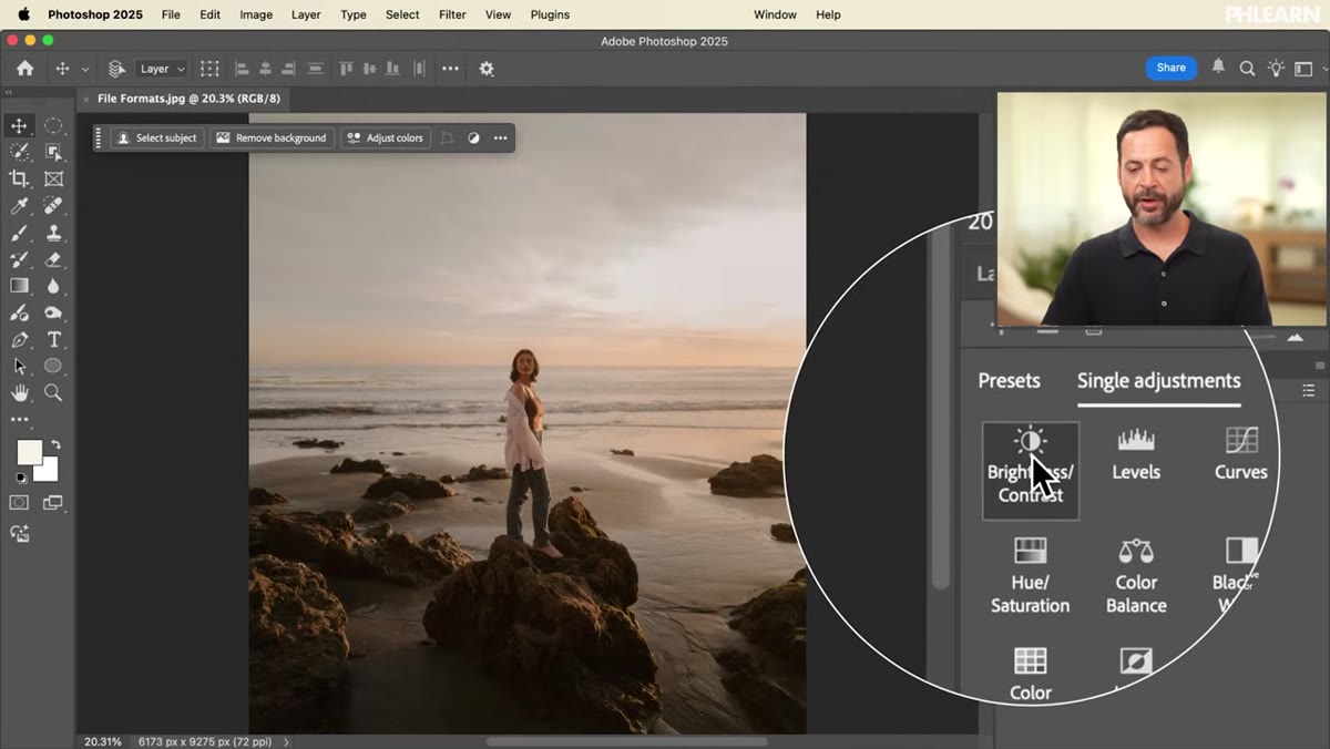 Brightness Contrast adjustment layer added in Layers panel
Rather than editing the image directly, Aaron adds a Brightness and Contrast adjustment layer via the Adjustments panel. If you don’t see that panel, go to Window and select Adjustments. Click the Brightness and Contrast icon, and your Properties panel will pop open with the sliders. He bumps the brightness up slightly to lift the subject, who reads a little dark against the rest of the composition. The critical point here isn’t the specific brightness value. It’s that using an adjustment layer keeps the original pixel data untouched, which means you can go back and change that value any time without degrading image quality.
Step 3: Use a Radial Gradient on the Layer Mask to Isolate the Effect
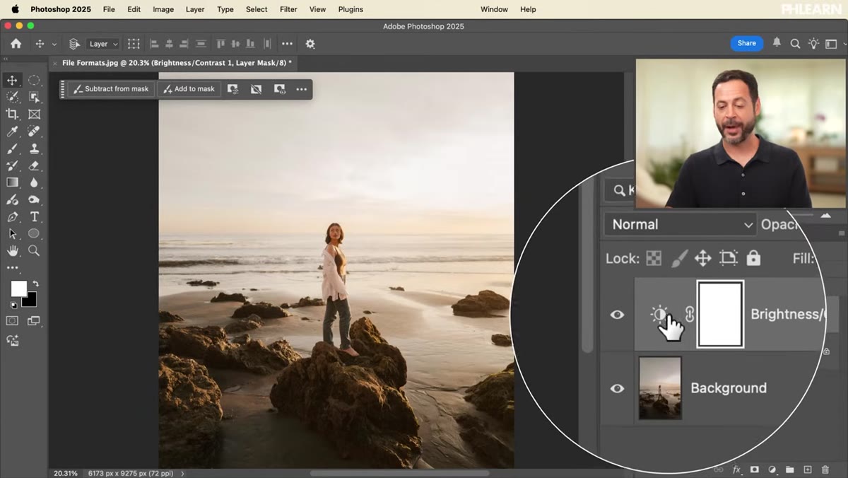 Radial gradient applied to layer mask in Layers panel
Here’s where it gets genuinely clever. Rather than masking around the subject by hand, Aaron uses a radial gradient on the adjustment layer’s mask to concentrate the brightness effect in the center of the frame and fade it toward the edges. Click on the layer mask thumbnail in your Layers panel (you’ll see a white highlight appear around it when it’s selected), then grab the Gradient tool with G. In the gradient picker, choose a black-to-white gradient from the Basics set, and switch the gradient type to Radial in the options bar at the top. Click and drag outward from the center of your subject. If the effect looks inverted, check the Reverse box in the options bar. The result is a vignette-style brightness boost that feels natural rather than surgical. The layer mask stays fully editable, so if the center point is slightly off, you just draw the gradient again.
Step 4: Apply a Gradient Map for Color Grading
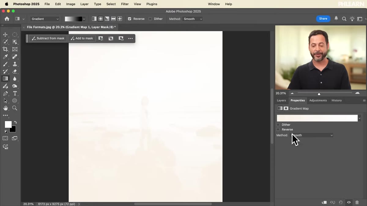 Gradient Map adjustment layer added above Brightness Contrast layer
Color grading is the next stop. Aaron adds a Gradient Map adjustment layer from the same Adjustments panel. A Gradient Map works by replacing the tonal values of your image with colors from a gradient. Dark tones get the color on the left side of the gradient, light tones get the color on the right, and midtones land somewhere in between. It sounds abstract but it produces some genuinely cinematic results fast. The key to using it without wrecking your image is blending mode and opacity. Drop the layer’s blend mode and reduce opacity to taste so it’s influencing the color without steamrolling the original image underneath.
Step 5: Save a Layered PSD to Preserve Your Work
 Photoshop Save As dialog showing PSD format option
This is the step most people either skip or do wrong. Once you’ve got your adjustment layers stacked and looking good, go to File, then Save As, and choose Photoshop (.psd) as the format. This is your archive copy. It keeps every layer, every mask, every adjustment intact. PSD files are larger than JPEGs, but that’s the trade-off for full editability. Aaron is pretty emphatic on this: treat the PSD like your project source file, the same way a video editor keeps their project file separate from the exported MP4. Never, ever skip this step.
Step 6: Export a Flattened Version for Its Intended Destination
 Save As dialog showing JPEG format selected for export
Once the PSD is saved, now you export for the actual use case. For web and social, JPEG is usually the right call. It compresses well, loads fast, and plays nicely with every platform. For anything that needs a transparent background, PNG is your friend since JPEG doesn’t support transparency at all. For print work, TIFF is the standard. It’s lossless, supports layers optionally, and is what most print vendors expect. When exporting, go to File, then Export, then Export As, and choose your format. For JPEGs, the quality slider between 80-90 is generally the sweet spot between file size and visible quality.
My Take: The Naming Convention Nobody Talks About
The two-file system Aaron recommends is solid, but it only works if your file naming keeps up with it. I learned this after digging through a folder of files all named “final,” “final-v2,” “final-ACTUAL,” and something called “final-useThis.” Not great. What I do now is append “_EDIT” to the layered PSD and use a clean descriptive name for the export. Something like “clientname-headshotJuly_EDIT.psd” sitting next to “clientname-headshotJuly.jpg.” Takes two seconds and saves genuine confusion later, especially when a client comes back six months later wanting a small change.
The single biggest thing to take away from this tutorial is the habit it’s trying to build: always save a layered file first, then export a flattened version. Every time, without exception. It’s not glamorous, but it’s the kind of workflow discipline that separates people who scramble when things go wrong from people who just open their PSD and fix it in five minutes. Watch the full tutorial on YouTube to see Aaron walk through the full format breakdown with the actual Photoshop demo.
Comments
Leave a Comment