Curves vs. Levels in Photoshop: Which One Should You Actually Be Using?

Curves vs. Levels in Photoshop: Which One Should You Actually Be Using?

For years I used Levels for everything. Exposure fix? Levels. Quick color correction? Levels. Basically anything that required me to not completely ruin a client’s photo? Levels. It felt safe. Predictable. And I won’t lie, part of the reason I avoided Curves was that the interface looked like something out of a seismograph reading and I had no idea what I was supposed to do with it. Then I watched this Aaron Nace tutorial from PHLEARN and it genuinely reframed how I think about both tools.

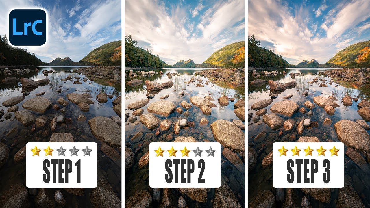
Lightroom First, Photoshop Second: Why Your Edit Order Is Wrecking Your Photos

Lightroom First, Photoshop Second: Why Your Edit Order Is Wrecking Your Photos

There’s a version of me from a few years ago who would open every photo straight in Photoshop. Raw file, JPEG, screenshot of a meme — didn’t matter. Photoshop was the big tool, so obviously that’s where the real work happened, right? Wrong. It took embarrassingly long for me to figure out that jumping past Lightroom (or Camera Raw) wasn’t a power move. It was leaving quality on the table before I’d even started.

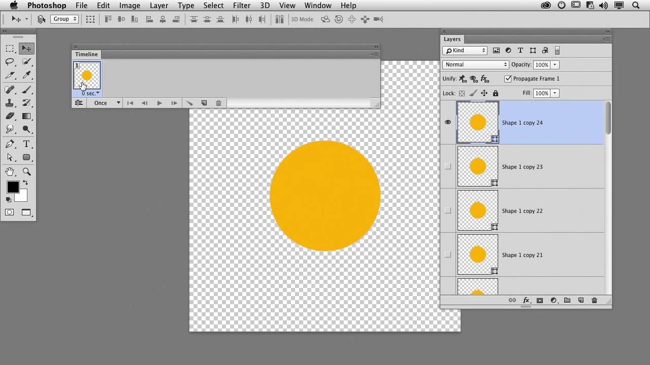
Building Rain From Scratch in Photoshop: What I Learned From Aaron Nace's Motorcycle Edit

Building Rain From Scratch in Photoshop: What I Learned From Aaron Nace's Motorcycle Edit

There’s a specific kind of frustration that comes from spending an afternoon on a composite that still looks fake, and you can’t quite put your finger on why. For me, it’s usually the atmosphere. The subject is sharp, the lighting is close enough, but the scene feels like a cutout dropped onto a background. Rain, when it’s done right, is one of the fastest ways to sell a scene as real.

Stop Trying to Fix Bad Windows in Photoshop — Just Replace Them

Stop Trying to Fix Bad Windows in Photoshop — Just Replace Them

There’s a certain kind of Photoshop problem that looks simple from the outside and turns into a two-hour nightmare once you’re actually inside it. Venetian blinds are exactly that problem. Uneven slats, inconsistent shadows, awkward gaps. You think “I’ll just clone stamp this out” and then forty-five minutes later you’re still at it, questioning your life choices, while the coffee you grabbed at the start of the session goes cold on the table beside your laptop.

How to Make Dramatic Black & White Photos in Photoshop (Without Guessing)

How to Make Dramatic Black & White Photos in Photoshop (Without Guessing)

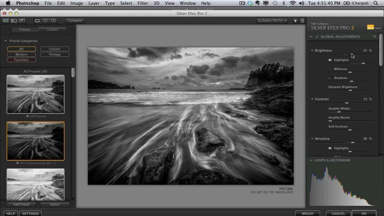
There’s a particular kind of black and white photo that stops you mid-scroll. Deep shadows, bright highlights, real tension between the two. Then there’s the other kind, which is just a color photo with the saturation turned off and a vague sense of disappointment. For a long time, most of what I was producing fell into that second category. I’d desaturate, maybe nudge the contrast slider, call it done. The results looked flat, lifeless, and honestly kind of embarrassing given how much time I’d spent on them.

Frequency Separation Filters: Stop Blurring Everything and Start Working Smarter

Frequency Separation Filters: Stop Blurring Everything and Start Working Smarter

Frequency separation is one of those techniques that every retoucher learns, uses constantly, and then slowly starts doing wrong out of habit. The classic setup is fine. You’ve got your high-frequency texture layer, your low-frequency color layer, and you’re ready to go. But then you grab the Gaussian blur and just… nuke the whole low-frequency layer. Every dark blends into every light. You get that weird mushy modeling effect that looks fine at 50% zoom and terrible everywhere else.

Paint Realistic Eye Makeup in Photoshop Using Actual Makeup Artist Principles

Paint Realistic Eye Makeup in Photoshop Using Actual Makeup Artist Principles

I do a lot of portrait retouching. Skin cleanup, dodging and burning, the occasional dramatic color grade. But for years, whenever a client asked me to “add some makeup” to a shot, I’d fumble around with a brush tool, slap some color on a normal layer, and wonder why it looked like I’d painted the model’s face with Microsoft Paint. Which, yes, I have experience with. It wasn’t pretty. The real problem wasn’t the tools.

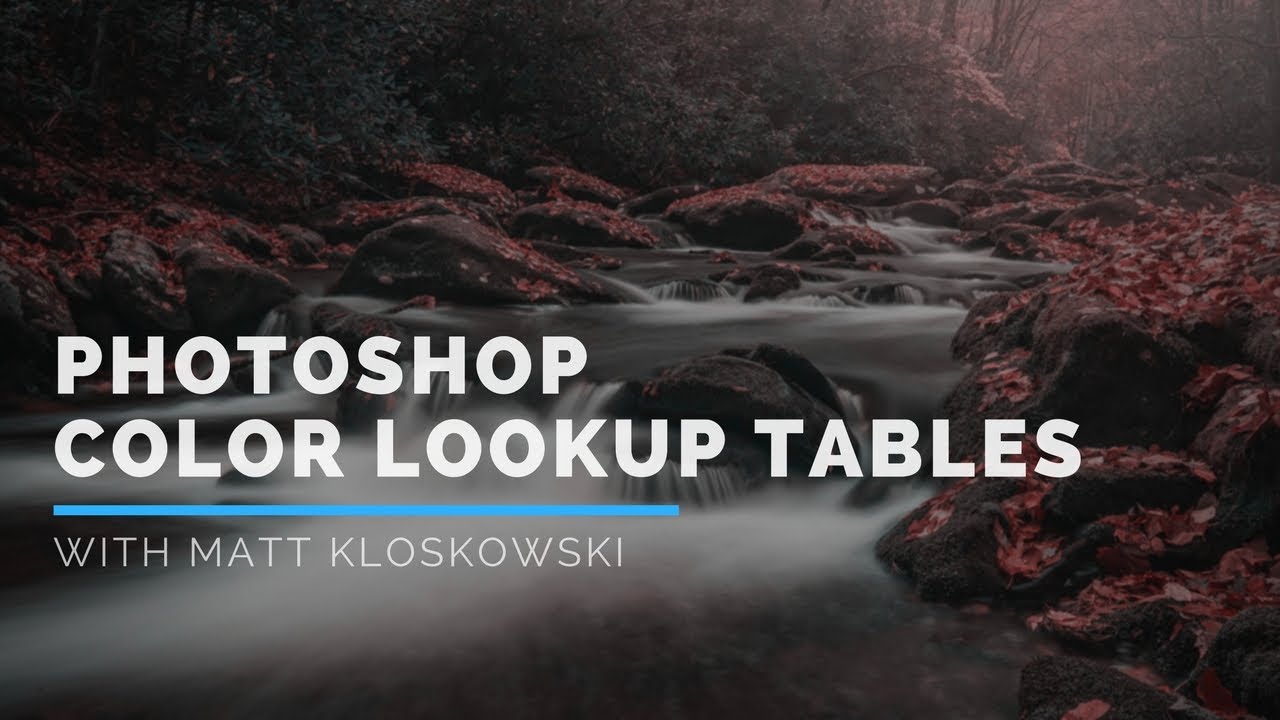
Lifting the Blacks: How to Nail That Moody Dark Film Look in Photoshop

Lifting the Blacks: How to Nail That Moody Dark Film Look in Photoshop

Client work has a way of forcing you to learn things fast. I spent an embarrassing amount of time trying to fake that moody, washed-out film look by just dragging the exposure slider down and hoping for the best. The result was always the same: muddy, flat, and nothing like the cinematic shadow work I was going for. The problem wasn’t my eye. It was that I was using the wrong tool for the job.

7 Photoshop Layer Tricks That Changed How I Actually Work

7 Photoshop Layer Tricks That Changed How I Actually Work

Layers are the backbone of everything in Photoshop. Not smart objects, not adjustment layers, not blend modes — layers, full stop. And yet I spent the better part of two years treating them like a simple stack of stuff, dragging things around and hoping for the best. It wasn’t until I started deliberately hunting down layer-specific technique that I realized how much time I was hemorrhaging on tasks that should have taken seconds.

Stop Guessing If Your Buildings Are Straight — Use Photoshop's Grid Like This

Stop Guessing If Your Buildings Are Straight — Use Photoshop's Grid Like This

Architectural photography has this sneaky way of making you feel like everything looks fine until you slap a straight line next to it and realize your building is leaning like it lost a fight. I’ve handed off composites with slightly tilted structures more times than I’d like to admit, usually because I was eyeballing it and convinced myself it was “close enough.” Spoiler: clients notice. So when I came across this Aaron Nace (PHLEARN) tutorial on using Photoshop’s grid system to analyze and correct building lines, I sat up a little straighter in my coffee shop booth and paid attention.

Your Photoshop Workspace Is Slowing You Down (Here's How I Fixed Mine)

Your Photoshop Workspace Is Slowing You Down (Here's How I Fixed Mine)

I’m writing this from a coffee shop, which is my permanent office situation, so my screen real estate is already a joke. Thirteen-inch laptop, one external monitor when I remembered to pack the cable, and a guy next to me watching YouTube without headphones. Under these conditions, a bloated, default Photoshop workspace isn’t just annoying, it’s genuinely expensive. Slow workflows mean fewer projects, which means less money, which means I can’t afford the fancy oat milk latte.

Photoshop's Generative Upscale Tool Might Save Your Old Photos (And Your Print Jobs)

Photoshop's Generative Upscale Tool Might Save Your Old Photos (And Your Print Jobs)

I have a folder on my hard drive called “Client Assets - HANDLE WITH CARE” and it is, genuinely, a disaster. Blurry product shots. Ancient family photos scanned at the wrong resolution. Images that looked fine on a phone screen but would print like a watercolor painting left in the rain. For years, my workaround was a combination of third-party upscaling apps, crossed fingers, and gently managing client expectations. Then Adobe quietly dropped a tool in Photoshop Beta that makes most of that song and dance completely unnecessary.