Stop Blending Modes, Start Using Channels: The Smarter Way to Overlay Graphics on Portraits

Stop Blending Modes, Start Using Channels: The Smarter Way to Overlay Graphics on Portraits

There’s a specific kind of Photoshop frustration that hits when you drop a graphic element onto a portrait, slap on Multiply or Screen, and think “okay, close enough.” It works, sort of, but the colors are off, the opacity feels wrong, and the whole thing looks like you gave up halfway through. I’ve shipped work like that. Not proud of it, but I’ve done it. The problem isn’t the blending mode itself.

Double Exposure in Photoshop: How to Blend Two Images Into Something That Looks Intentional

Double Exposure in Photoshop: How to Blend Two Images Into Something That Looks Intentional

Client work has a funny way of pushing you toward techniques you’ve been lazily avoiding. For me, double exposures were exactly that. I’d seen them everywhere, assumed they were either done in-camera or required some wizardly process I hadn’t earned the right to know yet, and kept putting off learning them properly. Then a branding client asked for a portrait-meets-nature composite for a wellness campaign, and suddenly my procrastination had a deadline.

The Photoshop Shortcuts I Use Every Single Day (And the Ones I Wish I'd Learned Years Earlier)

The Photoshop Shortcuts I Use Every Single Day (And the Ones I Wish I'd Learned Years Earlier)

I used to watch a designer I knew finish a retouching job in about 12 minutes. Same job would take me 45. We were using the same software, the same version, roughly the same skill level. The difference was that he barely touched his mouse. His left hand was always on the keyboard, fingers moving like he was playing a chord progression he’d memorized years ago. I was clicking through menus like I was navigating a mid-2000s website.

Photoshop Gotcha Fixes You'll Wish You'd Known Sooner (Plus a Slick 3D Light Trick)

Photoshop Gotcha Fixes You'll Wish You'd Known Sooner (Plus a Slick 3D Light Trick)

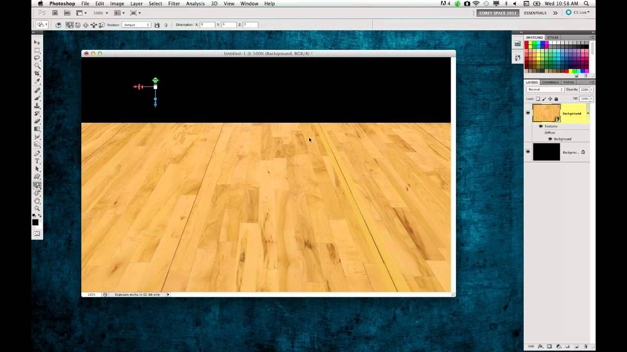
There’s a specific kind of frustration that hits when Photoshop stops behaving the way you expect and you can’t figure out why. Not a crash. Not a missing file. Just… something quietly wrong. A shortcut that used to work now does something slightly different. You sit there poking at settings like you’ve never opened the app before. I’ve been there more times than I want to admit, and I’m someone who once spent 20 minutes debugging a “broken” tool before realizing I was working on the wrong layer.

How to Slap Any Image onto a Building (and Actually Make It Look Real) with Photoshop's Vanishing Point

How to Slap Any Image onto a Building (and Actually Make It Look Real) with Photoshop's Vanishing Point

A friend of mine once spent three days building a composite where he placed a graphic onto the side of a building. Manually warped it. Nudged every corner point. Matched the lighting. It looked… fine. Plausible. Then someone in his feedback thread said “couldn’t you just use Vanishing Point for that?” and his soul briefly left his body. I watched this happen in real time. I also had no idea what Vanishing Point was, so I stayed quiet and nodded like I absolutely knew.

Build a Repeating Lightning Bolt Background in Photoshop (The Step-and-Repeat Method)

Build a Repeating Lightning Bolt Background in Photoshop (The Step-and-Repeat Method)

There’s a specific kind of panic that hits when a client asks for “something more interesting” in the background of a portrait shot that’s already been edited, color-graded, and basically signed off. You don’t want to blow up the existing work. You just need to add a layer of visual energy without rebuilding the whole thing from scratch. This is exactly the situation Aaron Nace tackles in this PHLEARN tutorial, and the approach he takes is genuinely clever.

Content Aware Scale: The Photoshop Feature I Keep Forgetting I Need (Until I Desperately Need It)

Content Aware Scale: The Photoshop Feature I Keep Forgetting I Need (Until I Desperately Need It)

There’s a specific kind of design panic that hits when you’re building a thumbnail, a print layout, or a client deliverable and the photo just doesn’t fit the canvas the way you need it to. The subject is dead center, you need room on one side for text, and if you just scale the whole image you’ll either crop something important or squash the person in the frame into a funhouse mirror version of themselves.

Stop Fighting Your Colors: How Color Range Masking Gives You Surgical Control

Stop Fighting Your Colors: How Color Range Masking Gives You Surgical Control

There’s a specific flavor of frustration I know too well: you brighten a photo, and suddenly everything looks like it’s been left out in the Texas sun for three days. The thing you actually wanted to pop, say a product, a piece of clothing, a neon sign, gets lost in the wash because you were editing the whole image instead of just the part that needed it. For a long time, my answer was to mess around with the HSL panel, nudge a slider, and hope for the best.

Stop Guessing Your Exposure: A Camera Raw Workflow That Actually Works

Stop Guessing Your Exposure: A Camera Raw Workflow That Actually Works

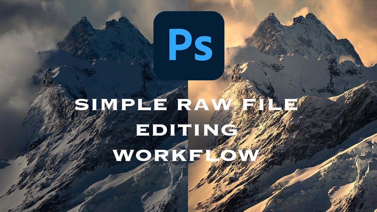
Exposure problems are the dirty secret of a lot of client work. You get a great shot, the composition is solid, the subject looks fantastic, and then you open it in Photoshop and realize half the image is either blown out or buried in shadows. I’ve been there more times than I care to admit. The temptation is to reach for Curves or Levels and start dragging things around until it looks “good enough” — which usually means you’ve overcorrected the highlights trying to save the shadows, or vice versa.

Two-Layer Vignettes in Photoshop: The Technique That Makes Your Subject Pop

Two-Layer Vignettes in Photoshop: The Technique That Makes Your Subject Pop

I used to add vignettes the lazy way. Throw a black-to-transparent radial gradient on top, drop the opacity to taste, call it a day. It worked well enough for meme graphics back when I was just making stuff for friends’ band pages, but the moment I started doing actual client work, that flat gradient approach looked exactly like what it was: a shortcut. The edges felt pasted on. Photographers noticed. Art directors noticed.

The 5-Minute Dreamy Photo Effect That Actually Works (No Orton Effect Required)

The 5-Minute Dreamy Photo Effect That Actually Works (No Orton Effect Required)

There’s a certain kind of client request that used to make me quietly groan into my coffee. “Can you make it look… softer? Like dreamy? You know, that look?” I did not always know that look. And my first instinct was usually to reach for some overcomplicated multi-layer Orton effect tutorial I’d bookmarked three years ago and never fully understood. Twenty minutes later I’d have something that looked like a fever dream, not a photograph.

Steal Colors From Any Photo and Make Your Images Look Like a Fever Dream (In a Good Way)

Steal Colors From Any Photo and Make Your Images Look Like a Fever Dream (In a Good Way)

Client work has a way of humbling you. I spent the better part of an afternoon once trying to manually paint a warm, hazy color grade onto a portrait, layer by layer, brush stroke by brush stroke, and the result looked like someone had smeared margarine on the screen. The color was there, technically, but it had no life. No cohesion. What I actually needed was already sitting in another photo on my desktop, and I had no idea I could just… take it.